How to use and customise the MaxiBlocks WordPress homepage design template for plumbing services
The MaxiBlocks WordPress homepage design template is a powerful tool for creating a professional and engaging website for plumbing services. This homepage template is packed with visual cues, clear calls to action, and intuitive layout sections to ensure your audience knows exactly what you offer and how they can get help. In this blog post, we will explore how to use each section of the template effectively and provide tips on customising it to reflect your unique brand.
Header section: emergency plumbing services at your fingertips
The header section is the first thing your visitors see, making it crucial for setting the right impression. It features a bold headline stating “Emergency plumbing services,” immediately establishing the focus of the website. Beneath this, a subtext provides essential information, offering “24/7 emergency plumbing service,” to instil confidence in the service’s availability. Two call-to-action buttons, “Shop now” and a hotline number, offer easy navigation and quick access to services.
The design is simple yet effective, with a clean white background allowing the text and buttons to stand out. The orange colour of the buttons adds a sense of urgency and draws the visitor’s attention, encouraging them to act immediately. The layout is straightforward, with all key information accessible at a glance, ensuring users are not overwhelmed.
10 customisation tips for the header section:
- Change the headline to reflect your specific services, such as “Reliable plumbing solutions 24/7” for a broader approach.
- Replace the hotline number with a link to a WordPress contact form for those who prefer digital communication.
- Add an animated number counter showcasing the number of satisfied customers served.
- Customise button text—use “Get help now” instead of “Shop now” to suit your brand.
- Replace the white background with an image related to your business to add context.
- Add an email subscribe button to capture leads directly from the header.
- Update the subtext to include additional services you provide, such as “Call for installations, repairs, and emergency service.”
- Customise button colours to align with your brand palette.
- Add a small icon next to the hotline number to visually reinforce that it’s a phone number.
- Include a video background showcasing your team in action to make the section more engaging.
Image section: showcasing plumbing expertise
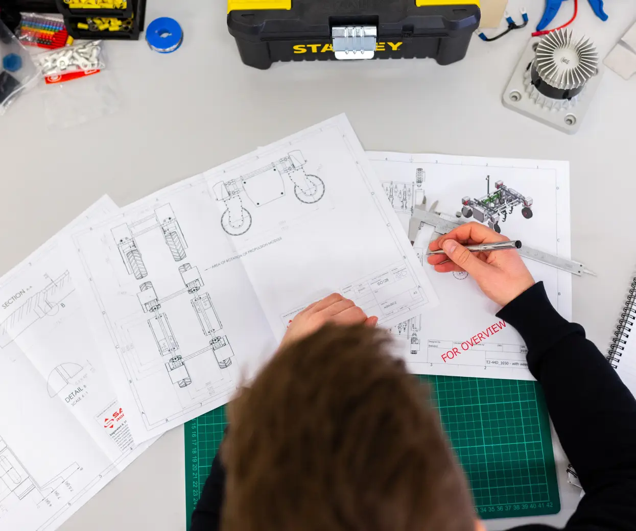
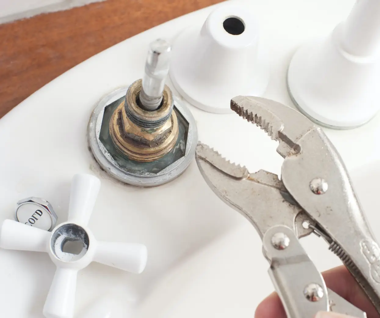
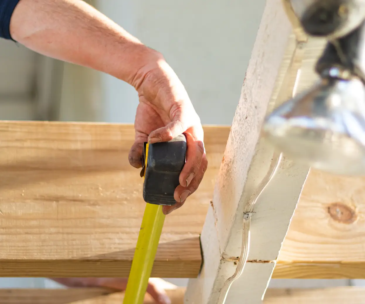
This section features three images arranged side by side, displaying different aspects of plumbing work. Each image provides a unique insight into the expertise of your plumbing team:
- Image 1: Tools and diagrams, representing careful planning and technical skills.
- Image 2: A plumber working on an outdoor tap, showcasing the hands-on nature of the job.
- Image 3: Close-up of plumbing components, highlighting the attention to detail in every project.
The images are presented in a balanced, grid-like layout, giving a professional and organised look. This arrangement helps visitors quickly understand the scope of services and the expertise involved in each task.
10 customisation tips for the image section:
- Replace images with photos of your own team to add a personal touch.
- Use high-quality website images that represent both indoor and outdoor projects.
- Add captions to each image to explain what is being showcased.
- Use a filter to give all images a consistent colour tone that matches your brand.
- Replace one of the images with a customer testimonial or completed project.
- Add an overlay with a call to action, such as “See our portfolio.”
- Create a slideshow instead of static images to show more work.
- Use an image of a smiling team member to add warmth to the page.
- Add subtle animations to each image when a user hovers over them.
- Link each image to a relevant service page for more information.
Team members section: Meet our professionals
The team section showcases three key team members, with their photos displayed in circular frames, accompanied by their names and roles. This simple presentation helps visitors get a feel for the people behind the services, adding a human touch to the brand.
The circular frames give a friendly and approachable feel, while the layout ensures that each team member is equally highlighted, creating a sense of balance and professionalism.
10 customisation tips for the team members section:
- Replace placeholder images with high-quality photos of your actual team members.
- Add a brief description of each team member’s experience or specialisation.
- Include links to each team member’s LinkedIn profile for professional credibility.
- Use hover effects to display fun facts about each team member.
- Add an email subscribe option to connect potential clients directly to a team member.
- Feature a short video introduction for each team member.
- Include an icon next to each name indicating their role (e.g., a wrench icon for technicians).
- Customise the background colour to match your brand colours.
- Add testimonials from happy clients under each team member.
- Link team member profiles to relevant blog posts or case studies.
Promotional section: service call to action
This section invites users to “Book a service call today” with the heading “Get help with all your plumbing needs.” There is also a video thumbnail of a plumber in action, allowing visitors to see a demonstration of the services offered. The bright orange button, “Get started,” is prominently positioned to draw attention.
The layout is focused on conversion, with the video adding a dynamic element and the button being strategically placed to encourage immediate action. The light blue background provides a soft contrast, making the call to action stand out.
10 customisation tips for the promotional section:
- Change the button text to “Schedule an appointment” for a more direct approach.
- Swap the video thumbnail for a real customer testimonial video.
- Add animated number counters to showcase specific achievements.
- Use block pattern text to add more emphasis to the call to action.
- Include a link to the WordPress blog for further content.
- Use different CTA examples, such as “Talk to a professional now” for more variety.
- Replace the orange button with a gradient background for a modern look.
- Add a countdown timer if there is a special offer on service calls.
- Include icons representing each type of service offered.
- Add a link to an email subscribe for a newsletter.
Services icons section: explore our plumbing services
This section features a set of service cards, each with a simple icon representing specific services such as “leak detection,” “drain cleaning,” and “water heater repair.” The icons are visually engaging and help users quickly identify the services they need.
The icons are laid out in a neat grid, making it easy for visitors to scan through the different services. Each card has a consistent design, ensuring visual harmony throughout the section.
10 customisation tips for the services icons section:
- Replace icons with those from the WordPress icon library to better match your brand.
- Add more services that are unique to your company.
- Customise the icon colours to align with your overall brand palette.
- Include animations on hover to make the icons interactive.
- Add a link to each card that leads to an in-depth service page.
- Incorporate a short description below each service name.
- Use an animated block pattern to draw attention to your most popular service.
- Add customer reviews related to each service.
- Highlight a particular service card with a different background colour.
- Include an option for visitors to directly book a service from each icon.
Appointment scheduling section: easy online booking
This section includes a large blue card with the headline “Schedule an appointment online.” The call-to-action button, “Start here,” is designed to be simple and inviting, encouraging visitors to take immediate action.
The layout is straightforward, with the blue card providing a contrasting background that makes the button and headline pop. The use of white space around the card ensures the content stands out without feeling cluttered.
10 customisation tips for the appointment scheduling section:
- Change the button text to “Book now” for a more direct prompt.
- Use a different background colour that fits with your brand.
- Add icons to guide users visually, such as a calendar icon.
- Include an email subscribe option to remind visitors of their appointment.
- Add a testimonial next to the scheduling form to boost trust.
- Make the button animated to draw more attention.
- Provide links to other important sections of your site, such as your FAQs.
- Include a countdown timer if appointment availability is limited.
- Offer a discount for first-time bookings with a promo code.
- Link to your WordPress navigation menus for easy navigation.
Client logos and testimonial section: build credibility
This section includes a quote that adds an inspirational touch, along with logos of notable brands like Google and Netflix. The logos serve as social proof, enhancing trustworthiness.
The layout is clean and organised, with the client logos evenly spaced for visual balance. The use of well-known brand logos immediately communicates reliability and trust, making visitors feel more comfortable engaging with your services.
10 customisation tips for the client logos and testimonial section:
- Replace the placeholder quote with an actual testimonial from a satisfied customer.
- Add more client logos to showcase partnerships.
- Use a block pattern text to make the testimonial stand out.
- Include animated transitions between testimonials.
- Add a link to a case study featuring one of the listed clients.
- Change the background colour to make this section distinct.
- Add an overlay on client logos to make them look cohesive.
- Use a video testimonial for better engagement.
- Include social media links below the quote.
- Add a headline like “Trusted by the best in the business” above the logos.
Footer section: seamless navigation
The footer includes key links such as “About us,” “Work,” and social media icons. The dark background separates the footer from the rest of the page, providing a distinct ending point for the visitor.
The footer layout is divided into columns, making navigation simple and organised. The use of social media icons encourages visitors to connect further, while the dark background creates a clear visual distinction from the rest of the content.
10 customisation tips for the footer section:
- Add a link to a 404 page for missing content.
- Include a small contact form for direct enquiries.
- Use a logo pattern to customise your brand logo in the footer.
- Include a newsletter email subscribe option.
- Add social proof in the form of customer reviews.
- Use icons next to each link for easier visual navigation.
- Link to your most recent WordPress blog post.
- Customise the footer’s background colour to fit your brand.
- Include a link to your pricing table if relevant.
- Add an “Our locations” link to help visitors find branches near them.
Types of websites that can use a WordPress homepage
This WordPress homepage template can be easily adapted for various industries. Here are some examples:
MaxiBlocks’ WordPress homepage template provides a strong foundation for a professional website, no matter the industry. By following these customisation tips, you can easily personalise the template and create an engaging, effective online presence for your business.
To explore more about using MaxiBlocks for WordPress websites or WordPress website design, check out the MaxiBlocks full library for additional resources and patterns.
