Create your dream WordPress homepage with MaxiBlocks
The WordPress homepage design template by MaxiBlocks is a versatile and beautifully structured foundation for any website, whether you’re creating a food and restaurant website, an agency homepage, or a health website. Let’s walk you through the sections, describe each element, and give you practical tips to make this homepage design truly your own.
If you’re new to WordPress or need some help with block patterns, check out the MaxiBlocks pattern templates.
Hero section – set the stage with stunning visuals
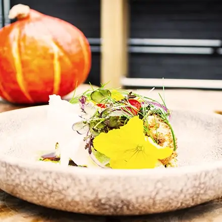
The hero section is the first thing visitors see, and it creates an immediate impression. This section features a bold headline over a stunning hero image. The default template uses an appetising dish, such as seafood pasta, which immediately draws attention. The headline reads “Life’s too short for boring food,” setting a lively tone. Below the headline, there are two icons indicating delivery and dine-in options. These icons are simple yet effective, helping users quickly understand the key services offered.
- Images: The hero background image features a repair worker using industrial equipment, conveying expertise and professionalism.
- Design and layout: This section uses a full-width image that provides a bold, eye-catching introduction. The headline text is centred and stands out against the background. It creates an impactful impression while the contact icons help guide visitors towards taking action.
10 tips to customise your hero section:
- Change the hero image to reflect your niche. For a travel website, use a scenic image. For a law firm, opt for an image that conveys professionalism.
- Customise the headline: Use an animated number counter to grab attention, e.g., “100+ Dishes Served Daily.”
- Add an animated video background to give it more dynamism.
- Switch the icons for relevant ones—use WordPress icons to represent services.
- Add a tagline under the headline to emphasise your brand’s mission.
- Include a call to action (CTA) button—for example, “Order Now” or “Book a Table.”
- Experiment with colours to align with your brand’s palette.
- Add a social proof indicator like customer ratings under the headline.
- Add parallax scrolling for a modern effect.
- Use block pattern text to creatively display your message, such as an inspiring quote.
Learn more about enhancing your hero section by visiting the website hero guide.
Introduction section – give them a taste of your brand
The introduction section provides visitors with a quick overview of your business. It typically includes your address and a few sentences describing your brand. The default template keeps it simple, which makes it easy for you to customise with your own details.
- Design: The section utilises a split layout with an equal distribution of text and image, keeping the balance visually appealing.
10 tips to customise your introduction section:
- Add your physical address if you operate a physical business like a restaurant or gym.
- Replace the text with a brand story or mission.
- Incorporate a testimonial to add credibility.
- Add a button for directions using a map plugin.
- Display accolades like awards for your services.
- Integrate WooCommerce to link this section to products or services.
- Use an email subscribe CTA to build your mailing list.
- Add a countdown for any upcoming events.
- Incorporate icons to represent your services—WordPress icons can make it visually appealing.
- Highlight unique services you offer, such as private dining or personalised consulting.
Features section – showcase what makes you special
The features section consists of three feature blocks that highlight the unique aspects of your business. Each block has an icon, a title, and a short description. In the default template, these blocks feature elements like fresh ingredients, the taste of quality, and an invitation to visit.
- Design: The section utilises a modular layout, keeping the information visually appealing and easy to navigate.
10 tips to customise your features section:
- Add more feature blocks for additional services.
- Replace icons to better represent your offerings—check the WordPress icon library.
- Incorporate animations to make icons more engaging.
- Use different colours for each block to separate services visually.
- Add a link to each feature to lead users to detailed pages.
- Replace images with website images from your business.
- Use different font styles to give each feature its own emphasis.
- Add a testimonial under each feature for credibility.
- Use animated number counters to highlight any stats.
- Include a CTA button under each feature, such as “Learn More” or “Get Started.”
Menu section – show them what you’ve got
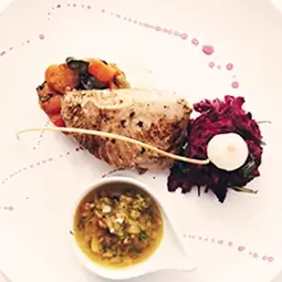
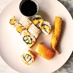
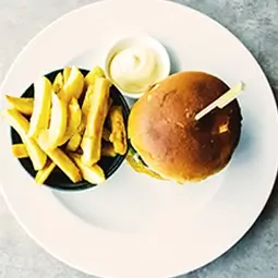
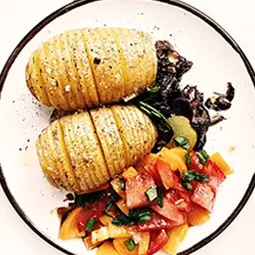
The menu section is designed to provide a visual representation of your offerings. It uses a clean layout with dish names, prices, and small images. This section is versatile, making it ideal for a restaurant menu but also adaptable for other types of products or services.
- Design: The section relies on a grid format, which keeps everything organised and easy to read. The use of images alongside each item helps to give customers a clear idea of what to expect.
10 tips to customise your menu section:
- Replace food items with services or products.
- Add block patterns for a pricing table for consulting or fitness packages.
- Add descriptions below each item for more context.
- Include dietary icons if you use this for a food menu.
- Use an animated carousel for a dynamic menu.
- Change the layout to a card or list style.
- Incorporate testimonials next to each dish.
- Use call to action examples such as “Order Now” or “Reserve.”
- Replace the default currency to suit your local audience.
- Add a “Specials” section with an animated number counter to show weekly offers.
Call to action buttons – encourage your visitors
The call to action section consists of three primary buttons—Order Online, Download Menu, and Book a Table. These buttons are strategically placed to encourage visitors to take immediate action.
- Design: The layout is straightforward, with each button given ample space to stand out. The buttons are designed in contrasting colours to make them highly visible.
10 tips to customise your call to action section:
- Add a CTA for newsletter subscription to build your audience.
- Replace “Order Online” with a link to a service page—use a consulting homepage template for an example.
- Change button colours for more contrast.
- Add icons to each button for better visibility.
- Link buttons to custom forms using a WordPress contact form.
- Animate the buttons when users hover over them.
- Create a dual CTA layout to offer secondary options.
- Use social proof labels like “Most Popular Choice.”
- Integrate with a 404 page as a redirect option if pages are missing.
- Experiment with typography for better readability.
For more ideas on CTAs, you can explore the WordPress navigation menus guide.
Gallery section – visual storytelling
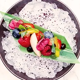
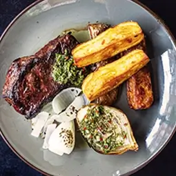
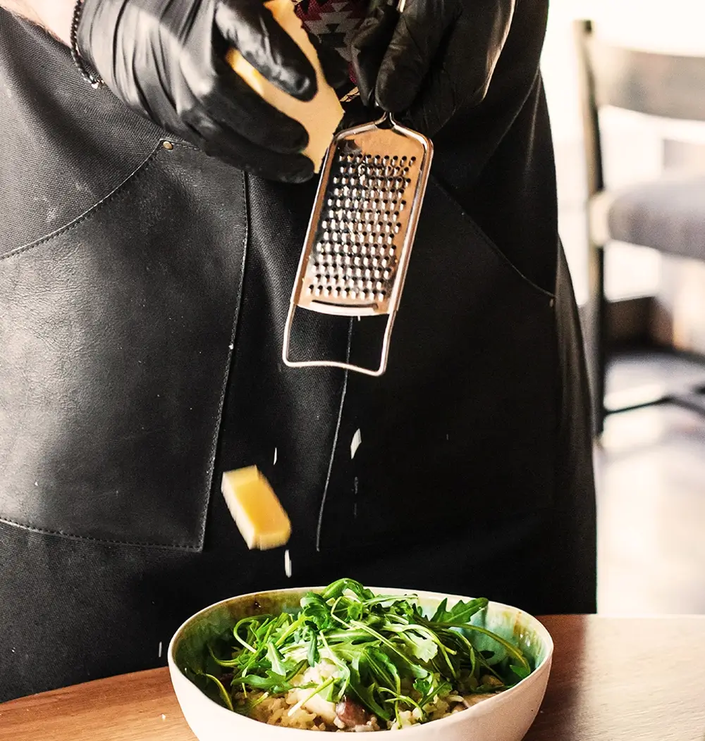
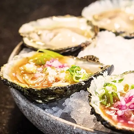
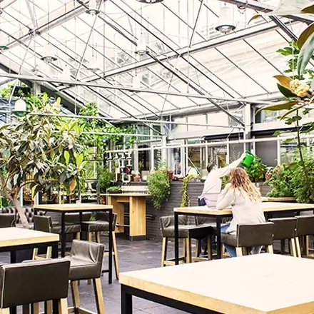
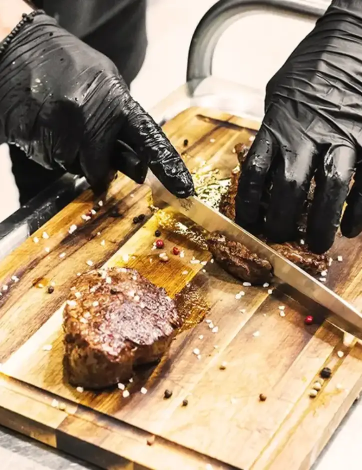
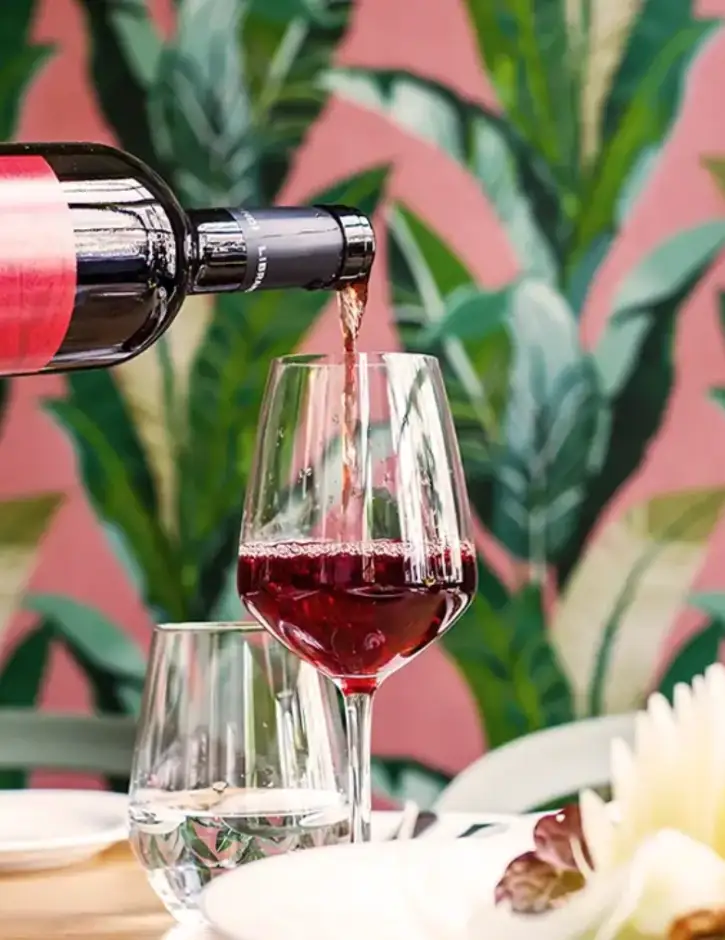
The gallery section features vibrant images of chefs preparing food, freshly plated dishes, and customers enjoying their experience. This section is meant to visually communicate the atmosphere and quality of your services.
- Design: The section includes large, high-quality images arranged in a grid or carousel, allowing users to easily browse through visuals.
10 tips to customise your gallery section:
- Replace with images from your specific industry.
- Use a gallery block to include additional pictures.
- Add hover effects for more interactivity.
- Use sliders if you have a larger selection of photos.
- Incorporate client photos if you offer a personalised service.
- Include an animated number counter to display the number of satisfied customers.
- Create image categories for better organisation.
- Add lightbox functionality for larger image previews.
- Use a masonry layout for a unique visual.
- Embed a short video to introduce your services.
Quote section – add a touch of inspiration
The quote section features a simple yet elegant quote by Alberto Rossi. This section is designed to add a sophisticated touch and convey the ethos of your business.
- Design: The layout is centred, with the quote placed prominently in a larger font. The simplicity of the design draws focus to the message itself.
10 tips to customise your quote section:
- Change the quote to something relevant to your industry.
- Add a background image for more visual appeal.
- Use animated text to bring the quote to life.
- Incorporate a CTA like “Learn More About Us.”
- Add customer testimonials for social proof.
- Include a company logo alongside the quote.
- Create a rotating quote section with multiple testimonials.
- Use block pattern text for unique styling.
- Incorporate website icons that represent your business.
- Change typography to align with your brand’s theme.
Different types of websites that can use a WordPress homepage
This WordPress homepage template can suit many industries, from food and restaurant websites to consulting websites. Here are some examples:
Learn more about specific templates like the food and restaurant homepage template.
Conclusion
Customising a WordPress homepage design template with MaxiBlocks allows you to create a truly unique website experience. Each section of this template provides a fantastic base, and with a few customisations, you can cater it specifically to your industry and audience.
Take a look at our homepage design templates to explore more about making your dream website a reality.
