Create your dream WordPress homepage with MaxiBlocks
The WordPress homepage design template by MaxiBlocks is a versatile and beautifully structured foundation for any website, whether you’re creating a food and restaurant website, an agency homepage, or a health website. Let’s walk you through the sections, describe each element, and give you practical tips to make this homepage design truly your own.
If you’re new to WordPress or need some help with block patterns, check out the MaxiBlocks pattern templates.
Hero section – set the stage with stunning visuals
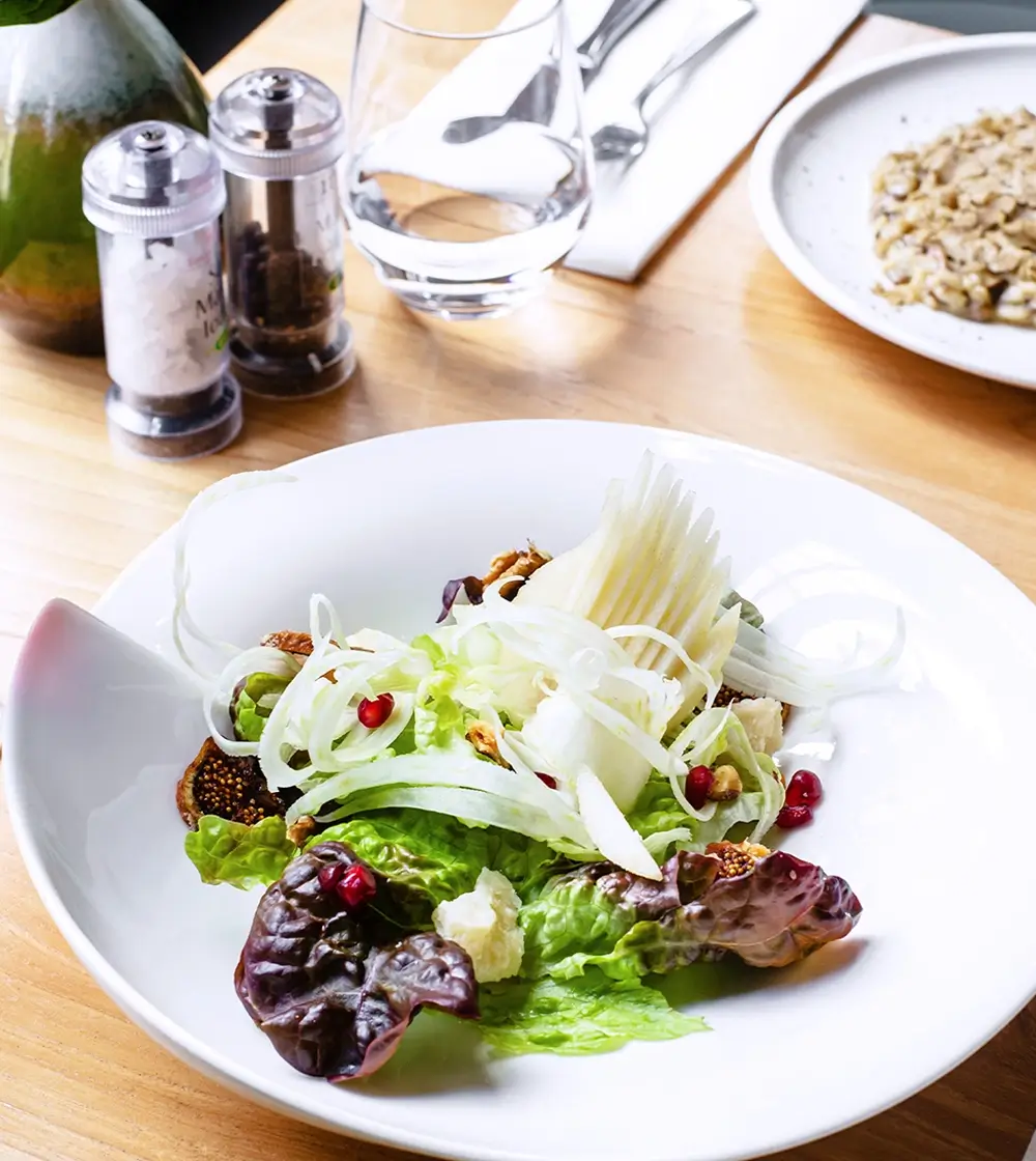
The hero section is the first thing visitors see, and it creates an immediate impression. This section features a bold headline over a stunning hero image. The default template uses an appetising dish, such as seafood pasta, which immediately draws attention. The headline reads “Life’s too short for boring food,” setting a lively tone. Below the headline, there are two icons indicating delivery and dine-in options. These icons are simple yet effective, helping users quickly understand the key services offered.
- Layout: The hero section is spacious, with the headline centrally aligned over the full-width hero image. The use of high-quality imagery helps convey the brand’s focus on quality. The icons are positioned just beneath the headline, maintaining balance without overcrowding the space.
10 tips to customise your hero section
- Change the hero image to reflect your niche. For a travel website, use a scenic image. For a law firm, opt for an image that conveys professionalism.
- Customise the headline: Use an animated number counter to grab attention, e.g., “100+ Dishes Served Daily.”
- Add an animated video background to give it more dynamism.
- Switch the icons for relevant ones—use WordPress icons to represent services.
- Add a tagline under the headline to emphasise your brand’s mission.
- Include a call to action (CTA) button—for example, “Order Now” or “Book a Table.”
- Experiment with colours to align with your brand’s palette.
- Add a social proof indicator like customer ratings under the headline.
- Add parallax scrolling for a modern effect.
- Use block pattern text to creatively display your message, such as an inspiring quote.
Learn more about enhancing your hero section by visiting the website hero guide.
Introduction section – give them a taste of your brand
The introduction section provides visitors with a quick overview of your business. It typically includes your address and a few sentences describing your brand. The default template keeps it simple, which makes it easy for you to customise with your own details.
- Design: The section utilises a split layout with an equal distribution of text and image, keeping the balance visually appealing.
10 tips to customise your introduction section
- Add your physical address if you operate a physical business like a restaurant or gym.
- Replace the text with a brand story or mission.
- Incorporate a testimonial to add credibility.
- Add a button for directions using a map plugin.
- Display accolades like awards for your services.
- Integrate WooCommerce to link this section to products or services.
- Use an email subscribe CTA to build your mailing list.
- Add a countdown timer to any upcoming events.
- Incorporate icons to represent your services—WordPress icons can make it visually appealing.
- Highlight unique services you offer, such as private dining or personalised consulting.
Features section – showcase what makes you special
The features section consists of three feature blocks that highlight the unique aspects of your business. Each block has an icon, a title, and a short description. In the default template, these blocks feature elements like fresh ingredients, the taste of quality, and an invitation to visit.
- Design: The section utilises a modular layout, keeping the information visually appealing and easy to navigate.
10 tips to customise your features section
- Add more feature blocks for additional services.
- Replace icons to better represent your offerings—check the WordPress icon library.
- Incorporate animations to make icons more engaging.
- Use different colours for each block to separate services visually.
- Add a link to each feature to lead users to detailed pages.
- Replace images with website images from your business.
- Use different font styles to give each feature its own emphasis.
- Add a testimonial under each feature for credibility.
- Use animated number counters to highlight any stats.
- Include a CTA button under each feature, such as “Learn More” or “Get Started.”
Statistics and features section – build trust with your audience
The statistics section displays key figures about the restaurant, such as the number of meals served (235), the average rating (9.9), the number of events hosted (45), and the number of new dishes (56).
- Design: Features a grid layout where each statistic is presented with a unique icon that visually represents the data, such as a star for the rating and a plate for meals served. The bold numbers are displayed prominently, making it easy for visitors to quickly see the restaurant’s success.
10 tips to customise your statistics and features section
- Update the statistics to reflect your business’s accomplishments.
- Replace icons with more relevant ones using the WordPress icon library.
- Use an animated number counter to add movement and catch attention.
- Add a background image that matches your brand theme.
- Incorporate client logos to showcase notable clients.
- Add a CTA below the statistics to direct visitors to learn more.
- Change the icon colours to reflect your brand’s identity.
- Use testimonials along with the statistics for more credibility.
- Include a video next to the statistics to tell your story visually.
- Update font styling to make the text align with your brand’s personality.
Video section – engage visitors with visuals
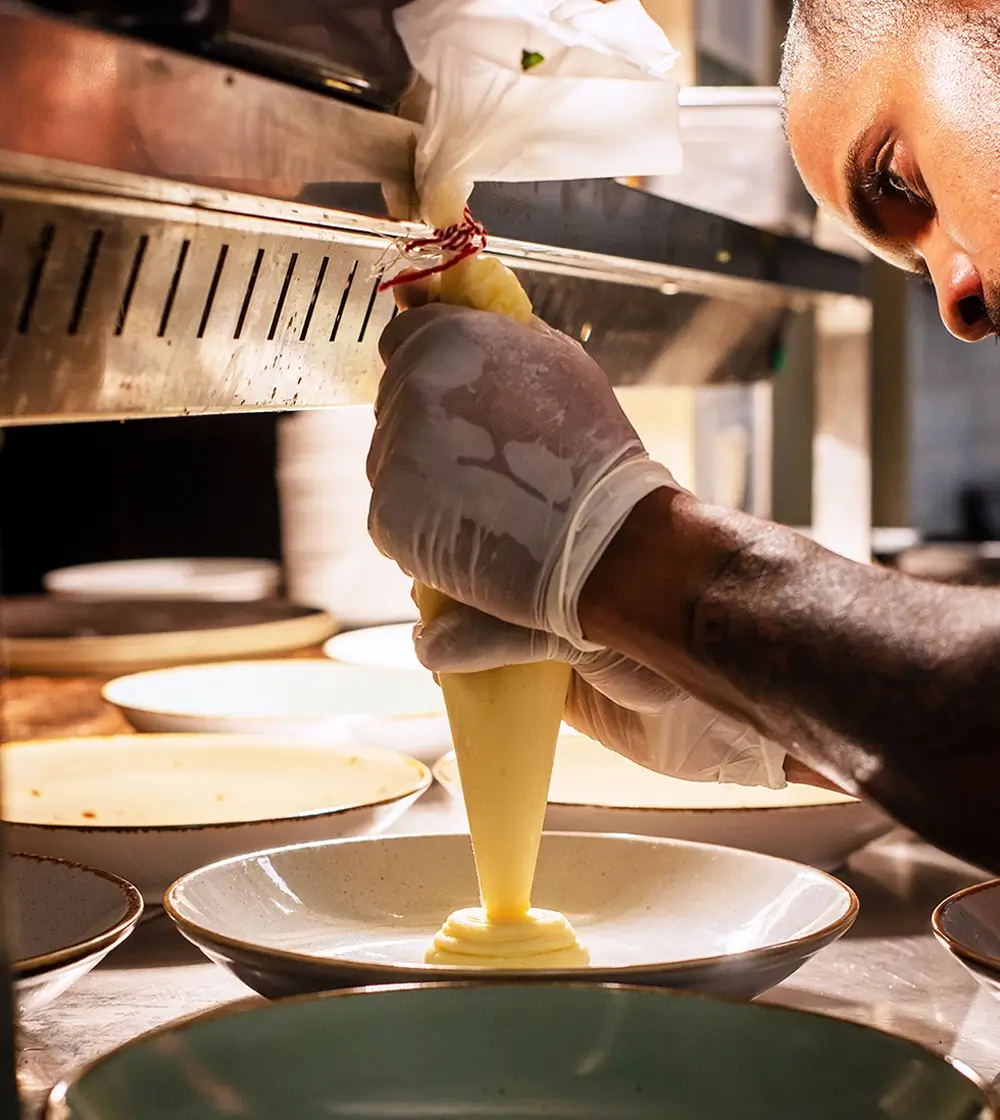
The video section features a thumbnail of a dish being garnished, with a prominent play button overlaid. This section provides an opportunity to introduce visitors to your restaurant, show behind-the-scenes content, or highlight the quality of your dishes.
- Design: The layout here is simple, with the video occupying the full width of the page. The vibrant colours in the thumbnail make it eye-catching, while the play button is clear and inviting for visitors to click and watch.
10 tips to customise your video section
- Replace the video with a clip that’s more specific to your industry.
- Add captions to ensure accessibility for all viewers.
- Use a custom thumbnail to reflect the video content.
- Add a CTA at the end of the video to guide viewers to take action.
- Incorporate animations for the play button to grab attention.
- Add background music to make the video more engaging.
- Display testimonials in the video to add credibility.
- Include a short introduction text above the video to set the context.
- Use video highlights for multiple short clips instead of a long video.
- Link to a related service page after the video for further engagement.
Menu section – show them what you’ve got
The menu section is designed to provide a visual representation of your offerings. It uses a clean layout with dish names, prices, and small images. This section is versatile, making it ideal for a restaurant menu but also adaptable for other types of products or services.
- Design: The design relies on a grid format, which keeps everything organised and easy to read. The use of images alongside each item helps to give customers a clear idea of what to expect.
10 tips to customise your menu section
- Replace food items with services or products.
- Add block patterns for a pricing table for consulting or fitness packages.
- Add descriptions below each item for more context.
- Include dietary icons if you use this for a food menu.
- Use an animated carousel for a dynamic menu.
- Change the layout to a card or list style.
- Incorporate testimonials next to each dish.
- Use call to action examples such as “Order Now” or “Reserve.”
- Replace the default currency to suit your local audience.
- Add a “Specials” section with an animated number counter to show weekly offers.
Team section – introduce the people behind your brand
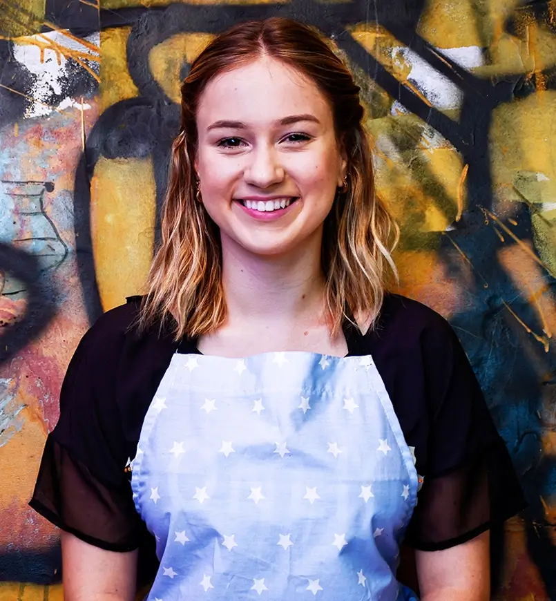
The team section showcases the chefs and staff working at the restaurant, under the headline “Look who’s in the kitchen”. This helps in humanising the brand and building trust with the audience.
- Images: High-quality images of the team members add a personal touch.
10 tips to customise your team section
- Add a short bio for each team member.
- Include social media links for staff to create a personal connection.
- Add animations to each image to make them more engaging.
- Incorporate a CTA like “Meet Our Team” to lead to a dedicated page.
- Change the layout to a grid style for better organisation.
- Add a “Fun Fact” for each member to make it more personable.
- Include testimonials about the team from customers.
- Use hover effects to display additional information.
- Link to a blog post where each team member shares their story.
- Add icons for specialties like baking or mixology to highlight expertise.
Gallery section – visual storytelling
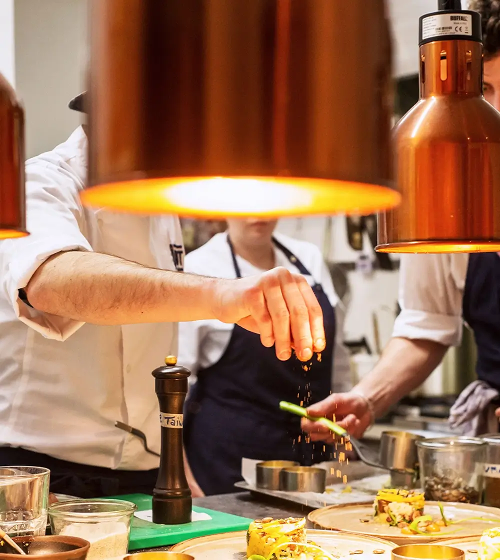
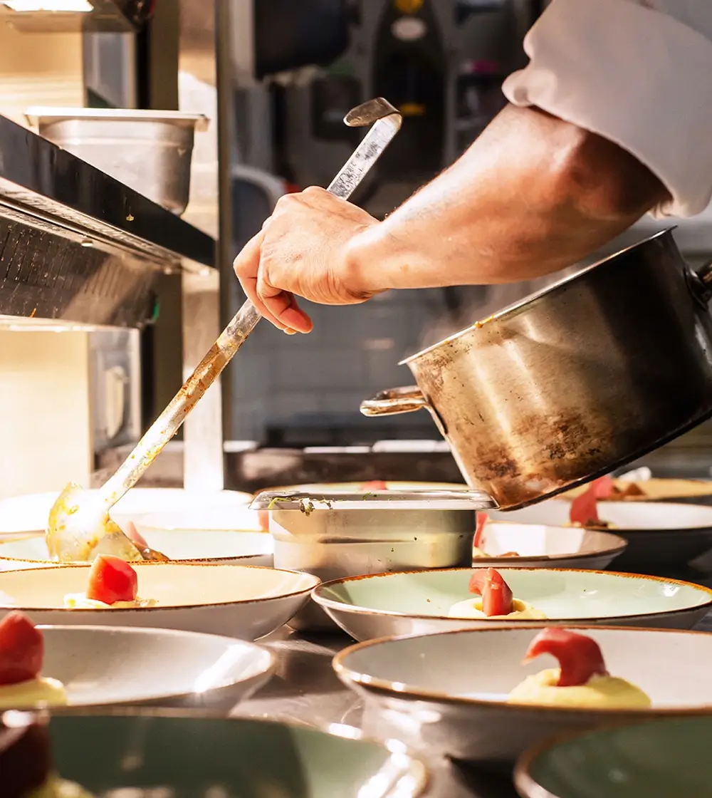
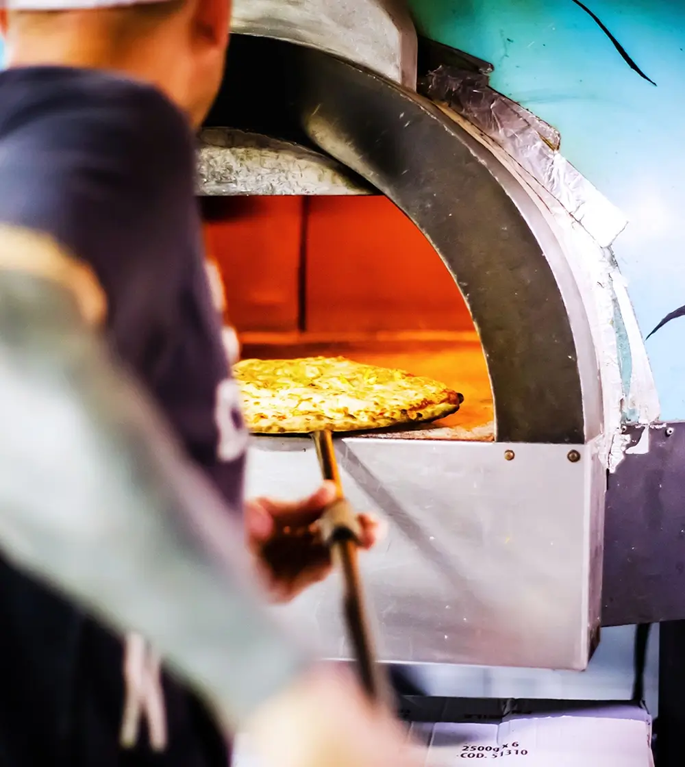
The gallery section features vibrant images of chefs preparing food, freshly plated dishes, and customers enjoying their experience. This section is meant to visually communicate the atmosphere and quality of your services.
- Design: The section includes large, high-quality images arranged in a grid or carousel, allowing users to easily browse through visuals.
10 tips to customise your gallery section
- Replace with images from your specific industry.
- Use a gallery block to include additional pictures.
- Add hover effects for more interactivity.
- Use sliders if you have a larger selection of photos.
- Incorporate client photos if you offer a personalised service.
- Include an animated number counter to display the number of satisfied customers.
- Create image categories for better organisation.
- Add lightbox functionality for larger image previews.
- Use a masonry layout for a unique visual.
- Embed a short video to introduce your services.
Testimonials section – build social proof
The testimonials section features customer reviews with quotes, profile pictures, and ratings. There are also platform logos like Booking.com and Tripadvisor, which add credibility.
- Design: The layout is simple, with each testimonial displayed in a separate box, giving enough white space to ensure readability.
10 tips to customise your testimonials section
- Add video testimonials for more impact.
- Include a rotating carousel for multiple testimonials.
- Use different font styles to emphasise key phrases.
- Incorporate customer photos for authenticity.
- Add icons to represent review platforms.
- Use block pattern text for a unique design.
- Include star ratings for quick visual indicators of quality.
- Add a CTA like “Read More Reviews” to lead to a dedicated review page.
- Highlight a customer success story for added depth.
- Use brand colours for quotes to match your site’s overall theme.
Newsletter sign-up section – stay connected with your audience
The newsletter sign-up section encourages visitors to “Stay up to date with our news”. It features three cards showcasing different updates, each with a relevant image.
- Design: The section includes vibrant imagery and CTAs like “Join the world’s most friendly community”. The buttons are coloured in contrast to the rest of the content, ensuring they stand out.
10 tips to customise your newsletter section
- Replace images to reflect your industry.
- Use a different headline that’s more specific to your business.
- Add social proof like “Join 500+ Subscribers”.
- Include a testimonial from a happy subscriber.
- Use an animated button to draw attention.
- Add a countdown timer for an upcoming newsletter feature.
- Incorporate social media icons to grow your following.
- Use hover effects to make the cards interactive.
- Change the layout to a two-column format.
- Add an email subscribe CTA to link to a special offer.
Different types of websites that can use a WordPress homepage
This WordPress homepage template can suit many industries, from food and restaurant websites to consulting websites. Here are some examples:
Learn more about specific templates like the food and restaurant homepage template.
Conclusion
Customising a WordPress homepage design template with MaxiBlocks allows you to create a truly unique website experience. Each section of this template provides a fantastic base, and with a few customisations, you can cater it specifically to your industry and audience.
Take a look at our homepage design templates to explore more about making your dream website a reality.
