How to customise your MaxiBlocks spa homepage template
If you want to create a luxurious and inviting online presence for your spa, this WordPress homepage design template by MaxiBlocks is a perfect choice. In this blog post, we’ll take you through each section of the template, detailing the content, images, icons, and design. We’ll also provide tips on how to make each section your own, customising it to suit your spa’s brand and atmosphere.
Header section: Hero image and headline
The header section sets the tone for your spa’s website. It features a hero image showing a person relaxing with a facial mask, holding a glass of juice. This image instantly conveys a sense of wellness, pampering, and relaxation. The headline reads “Wellness spa: your sanctuary for mind, body, and soul,” effectively positioning the spa as a place of retreat and rejuvenation. Below the headline, there is a brief introduction to the spa, followed by a call to action (CTA) button labelled “Book now.”
The layout here is simple, focusing on the powerful imagery and bold text to grab attention. The orange CTA button stands out against the soft, neutral colours used throughout the header, making it easy for users to take action.
Customisation tips for the header section:
- Replace the hero image with a high-quality picture of your own spa facilities.
- Update the headline to reflect your spa’s unique selling point, like “Unwind at [Spa Name]: Where luxury meets relaxation.”
- Personalise the CTA button text, such as “Schedule Your Spa Day” or “Reserve Your Treatment.”
- Include an animated number counter to display the number of satisfied customers or years in business.
- Add a subtle background animation, such as a video of your spa services.
- Customise the introductory text to reflect your spa’s ethos or highlight a popular service.
- Add social media icons for quick connections to your profiles.
- Use a different accent colour for the CTA button to align with your branding.
- Add a subtle scrolling animation to draw users’ attention to explore more.
- Include a “Scroll Down” arrow icon to guide visitors to continue navigating the page.
Services grid with images and icons
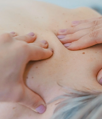
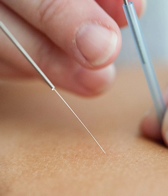
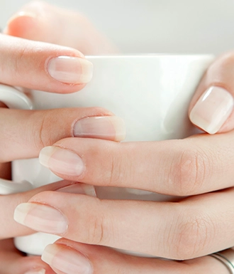
Next is the services grid, which showcases the range of treatments available, such as Massage, Acupuncture, Oil Therapy, Manicure, Facials, and more. Each service is represented with an icon and an accompanying image, creating a balanced visual experience. The icons are minimalist and consistent in style, using orange accents that help visitors quickly understand what is offered.
The grid layout is easy for users to navigate, allowing them to see everything offered at a glance. Each image provides a visual representation of the service, helping visitors quickly identify their area of interest.
Customisation tips for the services section:
- Replace icons with custom icons that better represent your services. You can browse the WordPress icon library for inspiration.
- Adjust the colour of the icons to match your spa’s branding.
- Add a brief description under each service to provide more context.
- Rearrange the order of services based on popularity or relevance.
- Link each service to a dedicated page with more details, including pricing.
- Replace the grid background with an image texture to make the section more dynamic.
- Add subtle hover animations to each service card to improve engagement.
- Incorporate testimonials below each service to add credibility.
- Include an animated element (e.g., fade-in) for when users scroll to this section.
- Update service titles to reflect any unique names you use for treatments.
Image and about section
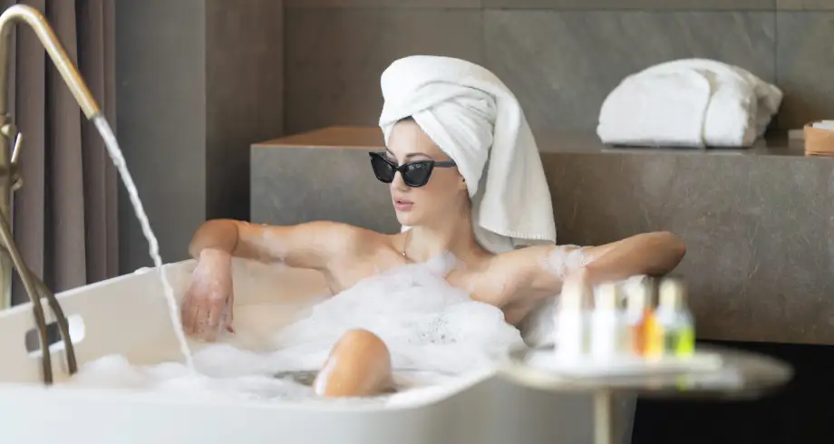
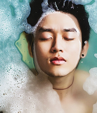
In the about section, there is an image of a person relaxing in a bathtub with spa products. Next to the image, the text “Since 1976” highlights the spa’s years of experience, establishing trust and expertise.
Below this, there is a box displaying working hours, providing visitors with practical information they need to plan their visit. The clean design makes this information easy to digest.
Customisation tips for the about section:
- Update the image to one of your spa facilities or a staff member offering a treatment.
- Modify the text to reflect your spa’s story—highlight your mission and values.
- Include a short quote from the founder to make the section more personal.
- Change the “Since 1976” text to reflect your actual founding year or a significant milestone.
- Add a secondary CTA below the working hours (e.g., “Contact Us for Appointments”).
- Experiment with a two-tone background to create a visual divide between the image and text.
- Highlight any special awards or recognition in this section.
- Use a carousel format to showcase multiple images, including your staff or spa products.
- Ensure the working hours are up-to-date and easy to edit if they change seasonally.
- Add an icon next to the working hours to make the information even more scannable.
Highlighted services section
This section showcases various treatments like massages, facials, and body treatments. High-quality images accompany each treatment to visually convey the benefits and enhance user engagement. The descriptions beneath each image provide a brief overview, while the icons subtly suggest that more information is available upon clicking.
Customisation tips for the highlighted services section:
- Use images of your specific treatments to add authenticity.
- Update service descriptions to include key benefits and unique features.
- Add a “Book Now” button under each service for quick conversions.
- Include ratings or customer reviews below each treatment.
- Use video thumbnails for some treatments to make the section more interactive.
- Rearrange the order of services based on your current promotions.
- Add a background gradient or texture to make the service cards pop.
- Use GIFs instead of static images to demonstrate aspects of the treatments.
- Customise the icon style to match your brand identity.
- Include limited-time offers to create urgency and drive bookings.
Membership and offers section
The membership section offers information on a VIP membership that emphasises exclusive spa benefits. Additionally, there are current offers like discounts for resort stays. The layout uses images with short descriptions, making it visually engaging and easy to understand.
Customisation tips for the membership and offers section:
- Update the offers regularly to keep the content fresh and relevant.
- Use dynamic content blocks to automatically display active promotions.
- Replace generic imagery with photos that represent the specific offers.
- Add a CTA button under each offer to make it easy for users to take action.
- Highlight membership benefits in bullet points for easier reading.
- Use contrasting colours for discounts to ensure they stand out.
- Include a testimonial from a VIP member to add credibility.
- Add an FAQ accordion to answer common questions about membership.
- Incorporate countdown timers for time-sensitive offers.
- Link the membership to a dedicated page with more details on benefits and pricing.
Team section
This team section highlights the spa’s team members, showing images of staff members with their names and titles. The grid layout gives a clean, professional look while adding a human touch to the page, which builds trust.
Customisation tips for the team section:
- Update the images with your actual staff to personalise your site.
- Include a short bio for each team member to showcase their expertise.
- Use a logo pattern to add certification logos next to each team member.
- Add a CTA, such as “Book a Session with [Team Member Name]”.
- Use block pattern text to highlight special skills or achievements.
- Include social media links for team members who are active online.
- Add testimonials from clients who have had positive experiences with individual staff.
- Integrate a link to an About Us page for visitors to learn more.
- Highlight awards or recognitions received by your team.
- Link the team section to detailed profiles on your website.
Testimonials section
This section features a TripAdvisor logo along with a customer testimonial to build credibility. The accompanying image of the customer adds a personal and relatable touch. The testimonial is designed to create a positive impression and provide social proof.
Customisation tips for the testimonials section:
- Use a rotating carousel to display multiple testimonials.
- Include customer photos for all testimonials to add authenticity.
- Use testimonials that mention specific services offered.
- Add a star rating graphic to each testimonial.
- Feature video testimonials to enhance trust.
- Incorporate quotes from well-known clients if applicable.
- Add a “Write a Review” CTA button to encourage feedback.
- Use different background colours to highlight each testimonial.
- Link testimonials to a case study page for more detailed stories.
- Include quotes from social media platforms for diversity.
Footer section
The footer includes contact information, navigation links, and social media icons, presented clearly and concisely. The social media icons are styled to match the overall design theme, and there’s also an encouragement to “Say hello,” prompting visitors to get in touch.
Customisation tips for the footer section:
- Ensure all contact details are up-to-date and prominently displayed.
- Link to important pages like FAQs, privacy policies, and terms of service.
- Customise the social media icons to match your brand colours.
- Add a small map to show your spa’s location.
- Include a subscription form for a newsletter to keep clients updated.
- Use icons to highlight each contact method (e.g., phone, email).
- Add a short tagline to reinforce your brand message.
- Feature a secondary CTA button, such as “Subscribe for Offers.”
- Include award badges or affiliations for added credibility.
- Make use of the footer space for any promotions or events you’d like to highlight.
Different types of websites that can use a WordPress homepage
The versatility of this homepage design makes it ideal for various types of websites beyond spas. Here are some options for different industries:
- Health websites: Perfect for showcasing services, health programmes, and patient testimonials.
- Diet homepage template: Highlight different diet plans and client success stories.
- Agency homepage template: Use this layout to introduce your agency, key services, and past projects.
- Business homepage template: Tailor it to introduce your products, services, and corporate team.
- Non-profit homepage template: Use the testimonial section to showcase impact stories.
- Travel homepage template: Show holiday packages, customer reviews, and booking CTAs.
- Home services homepage template: Highlight your services, customer reviews, and booking options.
- Photography homepage template: Highlight your portfolio and the different photography services you offer.
- Consulting homepage template: Use testimonials, services, and team sections to introduce your consulting expertise.
- Law firm homepage template: Include testimonials, a WordPress contact form, and a service breakdown to make navigation easy.
Explore more homepage design templates tailored to different industries to find the perfect fit for your business.
Final thoughts
This MaxiBlocks WordPress homepage template is incredibly customisable and offers everything you need to create a professional, inviting, and engaging website for your spa or wellness business. The clean layout, beautiful imagery, and thoughtful use of icons make it easy to navigate, while the detailed customisation tips provided here will help you make the most of each section. Explore more WordPress websites and tools like WordPress website builders to start building today.
