BG-Image-maxiblocks-1726746624-578207009

Website template: Home Page HEP-PRO-05


We are
a design studio
in Cape Town
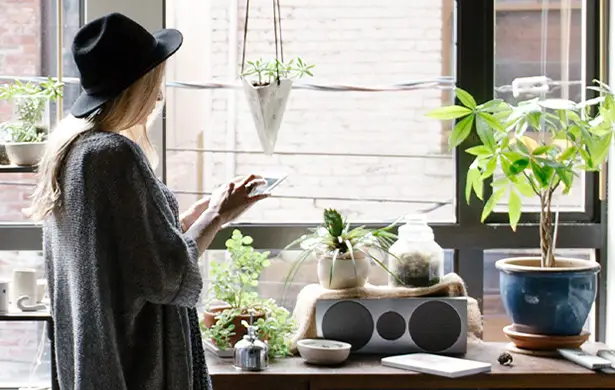
hep-pro-05-1-1710268369-1592420806

With an unwavering passion for design and an innate ability to bring ideas to life, our hero stands at the forefront of innovation and aesthetics. 

hep-pro-05-2-1710268371-2091996708
hep-pro-05-3-1710268372-124779035
hep-pro-05-4-1710268373-205126098

Meet out team

A new way to understand your customers better

Understand what works, try more of it and stop wasting time on the rest of it

Satisfied customers

Get the tools you need for a perfect website

Return on investment

The best way to achieve perfection

Awards

Don’t chase the money, chase your dreams

Uptime

Come explore the world of live pictures

Connect with customers and fans in a whole new way

Connect with people who share your interests
hep-pro-05-5-1710268374-1188645938

The best place to be in your business

hep-pro-05-6-1710268377-1433559637

Make life great

hep-pro-05-7-1710268379-1654404153

To have fun

hep-pro-05-8-1710268381-1498005948

Have a good time

hep-pro-05-9-1710268382-656578563

How we think

Choose your plan

Our plans for your strategies

hep-pro-05-10-1710268384-1068103960

$6

Essential

Vestibulum felis quis tortor ut sollicitudin leo

hep-pro-05-11-1710268386-637196630

$7

Standard

Vestibulum felis quis tortor ut sollicitudin leo

hep-pro-05-12-1710268390-2123977099

$8

Business

Vestibulum felis quis tortor ut sollicitudin leo

Connect with people all over the world

105 Road Name, Lisboa, Portugal
1002345

Build like a pro

How to build a killer home page with MaxiBlocks

Alright, let’s be real—you want a home page that hooks people in, keeps ’em around, and gets them to do what you want. Whether that’s buying something, signing up, or just staying long enough to get to know what you’re all about. MaxiBlocks can help you put together a home page that isn’t just another cookie-cutter site. Here’s how you can pull off a home page that pops, using MaxiBlocks and a bit of imagination.

1. Header and navigation menu

  • Component: WordPress navigation menus
  • Description: It’s all about first impressions. Your header is the fancy bit at the top that keeps your brand front and centre. We’re talking a sticky header with a logo on the left, menu on the right, and maybe a cheeky call-to-action button if you’re feeling extra. Keeps things neat, easy to click on, and straightforward for anyone on their phone or laptop.
  • Design tip: Keep the navigation simple—no more than five or six menu items. Too many choices can overwhelm visitors.

2. Hero section

  • Component: Website hero
  • Description: Get their attention straight away. A hero section that screams who you are, what you do, and why they should stick around. Throw in a huge image, a punchy headline, and a button. Make it simple but make it count—you want people curious enough to scroll down.
  • Design tip: Use a high-quality image that represents your brand and avoid clutter—make sure your headline is clear and easy to read.

3. Headline section

  • Component: Headline
  • Description: Alright, time to show off. This is the bit where you hit them with your big idea—that one-liner that explains why your product or service is a big deal. Keep it clear, keep it bold, and make sure they get it at first glance.
  • Design tip: Keep your headline short and impactful—aim for no more than 10 words to grab attention immediately.

4. Animated number counter

  • Component: Animated number counter
  • Description: People love numbers, especially the kind that show off how great you are. Got loads of happy customers? Years of experience? Projects under your belt? Let the numbers roll in with an animated counter. It’s visual proof that you’re the real deal.
  • Design tip: Limit the number of counters to three or four—too many can overwhelm and lose impact.

5. Icon features section

  • Component: Website icons / WordPress icons
  • Description: Break it down for your visitors—why are you awesome? Use icons to show off the best bits about what you do. People love to skim, and a few icons with short explanations make it easy to grab the highlights.
  • Design tip: Choose icons that are simple and visually consistent—make sure they match the style of your site.

6. Content section

  • Component: Content pattern
  • Description: Get into the details. This section is where you give visitors the meat of what you’re offering. Use MaxiBlocks to create a content section that’s easy to read—some text, some images, a nice mix so no one gets bored.
  • Design tip: Break up long paragraphs with headings, bullet points, and images to keep the content engaging and easy to scan.

7. Call to action

  • Component: Call to action examples
  • Description: You’ve got their attention—now tell them what to do. Whether it’s signing up, buying something, or just getting in touch, make the button big, bold, and inviting. Keep the text on it short but compelling: ‘Get Started,’ ‘Join Us,’ ‘Learn More.’ You get the idea.
  • Design tip: Use contrasting colours for your CTA buttons to make them stand out from the rest of the page.

8. Testimonials

  • Component: Testimonials design
  • Description: Let your happy customers do the talking. A few good testimonials with real names, faces, and what they love about your business can go a long way. It’s like a nudge saying, ‘See? These folks like us, maybe you will too.’
  • Design tip: Use photos of real people—faces create a personal connection and build trust with your audience.

9. Logo showcase

  • Component: Logo pattern
  • Description: Got some recognisable clients or have you been featured in some cool places? Show it off here. Add the logos to build a bit of trust. If they see brands they recognise, they’re more likely to take you seriously.
  • Design tip: Stick to a consistent colour scheme for the logos—either all in colour or all in greyscale for a cleaner look.

10. Pricing table

  • Component: Pricing table
  • Description: People want to know how much it costs, so be upfront about it. Show off your pricing options with a nice, clean table. Highlight the best value package, and make sure the call-to-action buttons are obvious.
  • Design tip: Highlight your most popular pricing plan by making it slightly larger or adding a ‘Recommended’ label.

11. Team section

  • Component: Website team
  • Description: People like to know who they’re dealing with, so give them a peek behind the curtain. Show off your team members with photos, their names, and what they do. It makes your business look more human, less corporate.
  • Design tip: Use candid photos of your team rather than stiff headshots—it makes your team seem more approachable and real.

12. Blog preview

  • Component: WordPress blog
  • Description: If you’ve got a blog (and you probably should), use this section to show off your latest posts. It’s a good way to keep things fresh and let people know what you’re up to or what’s on your mind.
  • Design tip: Include featured images for each post to make the blog section visually appealing and help draw readers in.

13. Email subscription

  • Component: Email subscribe
  • Description: Get those email addresses! Stick a form somewhere on the home page and offer something in return—like a free guide or a discount. Build that mailing list so you can keep in touch with folks who’ve shown some interest.
  • Design tip: Keep the form simple—just ask for an email address and maybe a first name. The fewer fields, the better.

14. Contact form

  • Component: WordPress contact form
  • Description: Make it easy for people to reach out. A simple form with fields for name, email, and message should do the trick. Don’t make them jump through hoops.
  • Design tip: Place the contact form in a prominent spot, like the footer or a dedicated contact section, so visitors don’t have to hunt for it.

15. Accordion FAQ

  • Component: WordPress accordion
  • Description: Got questions that keep popping up? Put ’em in an accordion FAQ section. It keeps the page tidy but lets curious visitors find the answers without too much scrolling.
  • Design tip: Keep the questions short and use a conversational tone—make it easy for people to find what they need.

16. WooCommerce products

  • Component: WooCommerce
  • Description: If you’re selling something, show off a few featured products here. Nice images, prices, and a button that makes it easy to buy—it’s all about making things as simple as possible.
  • Design tip: Use high-quality product images with clean backgrounds to make your products stand out.

17. Image gallery

  • Component: Website images
  • Description: Pictures or it didn’t happen. Add an image gallery with high-quality pictures of your product, your work, or your team in action. People love to see what they’re getting, so don’t skimp on the visuals.
  • Design tip: Use a lightbox feature so visitors can click on images to view them in a larger format without leaving the page.

18. Footer

  • Component: Website footer
  • Description: Wrap things up with a solid footer. Include important links, contact info, and social media buttons. Don’t forget a quick sign-up form if you want to grab some last-minute email addresses.
  • Design tip: Keep the footer consistent across all pages—use it as a navigation safety net for visitors who scroll to the bottom.

19. 404 error page (optional)

  • Component: 404 page
  • Description: Mistakes happen. A good 404 page can help people find their way back instead of leaving them frustrated. Keep it light, maybe even funny, and add a link back to the home page.
  • Design tip: Include a search bar or popular links to help visitors find what they’re looking for quickly.

20. Blog hero section (for blog page)

  • Component: Block patterns blog hero
  • Description: If you’ve got a separate blog page, start it off with a hero section to highlight some of your best content. It’s all about drawing people in and keeping them reading.
  • Design tip: Use a strong, eye-catching image and a headline that teases the content—make people want to keep scrolling.

Final thoughts

Building a solid home page is about making people feel something—trust, curiosity, excitement. Keep things simple, make the buttons obvious, and use MaxiBlocks to help pull it all together without overcomplicating it.

You may also like