Creating a professional flooring website with MaxiBlocks: Customising the WordPress home page template
This MaxiBlocks WordPress home page design template presents a clean, structured, and modern aesthetic that is ideal for a flooring business or any home improvement company looking to create an engaging and professional online presence. Let’s walk through the design and its key elements in more detail.
Hero section: Bold and impactful
The hero section at the top of the page immediately draws the visitor’s attention with a large, high-resolution image of a beautiful, modern floor in a bright and spacious room. The minimalistic design makes excellent use of white space, allowing the image to speak for itself. Overlaid on this image is a strong, bold headline “Upgrade your floors, upgrade your life” written in a clean sans-serif font, emphasising both style and substance.
- Visual Design: The image takes up the full width of the page, creating a sense of openness and luxury.
- Typography: Large, bold typography for the headline contrasts well with a smaller subheading that encourages visitors to explore more.
- Call to Action (CTA): A prominent “Play Video” button sits front and centre, urging users to engage visually with the brand.
Section 2: Product showcases with hover effects
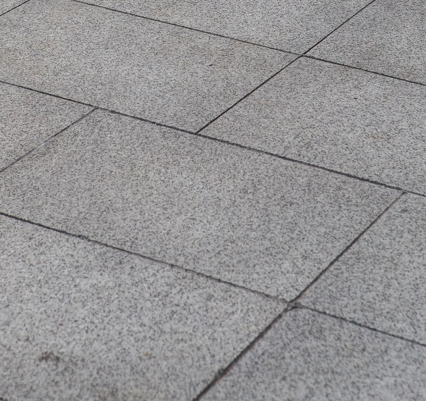
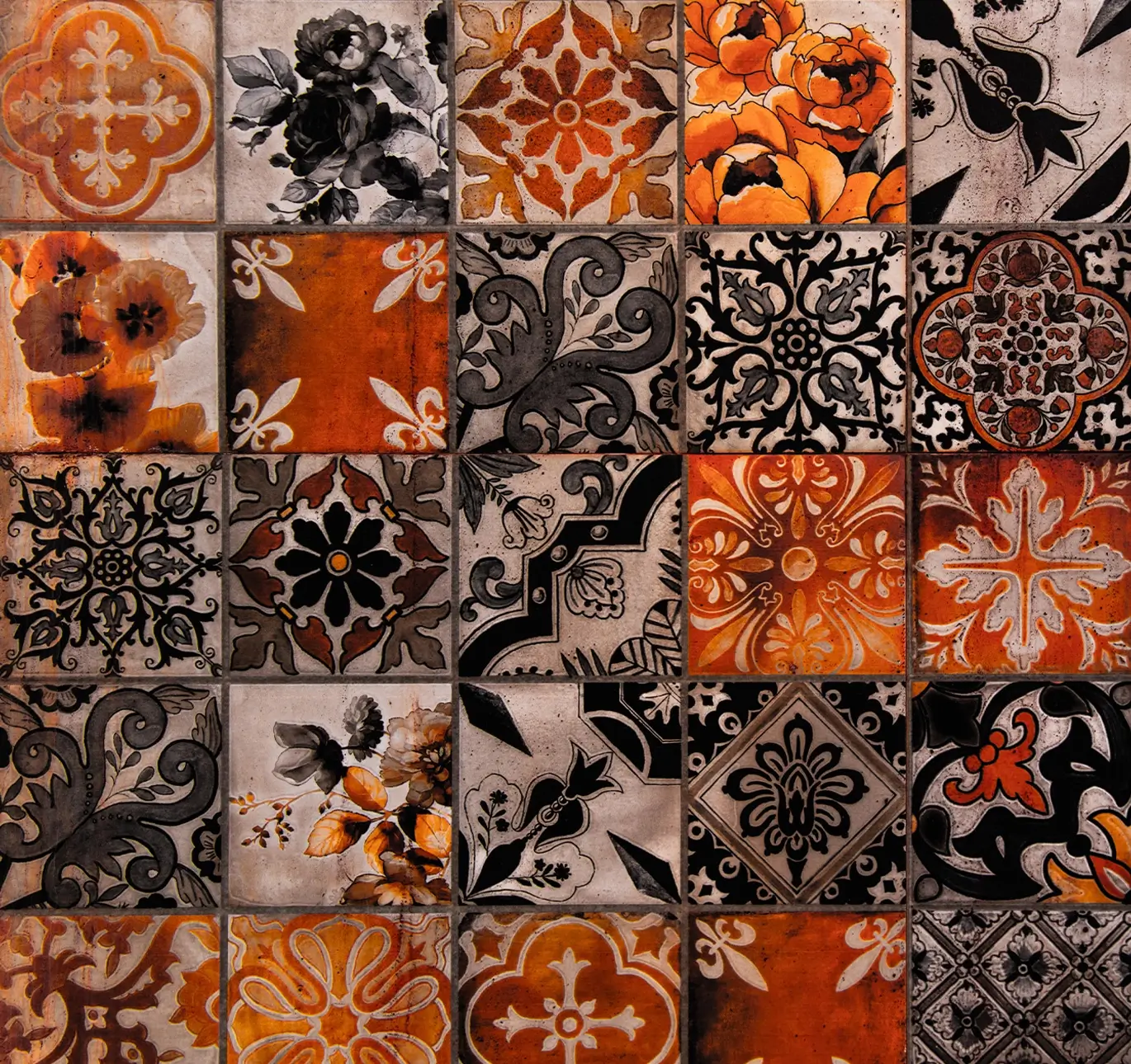
Below the hero section is a dynamic grid featuring different flooring materials like carpet, hardwood, vinyl, and tile. Each product has a square image block with a subtle hover effect that reveals more details about the product when the user moves their cursor over it.
- Visual Design: The grid is organised into equal-sized blocks, making it easy to explore different flooring options.
- Hover Interaction: The hover effect is smooth and modern, enhancing user experience by showing plus signs that indicate further interaction.
- Product Highlights: Each image is high quality, and the user can easily browse through the different options.
Flooring options section: Engaging user-friendly design
This section features a variety of flooring services such as installation, tile work, and custom rugs. The images used here vary in size, creating a mosaic-like grid that feels dynamic and engaging. Each service is presented with an image and a short description, making it easy for visitors to understand the services offered.
- Image layout: Large, striking images make the flooring types visually appealing and relatable.
- Typography: Simple, clean fonts are used for service titles, allowing the images and services to take centre stage.
- Icons: Small, relevant icons accompany the service descriptions, adding a visual cue for each type of service offered.
Call-to-Action Section: Encouraging interaction
The CTA section continues the clean, sleek design of the page with a solid black background that helps the white text and buttons stand out. The headline “Flooring that’s perfect for your home or business” is followed by several CTAs urging the user to schedule a consultation or explore project options. A subtle play icon is placed over the image to guide visitors towards watching a promotional video.
- Colour contrast: The use of contrasting black and white colours helps make the text and buttons pop, making this section visually distinct from the rest of the page.
- Minimalism: The minimal text and clean lines create a sense of professionalism and elegance.
Team Section: Building trust
A simple but effective section introduces the team of experts with headshots and short bios. This section adds a personal touch to the page, making the company feel approachable and trustworthy.
- Team profiles: Each team member’s profile is displayed in a clean, uniform grid with a circular profile picture and name.
- Typography: The section uses smaller text to keep the focus on the team members’ images, while the names are slightly bold for emphasis.
Footer section: informative and engaging
The footer of this MaxiBlocks WordPress template is designed to be compact, informative, and functional, offering a clear way for users to find important information and connect with the business. It plays an essential role in improving user navigation and providing quick access to key resources. Here’s a detailed breakdown of its features and how you can customise it.
Design and layout
The footer uses a sleek, modern design with a dark background that contrasts effectively with the rest of the page’s brighter content. White text is used to keep the information clear and easy to read, while small accent colours help certain elements stand out without overwhelming the design. This combination of simplicity and functionality makes it a strong closing section for the website.
The layout is divided into clear sections:
- Contact information: On the left side, there are quick links to your business location, contact numbers, and an email address. This ensures that potential clients can easily reach out to you for enquiries or consultations.
- Company and product links: The footer contains navigational links to important pages such as About, Services, and Products, helping visitors find what they’re looking for without having to scroll back to the top.
- Social media icons: To encourage interaction, icons for your social media platforms are neatly aligned at the bottom. These are clickable, allowing users to quickly visit your social profiles.
- Statistics: In the centre, some eye-catching business stats (like number of projects, satisfied clients, etc.) highlight your success, giving the footer an added layer of credibility.
- Copyright notice: At the very bottom, a simple copyright line ensures your website stays professional and up-to-date legally.
10 tips for customising the footer
- Update the contact information: Make sure the phone number, email address, and location reflect your business accurately. Add a clickable phone number for mobile users.
Website footer pattern
- Add custom social media icons: Replace default icons with ones that match your brand style or colours, and add links to all your active social media platforms.
WordPress icons pattern
- Use a custom background: Instead of a plain black background, consider using a subtle texture or a gradient to make the footer more visually interesting.
- Showcase key services or products: If you have popular services or product categories, feature them in the footer as quick links for easy access.
Content pattern
- Include a newsletter signup: If you’re looking to build a mailing list, add a simple signup form in the footer to capture user emails without taking up much space.
Email subscribe pattern
- Integrate a map: For businesses with a physical location, embedding a small Google Map can make it easier for visitors to find you.
- Customise the typography: Change the fonts used in the footer to reflect your brand’s style, ensuring they are consistent with the rest of the website.
- Highlight a special offer: Use one section of the footer to promote a current discount, sale, or special service you are offering.
Call-to-action examples
- Add icons to key links: Use small icons next to the important links (like services, about, and products) to make them more visually appealing and easy to navigate.
WordPress icons
- Include legal links: Add links to your privacy policy, terms of service, and other legal documents to make sure your site is compliant and transparent.
Customisation ideas
- Business statistics: The stats in the centre of the footer (such as number of projects, clients, or awards) can be customised to reflect the achievements of your business. You can even add a small icon next to each stat to make them stand out more.
- Social media integration: Change the colours or hover effects of your social media icons to match your overall website theme, making them more visually integrated into the design.
- Custom logo: Replace the default logo in the footer with your own. You can also experiment with placement or size to make it fit better with your brand style.
The footer design helps wrap up the website’s content in a concise yet functional way. By using the footer effectively, you can ensure that your visitors are guided to important resources, contact options, and legal information as they conclude their journey on your site.
10 Customisation Ideas for Each Section:
1. Hero Section:
- Replace the default background image with a photo of your showroom or a signature flooring project.
- Personalise the headline to reflect your unique selling proposition.
- Add a secondary CTA button to Explore Products or Get a Quote.
- Use a different button style to align with your brand colours.
- Add an overlay to the image for better readability of text.
- Incorporate subtle animations like a slow zoom-in effect for the image.
- Change the CTA button to an eye-catching contrasting colour.
- Include a short tagline or client review underneath the main heading.
- Modify the video button shape to reflect your branding (e.g., rounded vs. square).
- Add a scroll indicator to guide users down the page.
2. Product Showcases:
- Update the images with your custom flooring products.
- Add captions to explain the benefits of each type of flooring.
- Include a hover effect that reveals pricing or more details.
- Incorporate a filter option for users to sort by product type.
- Add customer reviews or star ratings under each product image.
- Use a lightbox feature so images expand when clicked.
- Add an interactive 360° view of your products.
- Customise the icon on hover to align with your branding.
- Create a downloadable PDF brochure for each product.
- Integrate clickable product tags to provide more information.
3. Service Offerings:
- Update the service icons to better represent your offerings.
- Add a Learn More button for each service.
- Customise the background to use your brand colours.
- Replace the default images with photos of your team at work.
- Include short video snippets to explain each service.
- Add pricing or package information below each service.
- Include a testimonial relevant to each service type.
- Highlight eco-friendly or sustainable flooring options.
- Feature a countdown timer for limited-time offers.
- Add hover effects that show service details.
4. Call to Action:
- Change the CTA wording to reflect your key business goals.
- Update the background image with a customer success story.
- Add a second CTA, such as Request a Callback or Download Catalogue.
- Experiment with different fonts and colours for contrast.
- Link the button to a form where users can request a quote.
- Include a chatbot button for live customer support.
- Add social proof such as “Over 500 satisfied customers”.
- Use dynamic text to reflect ongoing promotions.
- Incorporate countdown timers for flash sales.
- Add a scrolling carousel of testimonials or customer photos.
Different types of websites that can use this template:
While designed for flooring companies, this WordPress home page template can be adapted for a wide variety of industries, including:
- Interior Designers:
Showcase your flooring options, design solutions, and client testimonials to build trust and highlight your expertise. Use high-quality images of past projects to enhance your portfolio.
- Construction Companies:
Present various material options and include project galleries to showcase completed works. Use testimonials to demonstrate your reliability and craftsmanship.
- Home Improvement Businesses:
Highlight your home renovation services, whether it’s kitchen makeovers, bathroom redesigns, or flooring installations. Use a service grid to feature your most popular offerings.
- Real Estate Firms:
Feature available properties with high-quality images, include virtual tours to give potential buyers a real feel for the properties, and add CTAs like “Book a Viewing” or “Contact Us” to drive engagement.
For more ideas on how to use and customise this template, visit MaxiBlocks’ WordPress website templates page.
