How to customise the MaxiBlocks WordPress gym homepage template
The MaxiBlocks gym homepage template is your ultimate toolkit for creating a powerful first impression. It’s designed with energy, motivation, and ease of navigation in mind, making it perfect for gym owners, fitness coaches, or anyone in the health and wellness industry. Let’s take a closer look at each section of this template, so you can bring your unique style and brand to life.
Hero section: inspire your visitors from the start
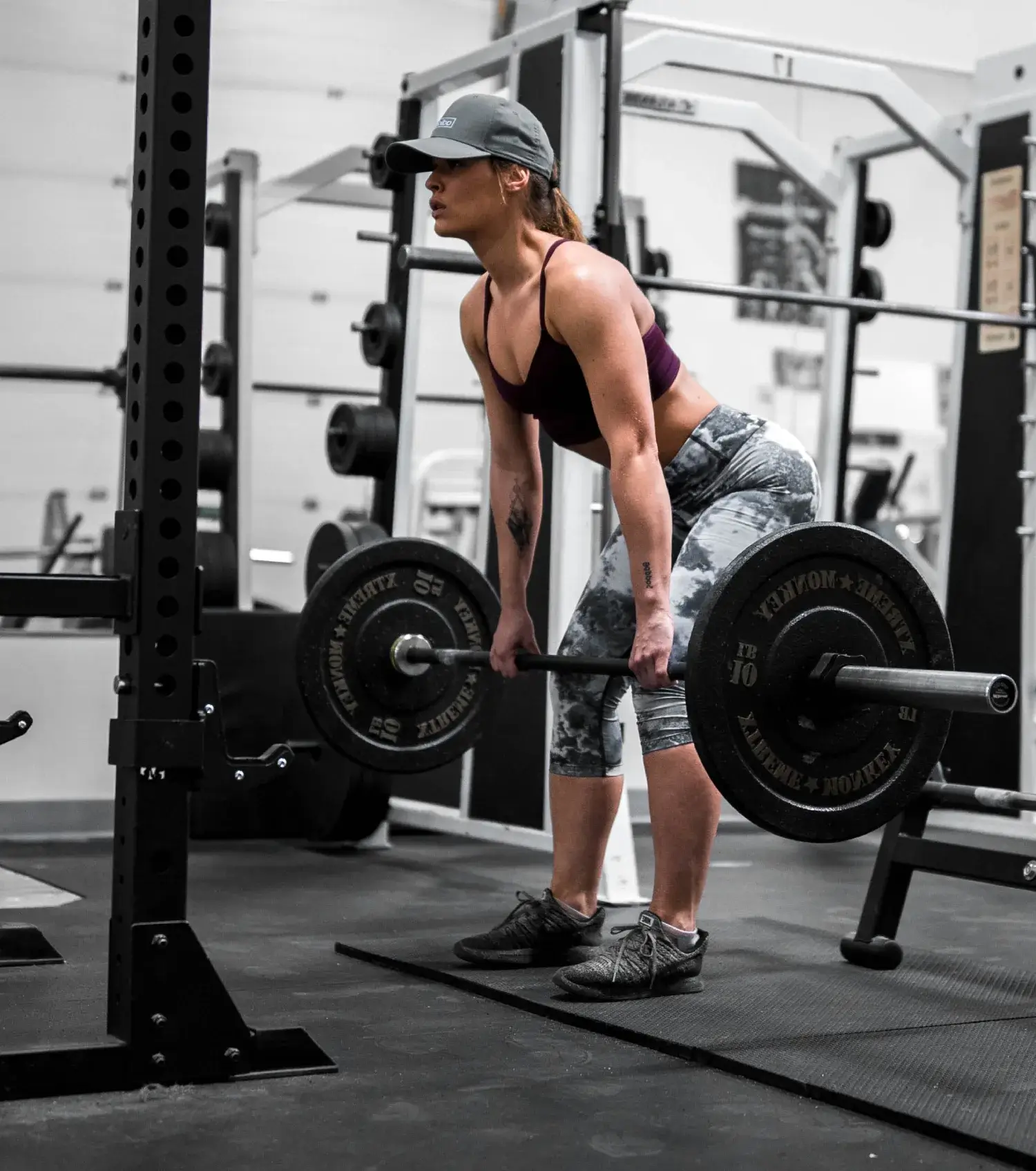
The hero section of this template features a large, bold headline, “Hustle to gain more muscle,” paired with an action-oriented “Sign up” button and an inspiring image of a woman lifting weights. The backdrop of this section is minimal, allowing the message to stand out clearly.
- Images: The hero image showcases strength and dedication. You can easily replace this with an image that resonates more with your brand—whether it’s a photo of your facility, a motivational scene, or a personal trainer in action.
- CTA Button: The button here is designed to capture immediate attention with its bold colour and strong label. This is where you encourage users to take their first step with you.
Customisation tips for the hero section:
- Update the headline to reflect your gym’s unique personality or goals, e.g., “Transform your health, one rep at a time.”
- Swap the hero image for a local touch—use a photo of your community or your star trainer.
- Adjust the CTA button to suit your tone. Change “Sign up” to “Get your free trial” or “Start your journey”.
- Add a secondary CTA for an alternate action, like a tour of the gym.
- Play around with background overlays. A subtle colour gradient might add depth.
- Experiment with animation effects—make the text appear dynamically.
- Update the font to reflect your gym’s branding style—bold and chunky, or sleek and modern.
- Use high-contrast colours for accessibility and to ensure readability.
- Change the subheading text to include an offer—e.g., “First month free when you sign up today!”
- Make sure the buttons are mobile-friendly by adjusting their size for smaller screens.
For more patterns to make your homepage stand out, check out the Maxi Blocks pattern templates.
Facilities section: showcase what makes you special
The facilities section comes next, providing a detailed look at what your gym offers. Each facility is represented with an easy-to-understand icon and a brief description—such as the gym floor, swimming, kids’ area, and snack bar.
- Icons: Bright and friendly, the icons make navigation easy. You can update these to better represent your services using the WordPress icon library.
- Layout: The grid layout makes each offering distinct and easy to digest.
Customisation tips for the facilities section:
- Replace icons with your own custom designs if you have a specific brand style.
- Update the descriptions to reflect unique features of your facilities, e.g., “Olympic-size pool with aqua aerobics classes.”
- Add a new facility if needed—like a juice bar or yoga studio.
- Use custom illustrations to stand out from stock icons.
- Consider making the icons interactive—changing colour when hovered over.
- Update the layout to create a more dynamic, non-traditional grid.
- Change the colour of the icons to match your brand colours.
- Add imagery behind the icons for more depth—for example, a subtle photo of the facility.
- Consider highlighting the most popular facilities by adding a small label like “Most Popular.”
- Use the WordPress block theme tutorial for guidance on making advanced changes.
Testimonial and achievement section: add trust and personality
Next is the testimonial section, featuring images of gym members sharing their experiences. There is also an achievement stat that boasts about the gym’s “67 years of experience”, adding credibility.
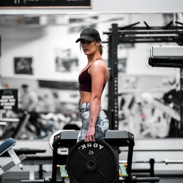
- Images: These circular images create visual interest and break up the more angular designs from earlier sections.
- Content: Real customer testimonials are a powerful way to connect with visitors.
Customisation tips for the testimonial section:
- Use photos of actual gym members to give a genuine feel.
- Include videos instead of photos to make testimonials more engaging.
- Add a quote directly below the headline for an emotional hook.
- Make the testimonials clickable, leading to a detailed success story page.
- Feature multiple statistics—like the number of satisfied members or average class ratings.
- Replace images with icons for a stylised, illustrative approach.
- Add social proof, e.g., display ratings from Google or Trustpilot.
- Create a slideshow to feature multiple testimonials in limited space.
- Add a “Join the success” button below the testimonials.
- Update the background to add texture—a light image or coloured gradient.
Fitness classes section: invite them to take action
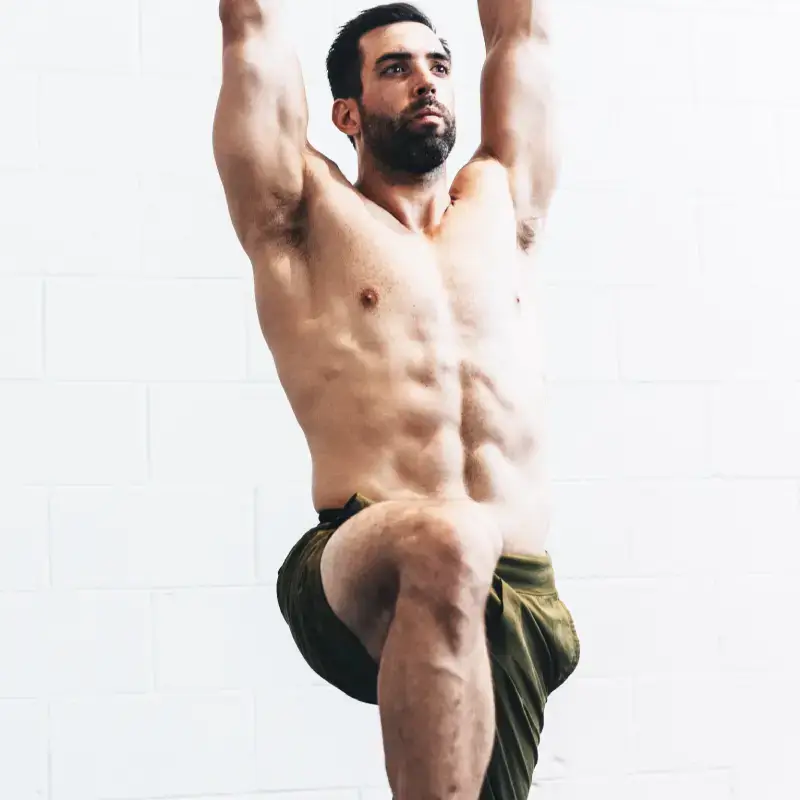
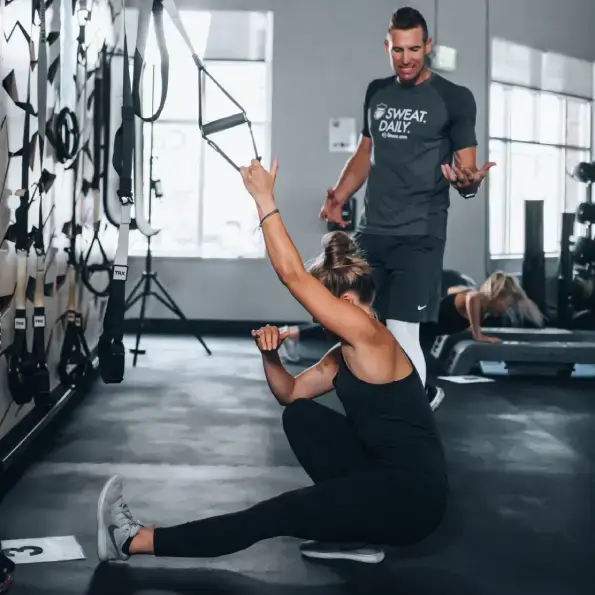
This section showcases various fitness classes with enticing images and brief descriptions—like Bootcamp, Boxing, and Body Burn. Each class includes a bold “+” sign, adding a feeling of abundance and energy.
Customisation tips for the fitness classes section:
- Update images to show your instructors in action.
- Change descriptions to highlight the benefits—e.g., “Body Burn: Sculpt and shape your physique in just 45 minutes”.
- Add links to class booking pages directly from this section.
- Use a vibrant hover effect to keep users engaged.
- Replace the “+” icon with one that represents your gym’s brand style.
- Include the class timings for easy access.
- Add a “Read more” button under each description for details.
- Introduce icons for each class for added visual clarity.
- Make classes filterable by type—like strength, cardio, or flexibility.
- Update the text to include testimonials from each class, adding trust.
Membership pricing section: make it easy to choose
The membership pricing section features three distinct cards for Basic, Pro, and Premium plans. Each card contains details and a clear CTA button.
Customisation tips for the pricing section:
- Rename the plans to reflect your brand—like “Starter”, “Athlete”, and “Champion”.
- Change the pricing colours to differentiate between plans more clearly.
- Add icons to highlight what’s included with each plan.
- Use subtle animation to draw attention to your most popular plan.
- Include an “Unlimited Access” label for the highest-tier plan.
- Add a “Save x% when billed annually” tag for promotions.
- Update the CTA button to reflect action-specific goals—e.g., “Try Pro Plan for Free”.
- Add a benefits comparison below the cards.
- Consider including social proof, like “Most chosen by our members”.
- Use different imagery backgrounds to visually distinguish plans.
Footer section: wrap it up cleanly
The footer includes navigation links, a contact button, and a large “Contact” call-to-action to ensure visitors can easily get in touch.
Customisation tips for the footer section:
- Add links to your social media profiles with icons.
- Include an email signup form for newsletters.
- Highlight opening hours to help visitors plan their visits.
- Customise the CTA to be more direct—e.g., “Get in touch for a free consultation”.
- Consider adding a live chat button.
- Add a sitemap for improved SEO.
- Use icons for contact information to save space.
- Include a map for location-based context.
- Customise the colours to contrast effectively with the page.
- Update the footer message—e.g., “Proudly powered by MaxiBlocks & WordPress.”
Who can use this template?
This WordPress homepage design is ideal for:
- Gyms and fitness centres: Perfect for showcasing classes, membership plans, and trainer profiles.
- Health coaches: Use it to feature client testimonials, available coaching packages, and personal stories.
- Yoga studios: Display different classes, teacher bios, and pricing in an attractive and easily navigable way.
- Wellness retreats: Showcase retreat packages, available activities, and testimonials to inspire confidence.
- Community fitness groups: Highlight different group classes, success stories, and community benefits.
This homepage template can be adapted for different purposes by updating images, class descriptions, and colour schemes. Whether you’re a WordPress website designer or a small business owner, this template is highly versatile and easy to adjust to your needs.
For more details about getting started, explore the WordPress templates and learn more about responsive WordPress design.
