Customising the MaxiBlocks tea shop homepage template
The tea shop homepage template, created by MaxiBlocks, is an ideal WordPress solution for businesses looking to showcase their offerings with a balance of beautiful visuals and straightforward navigation. This template includes various pre-built sections designed to help you engage your customers and convey your story effectively. Below, we’ll guide you section by section, explaining each component, how to use it, and ways to make it your own. Whether you’re running a tea shop, a boutique health store, or even a small café, this template is perfect for creating an inviting online space.
Header section: a welcoming start
The header is where first impressions are made. In this template, the header includes a MaxiBlocks logo, several navigation links, and a “Sign In” button, making navigation straightforward for your visitors. The design is clean, with a focus on functionality, using a simple and clear layout to ensure easy navigation. The background is often kept neutral to allow the logo and navigation links to stand out, providing a visually balanced and approachable entry point for your website.
- Customisation tips: Replace the MaxiBlocks logo with your own brand logo to ensure immediate brand recognition. Adjust the navigation links to align with your pages—such as “Our Teas,” “About Us,” or “Contact.” Adding a call-to-action (CTA) button like “Order Now” can also help drive conversions from the very beginning.
- Ideas for your layout:
- Add a phone number for immediate customer inquiries.
- Customise button colours to align with your brand identity.
- Link each menu item to corresponding sections for a one-page scrolling effect.
- Introduce a subtle animation to the “Sign In” button to draw attention.
- Add a transparent background for an elegant look.
- Include an “About Us” link for visitors who wish to learn more about your story.
- Incorporate social media icons in the navigation bar for easy visitor connection.
- Adjust the padding around the logo to fit it perfectly.
- Use contrasting colours to make menu items stand out.
- Add a dropdown menu to keep it clean and organised.
For more ideas on creating a tailored navigation menu, check out WordPress navigation menus.
Hero section: attract with a powerful headline and image
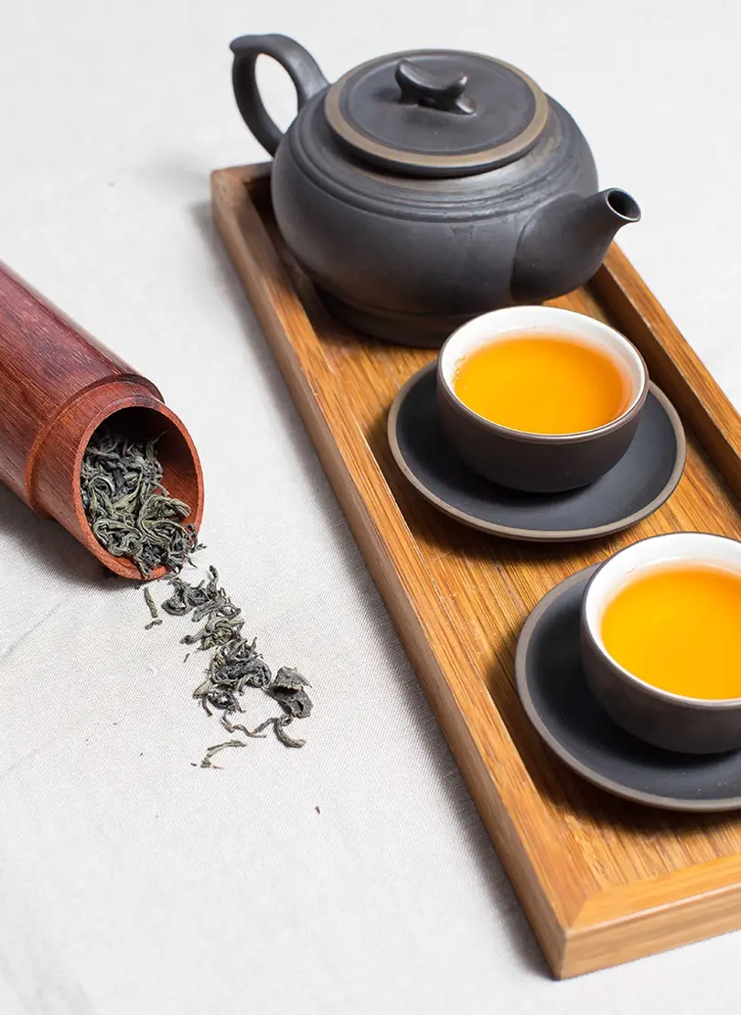
The hero section features a large banner image with a teapot and teacup, giving a sense of warmth and tranquillity. The headline reads “Discover the essence of tea,” setting the tone for what visitors can expect. The layout is simple yet impactful, with the banner image occupying a significant portion of the screen, drawing attention immediately. The CTA button is strategically placed to encourage engagement, and the headline uses a bold, modern font to convey the message clearly.
- Customisation tips: Replace the image with one that reflects your unique brand—perhaps a shot of your shop, your products, or your team. Update the headline to capture the spirit of your brand, such as “Brewed With Love” or “Organic Tea Crafted for You.” Include a compelling CTA button like “Explore Our Teas” to prompt immediate engagement.
- Ideas for your layout:
- Swap in an animated image slider for more visual variety.
- Add an animated number counter below the headline to show impressive statistics about your business.
- Highlight a featured tea product with an eye-catching photo.
- Use a block pattern text to emphasise an ongoing promotion.
- Experiment with background colours or gradients to make your headline pop.
- Include a small product video that starts automatically without sound.
- Change the button text to something unique, like “Browse Our Selection.”
- Add a shadow effect to your text for more depth.
- Incorporate a subtle animation to make the hero image stand out.
- Add customer testimonials in the form of a WordPress accordion below the hero.
Want to learn more about setting up your hero section? The block patterns blog hero offers several examples.
Journey section: build trust
The journey section highlights key milestones such as “Since 1976” and “+100K clients.” It’s a great way to build credibility by showing the history and experience behind your brand. The design includes bold text and simple icons to make these milestones stand out. The layout is straightforward, using horizontal or vertical alignment to display the milestones in a visually appealing way, ensuring that visitors can easily grasp your brand’s credibility.
- Customisation tips: Adjust these milestones to fit your business’s journey. For newer businesses, focus on what makes you unique—such as “100% Handcrafted Teas” or “Sourced from Local Farmers.”
- Ideas for your layout:
- Swap in a timeline graphic for a more visually engaging presentation.
- Highlight awards or recognitions.
- Add block icons to illustrate each milestone.
- Use a different background colour to make this section stand out.
- Include a short testimonial beneath this section.
- Add links to a more detailed history page.
- Integrate WooCommerce to link directly to your best-selling product.
- Incorporate subtle movement—like fading in numbers as the visitor scrolls.
- Highlight your values instead of milestones.
- Use icons to represent “experience” or “loyal customers.”
Check out more about WordPress block themes that can help you enhance your journey section.
Product highlights section: showcasing your offerings
This section uses images to showcase different types of teas: green, red, and yellow. Each product image has a plus sign for more details. The design is clean and uses a grid layout, making it easy for visitors to view multiple products at once. The images are vibrant, adding visual interest, while the plus sign icon encourages further exploration. This section is perfect for showcasing featured products, new arrivals, or popular selections.
- Customisation tips: Update these images to match your product line—you could showcase different tea blends, tea accessories, or even gift sets.
- Ideas for your layout:
- Add a WordPress blog link with “Learn More” for each tea type.
- Swap in product videos for a dynamic touch.
- Use WordPress icons to label different tea properties (e.g. caffeine-free).
- Include a “Best Seller” label on popular products.
- Add a discount badge for a promotional product.
- Include a rating and review snippet below each image.
- Add a carousel to allow scrolling through more products.
- Highlight any seasonal or limited-edition products.
- Link the plus icon to a detailed product page.
- Include call to action examples like “Add to Cart” beneath each image.
Discover how to integrate beautiful block patterns by visiting MaxiBlocks pattern templates.
Benefits of tea section: educate your customers
This section features a teapot image and a brief explanation of the benefits of tea. It helps build a connection by educating your customers. The design uses a split layout, with the image on one side and the text on the other, creating a balanced look that’s easy to follow. The image provides visual interest, while the text focuses on delivering value by informing the visitor about the benefits of your products.
- Customisation tips: Personalise the content based on your tea offerings—whether it’s stress relief, boosting immunity, or something else. Change the image to highlight a unique product.
- Ideas for your layout:
For more inspiration on effective use of content patterns, head over to the Gutenberg blocks page.
Testimonial section: build trust
This section displays a testimonial from a satisfied customer, adding credibility and trust. The design is simple, with a block of text in the centre of the page, possibly with a photo of the customer for a personal touch. The layout focuses on making the testimonial the centrepiece, using clean fonts and minimal distraction to emphasise customer satisfaction.
- Customisation tips: Replace the placeholder with real testimonials from your customers, possibly including a photo for a personal touch.
- Ideas for your layout:
- Add multiple testimonials in a slider format.
- Include a WordPress contact form so visitors can easily submit their own testimonials.
- Use video testimonials.
- Feature a key client as a spotlight.
- Add star ratings below each testimonial.
- Incorporate WordPress icons to signify satisfaction (e.g. hearts).
- Include a featured image of the product reviewed.
- Use soft background music to make it more engaging.
- Place CTA buttons below each testimonial to encourage purchase.
- Highlight a customer journey story.
Learn how you can use these testimonials in your homepage design templates.
Footer section: complete your story
The footer section provides a “Build like a pro” promotional message, a newsletter signup, and additional links to explore more about the company. The design utilises a dark background to distinguish it from the rest of the page, with white or light-coloured text for easy readability. The layout includes multiple columns to organise information like social links, contact details, and quick navigation links, making it user-friendly.
- Customisation tips: Update the footer with your social media links, contact details, and important navigational links, such as “Privacy Policy” and “FAQ.”
- Ideas for your layout:
- Add social media feeds directly into the footer.
- Include WooCommerce links for easy cart access.
- Change the footer colour to contrast with the rest of the page.
- Add an Instagram feed with relevant photos.
- Place quick links to key pages like “About Us” or “Contact.”
- Add a trust badge like “Secure Checkout.”
- Include a mini FAQ section.
- Use custom icons for each social media link.
- Feature a small “Our Team” section.
- Add a button that lets users easily switch languages.
To learn more about designing a great footer, visit the website footer resource.
Different types of websites that can use this WordPress homepage
The beauty of this tea shop homepage template is its adaptability. This template could be repurposed for a range of industries and websites, including:
You can find specific templates that suit your needs through the homepage design templates link.
Final thoughts
This WordPress homepage template by MaxiBlocks provides a versatile foundation that can be tailored to fit your brand’s personality. Whether you’re a small business, a consultant, or part of a non-profit, the flexibility of MaxiBlocks’ block patterns helps you create an inviting space for your audience. The combination of visuals, testimonials, and well-designed CTAs makes this template a reliable choice for anyone looking to develop a user-friendly and beautiful online presence.
If you’re interested in exploring other WordPress website options, check out WordPress websites, WordPress website design, and other WordPress website builders for more inspiration.
