How to use and customise a WordPress services page design template with MaxiBlocks
Creating a well-structured services page is for communicating your brand’s offerings and value to potential clients. The services page design template by MaxiBlocks is an excellent way to present your services in a modern, clean, and visually appealing way. In this post, we’ll walk you through how to use this template section by section, explain the content, and give you tips on how to make it your own.
MaxiBlocks provides a wide variety of WordPress patterns page templates that you can use to easily create a professional services page. Below, we go through the design elements of this template section by section, providing detailed instructions on customising each one to suit your business needs.
Header section: In a world of technology, people make the difference
The header section features a motivational headline: “In a world of technology, people make the difference.” This statement immediately sets the tone for the page, focusing on the importance of people, skills, and values in a technology-driven world. The subheading, “Success usually comes to those who are too busy to be looking for it,” adds an inspirational layer, encouraging viewers to take action.
- Images: Below the headline are three circular images representing different values:
- Be fearless: A photograph of a sailboat’s mast against a clear sky, symbolising adventure and courage.
- Be remarkable: A person climbing bright, minimalist stairs, suggesting ambition and striving for greatness.
- Be transparent: A calm workspace with a laptop and plant, reflecting simplicity and honesty.
- Design and Layout: The combination of circular images and motivational titles creates a visual flow that feels inspiring without being cluttered. The layout gives each idea enough space, allowing for easy comprehension.
Customisation tips for the header section
- Change the headline to reflect your brand’s mission or key message.
- Replace the background image with a high-quality photograph that represents your industry or target audience.
- Use animated elements for the images to create a dynamic feel.
- Add a call to action beneath the headline, such as “Explore our services.”
- Use website icons from the WordPress icon library to create visual interest.
- Introduce a background gradient to create a more distinctive atmosphere.
- Adjust the font styles to match your brand typography.
- Add subheadings that elaborate on each value (e.g., “Be fearless in embracing change”).
- Include a button that links to a relevant part of the site for each image.
- Use hover animations on the images to encourage interaction.
Quote and steps section
This section is designed to be both motivational and informative. It begins with a quote, “In order to succeed, we must first believe that we can,” emphasising the importance of a growth mindset. Below the quote, six numbered steps are presented in a horizontal layout:
- Financial analysis
- Saving & investments
- Investment banking
- Saving & investments (duplicated for emphasis)
- Business consulting
- Online consulting
Each step is numbered in bold orange, making them visually distinct and easy to follow.
Customisation tips for the quote and steps section
- Update the quote to something more aligned with your brand or industry.
- Add or remove steps based on the specific services you provide.
- Use block pattern text to present each step with a consistent style.
- Include icons next to each step to make them easier to identify.
- Add call to action examples such as “Learn more” under each step.
- Use hover effects for each numbered step to make the section interactive.
- Link each step to a more detailed WordPress block templates page.
- Replace the text with an animated sequence for a more modern look.
- Use animated number counters to highlight key statistics.
- Add related testimonials below each step to show real-world success stories.
Pricing section: Choose your best plan
This section introduces three pricing options, each presented as a separate card: Student ($20), Professional ($45), Advanced ($95). Each plan includes details about the features offered, along with an orange “Subscribe” button for easy action.
- Layout: The three pricing cards are arranged side by side, making it easy for viewers to compare options. Each card has a consistent layout, with the pricing, plan name, and features clearly separated to avoid confusion.
- Features: Each card lists a set of benefits, with a tick indicating availability.
Customisation tips for the pricing section
- Rename each pricing plan to something more reflective of your audience, such as “Basic, Growth, and Enterprise.”
- Update the price points to match your actual pricing.
- Add a discount badge to one of the plans to encourage uptake.
- Include WooCommerce integration for direct purchases from this section.
- Add tooltips to explain each feature in more detail.
- Include testimonials that highlight why people prefer a particular plan.
- Customise the Subscribe button text to something like “Get Started” or “Sign Up Today.”
- Use website images related to your product within each pricing card.
- Add icons next to each feature to help visual recognition.
- Introduce colour-coded borders for each plan to help distinguish them visually.
Ideas section
The ideas section includes four cards, each with a unique title, image, and brief description. Examples include:
- “Ideas for life”: A photograph of a creative person using a camera.
- “A better way”: A rustic setup suggesting craftsmanship.
- “Quietly brilliant”: A serene table setting with breakfast items.
- “Evolve wisely”: A comfortable setup of a person working at home.
Each card has a “Read more” link, allowing the visitor to explore further.
Customisation tips for the ideas section
- Replace the images to reflect your own blog posts, podcast style, or portfolio.
- Add hover effects that change the image slightly, creating an interactive element.
- Include specific titles for each card, like “Latest business insights” instead of “Read our blog.”
- Introduce animated arrows or graphics pointing to the cards to draw attention.
- Use different background colours for each card to differentiate them.
- Add call to action examples such as “Explore now” under each card.
- Create a carousel to show more than three items if needed.
- Link to different block patterns blog hero templates for showcasing different posts.
- Include recent articles or episodes as small text beneath each card for more context.
- Use testimonial quotes in this section to add social proof.
Gallery and statistics section
This section features three large images that span across the page width, creating a visually immersive experience. Each image adds to the storytelling by providing insight into the brand’s ethos and culture.
- Images Include:
- Urban adventure: A child walking near a grand structure, evoking a sense of curiosity and exploration.
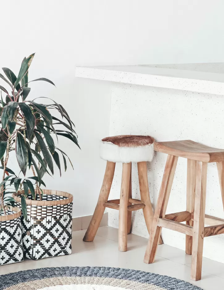
- Cosy home setting: A photo of stools and a rug in a home, promoting a comfortable and inviting atmosphere.
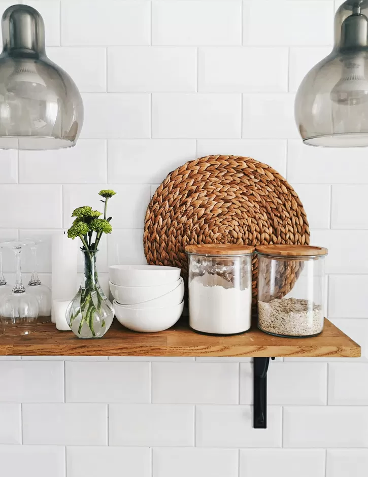
- Kitchen essentials: Kitchen items, indicating a sense of homeliness and quality.
Below the images are three key metrics that showcase achievements: 100K Out in the game, 19M Pushing limits, and 8.9% Above the rest. These metrics are large and bold, adding a sense of authority.
Customisation tips for the gallery and statistics section
- Replace the images with photographs that reflect your brand’s unique story or industry.
- Update the metrics to reflect your company’s achievements.
- Add animated number counters to make the statistics dynamic.
- Use hover effects on the images for an interactive experience.
- Introduce text overlays on the images to provide context.
- Include customer testimonials next to each image for more engagement.
- Add calls to action below the metrics, such as “Learn more about our achievements.”
- Use website icons to help represent each metric visually.
- Include a background gradient to make the section visually distinct.
- Use WordPress block themes to create a unique layout that fits your site’s overall theme.
Footer section: Contact and navigation
The footer includes different columns for navigation, services, company information, and contact details. There is also a copyright note that says “Made with MaxiBlocks” to reinforce the brand identity.
- Navigation Links: The footer is divided into multiple columns for easy navigation, with links to Services, Company, About, and Contact.
- Social Media Links: There are also icons for social media platforms like Facebook and Instagram, encouraging visitors to stay connected.
Customisation tips for the footer section
- Add an email subscribe form to capture leads.
- Introduce social media badges that match your brand colours.
- Include FAQ links to assist users in finding quick answers.
- Add a Google Maps embed if you have a physical location.
- Use WordPress navigation menus for better site structure.
- Change the footer background colour to match your brand theme.
- Include key metrics (e.g., customer satisfaction) to add credibility.
- Add contact form buttons to encourage outreach.
- Use testimonials design in the footer to provide proof points.
- Include links to your 404 page to ensure users can easily navigate if they hit a broken link.
What is a services page and why is it important?
A services page is one of the most critical components of any website. It clearly outlines the services or products offered, helping visitors understand the value your company can provide. For businesses across industries like health websites, consulting websites, or architecture website templates, a well-crafted services page provides credibility, offers clarity, and drives potential customers towards making a decision. By using the WordPress block themes, you can easily customise the services page to be as unique as your business.
What websites benefit from a WordPress 404 page?
Having a well-designed WordPress 404 page is valuable for many types of websites. If users land on a non-existent page, an effective 404 page can help guide them back to relevant content instead of abandoning the site. Whether you have a health website, non-profit homepage template, or even a wedding website, providing navigation options on a 404 page significantly reduces your bounce rate.
Final thoughts
Using the WordPress services page design template by MaxiBlocks provides an excellent starting point for creating an engaging, informative services page. With the ability to customise each section, from motivational headers to the footer, you can create a services page that truly reflects your brand. For more guidance on building your WordPress website, check out our WordPress website builders and Elementor alternatives.
For more inspiration, explore other WordPress websites and discover how easy it is to create a beautiful, functional website for your business.


