

Our work
Case studies
Eipsum dolor sit amet consectetura dipisicing elit ipsum eiusmod
Tempor incididunt dolore magna aliqua enia minim veniam quis lorem tempor dolor.

Build WordPress sites with MaxiBlocks. All features free forever. No locked functionality. Optional Cloud Library saves you 10+ hours per project. Start free


Our work
Tempor incididunt dolore magna aliqua enia minim veniam quis lorem tempor dolor.
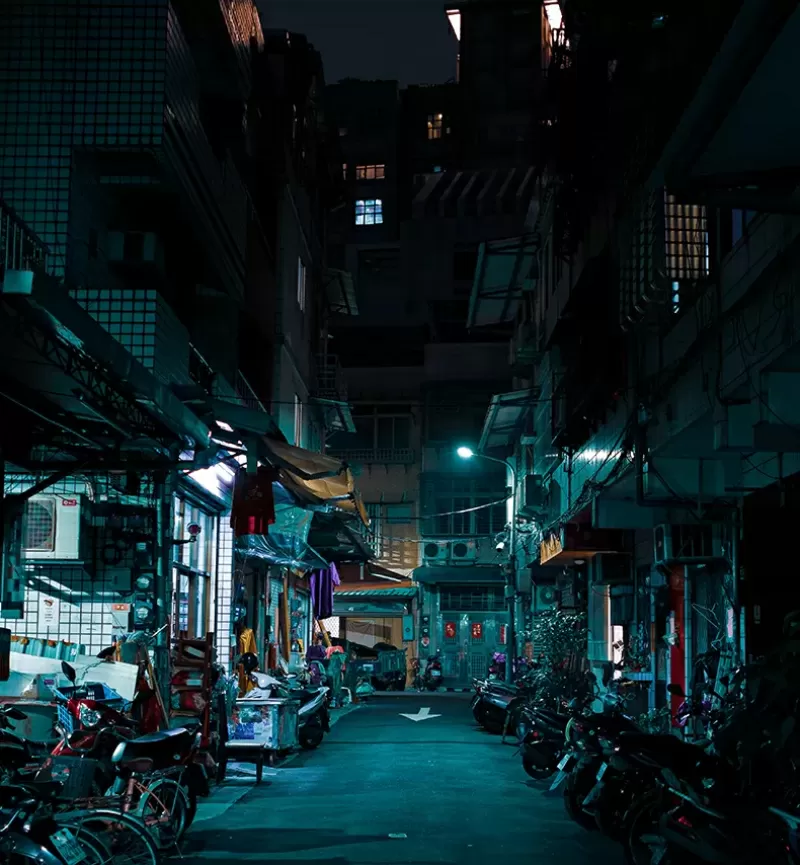
Transform the look of your WordPress website with a striking multi-column image layout that draws users in! This design features a vibrant grid arrangement with two rows and three captivating images, paired with a compelling text block to the right. The asymmetrical layout creates a dynamic visual flow, ensuring your content stands out and captivates your audience.
Organise related posts into categories for easy navigation. Categories help group similar content, making it accessible for readers seeking specific topics. They’re like broad labels that provide a structure for your posts.
Tags offer more specific keywords related to your post’s content. Unlike categories, which are more general, tags pinpoint topics covered in your posts, enabling readers to find related articles easily.
Create unique content types beyond standard posts and pages. Custom post types provide flexibility to tailor content structures, perfect for portfolios, testimonials, or any custom content your website might need.
Pages are static and suited for content that doesn’t change often, like “About Us” or “Contact” pages. These provide essential information about your website, offering users a consistent navigation point.
Menus are vital for navigation across your WordPress website. With custom menus, you can order and link to your site’s pages, categories, and custom links, creating an intuitive browsing experience.
Widgets enhance your sidebar or footer, offering users quick access to content and features like recent posts, category listings, or search bars, improving user experience and engagement.
Showcase photo or video collections neatly using multimedia galleries. This feature highlights visual content in an organised manner, enhancing the aesthetic and interactive appeal of your site.
Use form templates to maintain consistency across similar pages. Applying templates guarantees a uniform look and feel, vital for a streamlined user experience across various site pages.
Vary how posts display with dynamic post formats. Each format offers a distinct way to present content, be it a gallery, video, quote, or audio, adding diversity to how your information is shared.
Design with responsive layouts to ensure seamless viewing across devices. This adaptability enhances user experience, making information accessible whether users view it on desktops, tablets, or smartphones. Learn more about responsive WordPress design.
The heart of most websites, blog posts are dynamic entries that can cover any number of topics or interests. They are often categorised around themes or ideas, continually updated to engage and inform your audience.
Static content like pages provides timeless information crucial for every website such as “About,” “Contact,” and “Terms of Service” pages. They act as pillars of information that won’t change frequently but will guide users on your site.
Groups of images or graphics, galleries are perfect for showcasing visual work, whether artwork, product photos, or event photography, providing an interactive visual exploration feature visitors love.
Videos engage audiences with visual and auditory information, perfect for tutorials, vlogs, and story-driven content. They offer dynamic engagement, keeping visitors on your site longer to experience the content.
Audio files and podcasts make your site come alive with sound, offering rich content around interviews, discussions, or music that audience can listen to anytime, enriching user experience.
Testimonials build trust by showcasing customer feedback. Real user experiences provide credibility, convincing potential customers of the value of your products or services.
Showcase your best work in a portfolio, ideal for creative professionals like designers, photographers, and artists, helping you display skills and attract potential clients with an online gallery of achievements.
Keep followers updated with press releases, announcing important news and developments, perfect when launching products or initiatives to inform the public and media of newsworthy occurrences.
Perfect for e-commerce sites, products are crucial for listing and detailing items you sell, helping customers understand features, specifications, and prices to facilitate online shopping experiences.
Offer real-world examples demonstrating your expertise and successes with case studies. Potential clients can see how you’ve solved problems and achieved results, providing compelling evidence of your capabilities.
This unique multi-column layout, boasting vibrant imagery and a contemporary aesthetic, offers an engaging experience perfect for showcasing your portfolio or case studies. Its effective visual storytelling is designed to leave a lasting impression, making it an ideal choice for WordPress website design. Don’t miss out on the opportunity to impress your visitors-consider integrating this stunning layout into your next WordPress project!
