Capture attention with a stunning design!
Discover a captivating layout that expertly showcases your food-related content! This original design features a multi-column arrangement that effortlessly divides information into engaging sections. With two rows, the top row flaunts a bold main header, while the bottom row engages users with a dynamic interplay of an image alongside descriptive text.
Key features of the design
- Bold header: Grabbing attention with impactful text: “The only thing we’re serious about is food.”
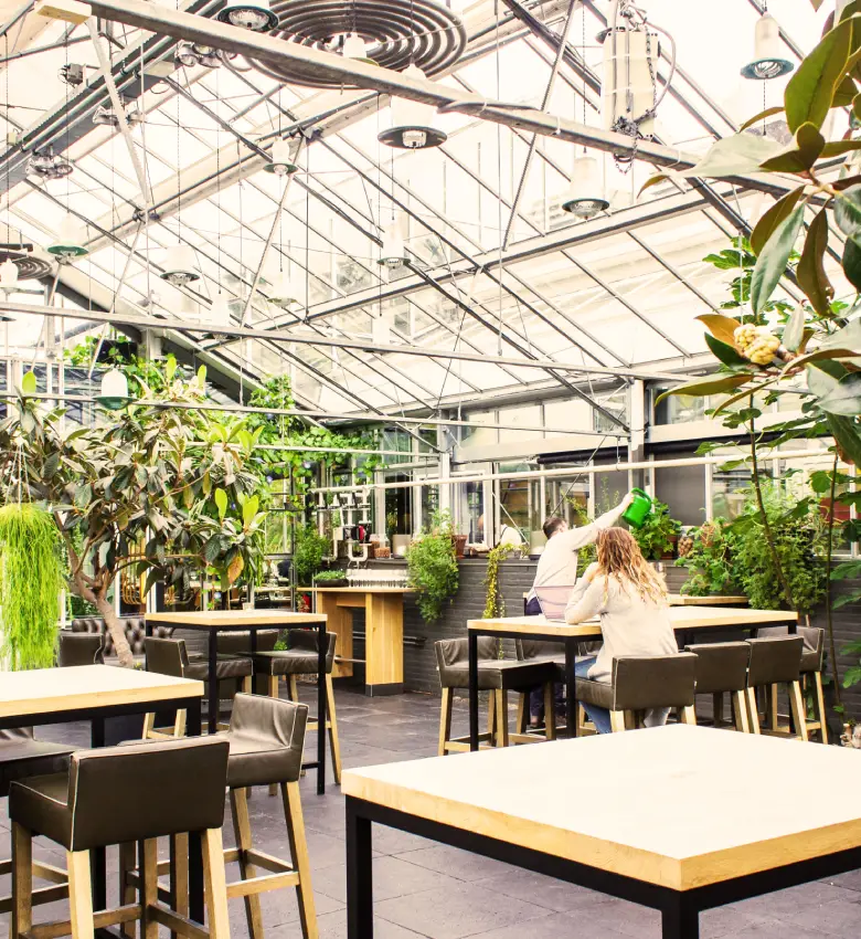
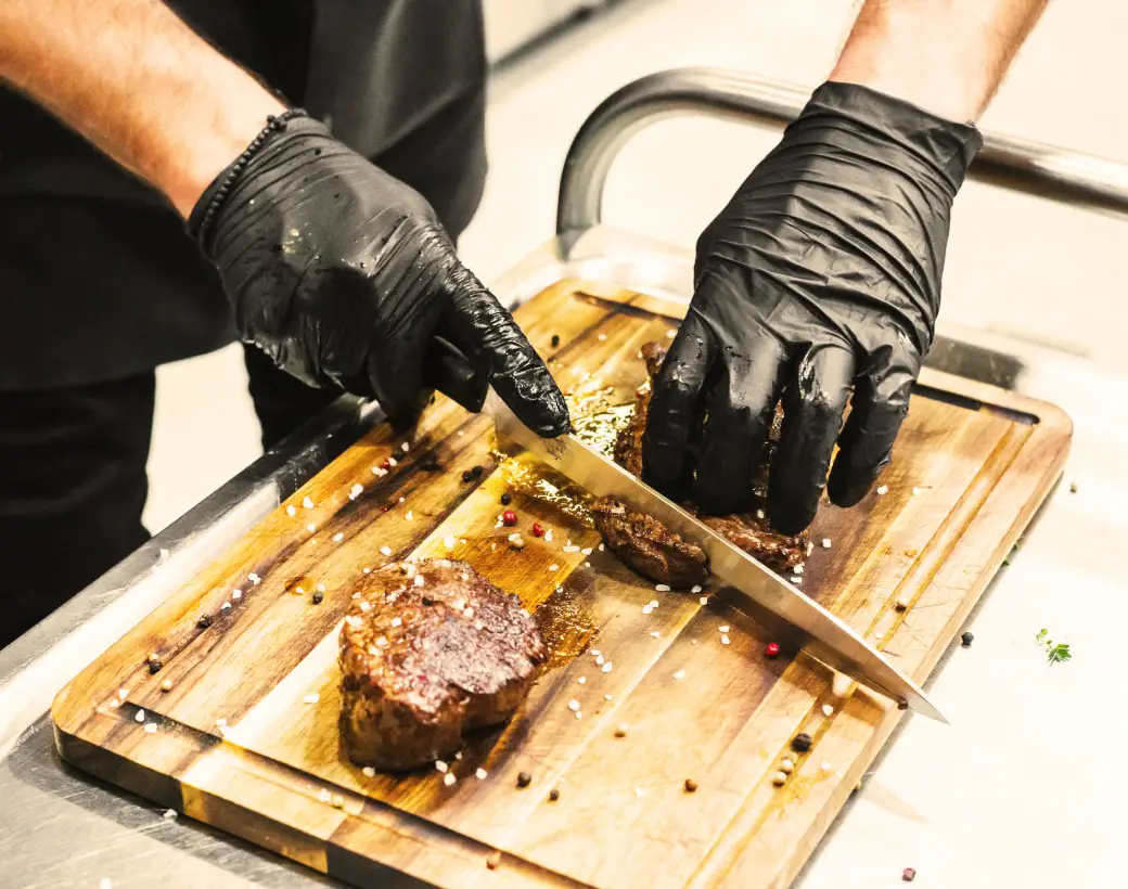
- Appealing imagery: Featuring vibrant images highlighting a lively kitchen scene and a beautifully arranged dining setup.
- Engaging text: Informative yet friendly text blocks inviting readers to discover more-“We’ve got something for everyone” captures the essence of inclusivity.
- Interactive elements: Connect easily with your audience through a prominent WhatsApp messaging button.
- Typography excellence: A combination of large, bold headers and smaller readable body text ensures a comfortable reading experience.
- Visually striking icons: Including the familiar WhatsApp logo enhances user interaction.
Standout design features
- Dramatic contrast: The bold typography set against a dark background creates an eye-catching appearance that’s sure to stand out.
- Potential for dynamic interactions: With hover effects and modern design elements, your audience will enjoy an interactive browsing experience.
- Responsive and accessible: Designed to adapt beautifully across devices, this layout prioritises user experience while ensuring accessibility for all.
- High legibility: Thanks to the contrast between text and background, this design caters well to users with visual impairments.
A minimalist approach with maximum impact
Characterised by its minimalist and modern style, this design focuses on showcasing food through powerful imagery and structured content. The visual hierarchy directs attention effectively, starting with the eye-catching header, flowing to the images, and concluding with informative text. Additionally, strategic use of white space prevents clutter, enhancing the overall focus on key content.
Summary
This design not only boasts a striking, minimalist aesthetic but also features an effective visual hierarchy, engaging images, and a clear call to action. Its adaptability and emphasis on accessibility make it the perfect layout to elevate your WordPress website. Embrace this design to create a captivating online presence that will entice and inform your audience!
10 ways to organise content in WordPress
1. Categorise your posts
Effective categorisation is key in organising content on a WordPress website. Categories help group related posts, making it easier for visitors to find what they’re looking for. Whether it’s recipes, tips, or restaurant reviews, ensure each post fits neatly into a category. By doing this, you’ll improve user navigation and enhance SEO performance. Introduce a logical category hierarchy that aligns with your content strategy for optimal results.
2. Use tags for specifics
Tags provide more detail than categories by targeting specific content aspects. Unlike categories, tags are not hierarchical, so they allow flexibility in describing content nuances. They help users find related posts quickly and can boost site searchability. Efficient tag management encourages consistent usage without overloading a post with too many tags. Balancing categories with tags provides clear guidance and strengthens the structure for any WordPress website builder strategy.
3. Implement a custom menu
Crafting a custom menu enhances user experience by providing a clear navigation structure. A well-thought-out menu can direct users to important sections, such as popular posts or service pages. Custom menus offer flexibility to rearrange links according to user needs. When built using WordPress navigation menus, they provide a seamless path to key sections of your site.
4. Create a sitemap
A sitemap is crucial for presenting your site’s architecture to search engines. By outlining all pages and posts, it helps search engines index your site more effectively. There are plugins available for generating sitemaps in WordPress, ensuring your site structure is transparent and easily navigable. This tool offers insights into how your content is interlinked, both for visitors and search engines.
5. Use sidebars for quick access
Sidebars are valuable real estate on a site for featuring key content or interactions. Whether displaying a popular post widget, newsletter signup, or recent comments section, sidebars can enhance user engagement. Careful design and placement allow for dynamic navigation and content access. When integrated thoughtfully, sidebars can significantly enrich the user experience.
6. Showcase posts in sliders
Sliders are visually appealing ways to highlight featured posts on your homepage. They not only grab attention but also offer a quick overview of top content, enhancing users’ exploratory experience. Sliders can be customised to match site aesthetics while ensuring sustained interaction. When utilised properly, sliders can keep content fresh and engaging, inviting further visitor exploration.
7. Optimise the footer
The footer is often overlooked but offers an opportunity for added navigation. It’s an ideal place for quick links to privacy policies, contact details, or social media profiles. Including a brief site map or additional menus in the footer enhances accessibility. Thoughtful footer design complements the overall WordPress website design by offering users one final destination for guidance.
8. Condition your homepage
The homepage is usually the first point of contact with visitors, so it’s crucial to make a positive impression. It should be inviting, informative, and reflect site tone and content diversity. Include a brief introduction, featured sections, and a clear value proposition to engage users instantly. Optimising your homepage design will guide visitors smoothly throughout your website.
9. Internal links for increased retention
Regularly linking to related or previous posts not only improves SEO but keeps users on your site longer. Thoughtful internal linking weaves your content fabric tightly, showing users the depth and breadth of your offerings. Incorporating links naturally within the text improves navigation and encourages users to explore various areas of your site, increasing engagement and retention.
10. Categorise with a mega menu
Navigate complex sites with ease by implementing a mega menu. This advanced menu type can reveal subcategories and featured content at a glance, streamlining navigation for end-users. Mega menus are particularly beneficial for sites with diverse or extensive content categories. Clever usage helps visitors understand content structures promptly, enhancing overall navigation efficiency.
10 types of content in WordPress
1. Blog posts
Blog posts form the backbone of any content-oriented WordPress website. Whether offering culinary tips or sharing personal dining experiences, each post captivates audiences with storytelling. Frequent posting keeps content fresh, increasing opportunities for higher engagement and feedback. Tailor blog posts to cater to current trends and audience interests, establishing authority and fostering a loyal readership.
2. Static pages
Static pages are a cornerstone of any website structure. They provide essential information such as About Us, Contact, and Privacy Policy. Unlike posts, pages remain a consistent source of reference without frequent updates. Thoughtful page design and content ensure clarity around your mission and identity, providing a foundation for visitor trust and understanding.
3. Galleries
Showcasing galleries offers a visual feast for visitors, ideal for sites centering on food presentation or restaurant aesthetics. High-quality images convey messages without words, highlighting your site’s visual storytelling. Galleries are customisable with various styles and layouts, catering to aesthetic preferences while showcasing engaging content, making them an engaging part of a WordPress website design strategy.
4. Videos
Videos enhance content engagement by providing dynamic visual and auditory stimuli. Whether demonstrating a recipe or offering a visual tour, they draw in visitors and keep them engaged for longer. Integrating video ensures information is accessible in an easily digestible format, enhancing user interaction. Video content enriches your overall WordPress website builder capabilities.
5. Podcasts
Podcasts offer a personal touch, building connections with audiences through voice. Sharing expert interviews, culinary discussions, or in-depth analysis through audio forms a rapport with the audience. Podcasts can be listened to on the go, broadening reach beyond standard web content consumption. Consistent production augments your content diversity and engagement.
6. Infographics
Infographics simplify complex information through engaging visual elements. They break down statistics or processes relating to food or any topic into digestible formats. Infographics don’t just enhance understanding; they make sharing information more appealing, increasing potential virality and widening audience reach. They’re a vital part of WordPress website design strategy.
7. Testimonials
Testimonials build credibility by showcasing satisfied customer experiences. Highlighting positive interactions and endorsements bolsters trust and persuades new visitors. If applicable, incorporate concise, authentic testimonials to feature on service pages, subtly guiding potential clients towards making decisions with confidence.
8. E-commerce products
E-commerce functionality allows food-related sites to operate as digital marketplaces. Whether selling cookbooks, kitchen gadgets, or culinary classes, WordPress-powered online stores offer a seamless shopping experience. Implementing intuitive navigation, secure transactions, and detailed product pages will ensure customers’ procedures are smooth and hassle-free.
9. Event pages
For restaurants or culinary influencers, event pages update consumers on happenings, launches, or festivals. Clearly displaying event details, RSVP links, and engaging visuals can garner community interest and boost participation. Events highlight dynamic involvement, enhancing engagement and building a vibrant community around shared experiences.
10. FAQ sections
A FAQ section addresses common queries, improving visitor accessibility while reducing individual contact instances. Carefully constructed FAQs save time and provide immediate clarity on frequent customer concerns. Like a virtual assistant, an up-to-date FAQ section continuously supports by addressing clarity on your WordPress website.
Conclusion
Integrating these organisational techniques and content types into your WordPress website design unlocks potential for creating a captivating, audience-focused site. Whether you are an aspiring blogger or running a multifaceted business, these methods ensure structure, engagement, and an enduring connection with your audience. Dive into this online journey and watch your site thrive with the power of versatile content and effective organisation!


