Join our VIP dinner club and get the latest in fodies trends
Lorem ipsum dolor sit amet, consectetuer adipiscing elit. Donec odio. Quisque volutpat mattis malesuada eros.


Build WordPress sites with MaxiBlocks. All features free forever. No locked functionality. Optional Cloud Library saves you 10+ hours per project. Start free
Lorem ipsum dolor sit amet, consectetuer adipiscing elit. Donec odio. Quisque volutpat mattis malesuada eros.


Are you ready to transform your WordPress website into an engaging space that attracts and retains visitors? Consider this dynamic layout design that beautifully balances text and imagery!
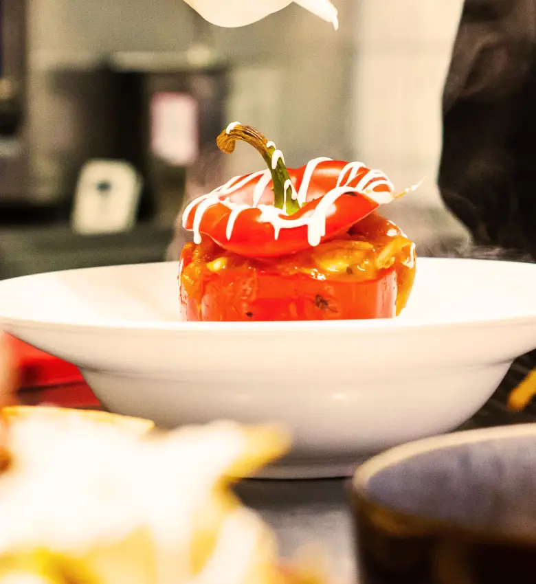
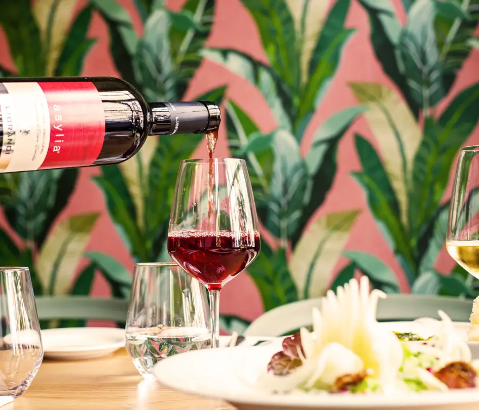
The initial design showcases a multi-column format that captures attention and enhances user experience. It features two main columns: a prominent text column on the left that commands focus, and a smaller column on the right showcasing vibrant images. This asymmetrical balance not only draws the eye but also provides a unique visual appeal.
The “Join now” button serves as the gateway for user engagement.
Bold, modern headings combined with clean sans-serif text ensure clarity and readability throughout.
The images themselves act as impactful graphical components, adding depth to the theme without the need for additional icons.
A clean presentation is maintained with images displayed without noticeable borders or radius effects.
Organising content with categories and tags helps to create a logical structure for your site, making it easier for visitors to find what they’re looking for. Categories offer a broad grouping of your posts, while tags are more specific. Using this method allows your WordPress navigation menus to be intuitive, enhancing the overall user experience significantly.
Custom post types are a powerful way to diversify content on your site beyond the default posts and pages. With custom post types, you can create unique sections specific to your needs, such as a portfolio, testimonials, or product listings. Using custom post types, your WordPress block templates can become more dynamic and tailored to your design strategy.
A well-organised menu is crucial for user-friendly navigation. Group related content under main menu items and use submenus for additional organisation. This way, your visitors can easily browse different sections of your site, enhancing accessibility, especially when adding and managing submenus with Gutenberg.
Widgets can be used to organise content in your sidebar or other widget-ready areas. They are ideal for displaying recent posts, categories, tag clouds, or bespoke content like social media feeds or contact information. This method enables a user-friendly way to categorise and showcase important information on your open-source website.
The Gutenberg editor offers a block-based approach to content creation, enabling easy organisation and formatting. With a myriad of blocks available, from paragraphs to images to galleries, you can design visually appealing pages that are easy to navigate. Implementing Gutenberg blocks can make the layout more strategic and reader-friendly.
Using a consistent style guide helps maintain uniformity across your site. Define typography, colour schemes, and other stylistic choices to ensure all posts and pages appear cohesive. This approach enhances the professional look of your site and simplifys content management, crucial for successful WordPress templates.
Organising content in a storytelling format can captivate your audience, leading them through a journey with your words. This approach works well for blog posts, case studies, or about pages, ensuring a more engaging experience that encourages visitors to stay longer and explore more of your WordPress pattern library.
Full-site editing enables you to design and structure content throughout your entire site using blocks. This unified approach allows for a more consistent design and facilitates easier updates. Embracing full-site editing can significantly streamline the process of organising and presenting your site’s content.
Enhancing your posts with multimedia elements like images, videos, and audio can provide a richer experience for your audience. Organise multimedia strategically to complement your text and provide an immersive experience. Engaging with different responsive WordPress designs can make the integration of multimedia seamless.
Planning your content schedule in advance with a calendar helps maintain regular postings and explains how your content distribution aligns with your broader strategy. It also ensures that you organise posts around relevant events or themes, making your open-source website builders more dynamic and engaging.
Blog posts remain the bread and butter of any WordPress website. They allow you to share news, insights, or stories in a chronological format. A steady stream of blog posts keeps your site fresh and engaging for visitors.
These pages are crucial for e-commerce sites. Product pages showcase items with images, descriptions, and purchase options. This type of content is designed to convert visitors into customers, providing all the necessary information and interactive features like a shopping cart.
Landing pages focus on a single goal or call-to-action, using simplified content for lead generation or marketing campaigns. They’re essential for directing user focus and driving conversions, whether it’s signing up for a newsletter or downloading a free resource.
Portfolios are perfect for showcasing work samples or projects. Ideal for creatives and businesses that want to demonstrate their capabilities visually, these entries often include galleries or case studies to provide context and detail.
Testimonials build credibility and trust by sharing past client experiences. This type of content often includes written feedback alongside the client’s name and sometimes their photo, adding authenticity and encouraging potential customers to trust your services.
FAQ sections address common questions or concerns visitors may have. They offer a concise way to share important information, improve user experience, and help reduce customer service inquiries by addressing these points upfront.
Galleries enable the display of images in an organised and visually appealing format. They’re perfect for photographers, designers, or any situation where showing multiple visuals together is more impactful than isolated images.
Videos engage users in a dynamic way and are increasingly important in content strategies. From tutorials to product demos, videos can convey information quickly and memorably, often resulting in higher user retention and interaction.
These detailed guides help users understand complex products or services. They can be step-by-step descriptions, often enhanced with videos or images, to ensure users can troubleshoot or operate items effectively, adding significant value to a brand.
Event listings are crucial for businesses or organisations hosting regular activities or gatherings. They provide all necessary details in a structured format, such as date, location, and ticket information, helping to promote attendance and engagement.
This modern, minimalist layout design is crafted to enhance user engagement on your WordPress website design. With clear visual hierarchy, striking contrasts, and a focus on usability, it invites visitors to take action and join your dinner club. Don’t miss out on the opportunity to captivate your audience-implement this design and watch your community grow!
