How we work
We bring brands to life. We create how they think, feel, look, communicate and respond wherever they touch their audience.

Build WordPress sites with MaxiBlocks. All features free forever. No locked functionality. Optional Cloud Library saves you 10+ hours per project. Start free

We bring brands to life. We create how they think, feel, look, communicate and respond wherever they touch their audience.
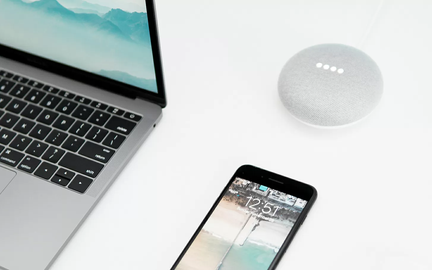
Experience a striking and engaging design that makes your content stand out! The original layout showcases a bold asymmetrical design, uniquely combining captivating visuals with clear messaging. Designed for maximum engagement, this layout features two primary columns: the left side showcases dynamic images-like a laptop and smartphone-while the right side focuses on informative text that guides your audience toward action.
Organising content with categories helps group similar topics, improving navigation and user experience. Assign clear, descriptive names to each category, reflecting your site’s core themes.
Tags offer a way to identify specific elements across posts. Unlike categories, tags are more specific, helping users find content based on keyword searches.
Menus visually organise and link key pages, enhancing site navigation. Best practices suggest keeping them clear and concise. Learn more about using dropdown menus.
Page hierarchies structure content logically, showing relationships between main topics and subtopics. This is particularly useful for static content.
Widgets allow you to add functionality and features across your site, best utilised in sidebars or footers, enhancing engagement with recent posts or search bars.
Custom post types provide flexibility beyond blog posts and pages. They’re ideal for unique content like portfolios, testimonials, or product listings.
Featuring important posts or pages on the homepage can drive attention to significant content. This can be done using sticky posts or sliders.
Breadcrumbs offer a secondary navigation scheme that recognises the user’s location within a larger site hierarchy.
Plugins such as WPBakery Page Builder or Elementor alternatives help structure content visually without coding.
Block templates streamline content formatting, ensuring consistency site-wide. Discover more at the WordPress block templates guide.
Posts are time-sensitive content, ideal for articles or news updates. They’re displayed in reverse chronological order on the blog page.
Pages hold static content, like About Us or Contact pages. They’re not tied to a specific date, making them suitable for timeless information.
Beyond pages and posts, custom post types accommodate varied content, such as products or events, requiring unique layouts and data fields.
WordPress allows embedding images, audio, and video, central to creating visually-rich content. Understand more at WordPress icon library.
Forms enable user submissions, from simple contact forms to complex surveys. Plugins simplify form creation and management.
Portfolio content showcases work and projects, ideal for creatives like photographers, designers, or writers.
Testimonials build trust, displaying customer feedback or endorsements conspicuously throughout the site.
Product listings enable online sales through WooCommerce. Manage inventory, pricing, and shipping seamlessly on your WordPress website.
Event listings keep audiences informed about upcoming events, providing details like date, location, and registration links.
Landing pages focus on conversions, structured around calls-to-action like newsletter signups or product trials. Check out WordPress block themes to create compelling layouts.
This design strikes a perfect balance between a minimalist aesthetic and a dynamic layout. Engaging imagery paired with informative text invites users to explore further, making it a user-friendly and appealing option for your WordPress website design. Don’t miss out on utilising this combination to elevate your content and provide an inviting experience for your audience!
