Transform your WordPress site with stunning visuals
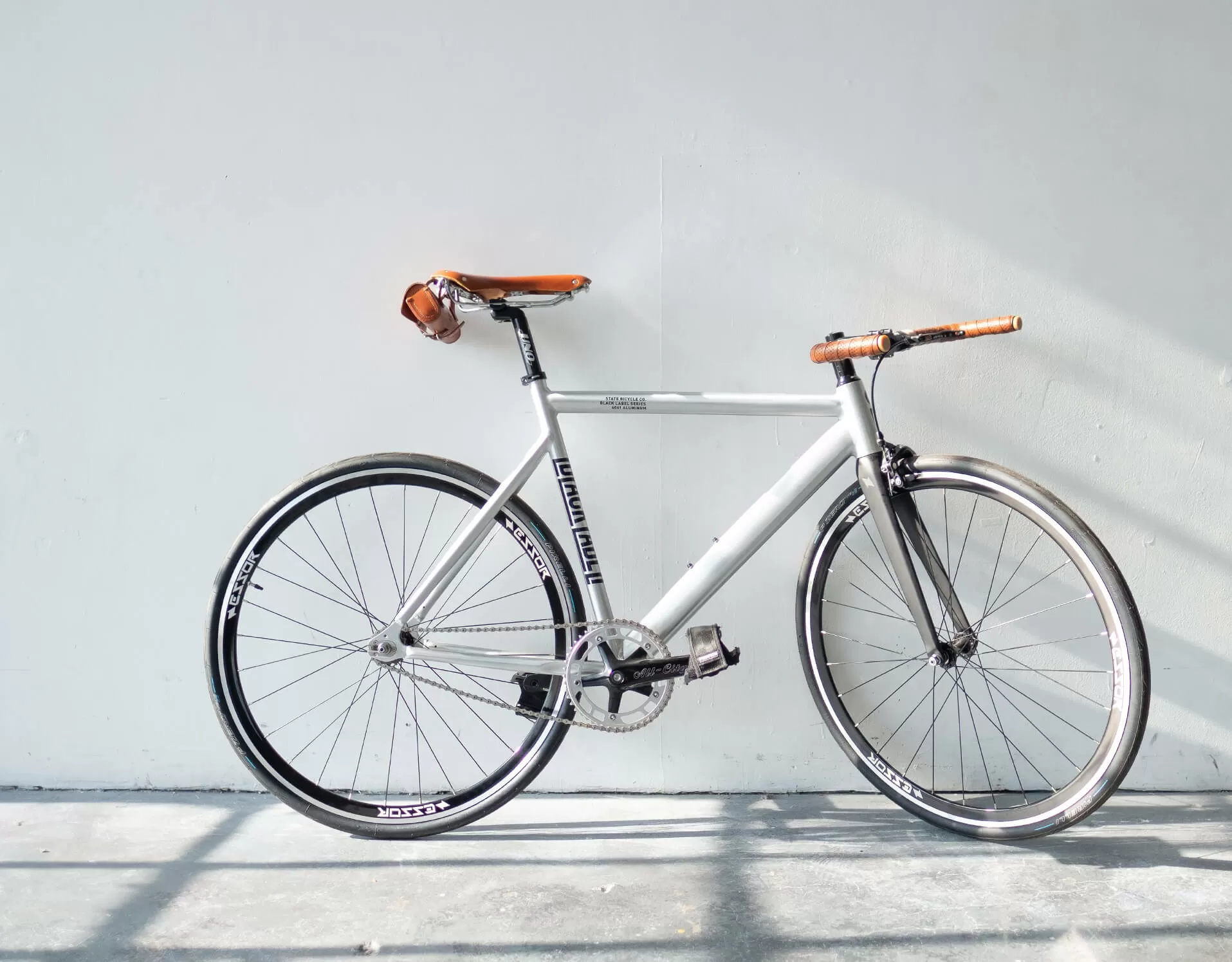
Enhancing your WordPress website design with striking visuals can create a captivating experience for visitors. Here’s how an asymmetrical layout featuring bold text and a high-quality bicycle image can elevate your site.
Detailed image analysis
1. Layout analysis
- Overall Structure: Utilises a multi-column format with two distinct sections.
- Arrangement of Rows and Columns: Features a vertical text column on the left and a larger image on the right.
- Asymmetrical Layout Choices: The contrast in width guides attention to the bicycle image, making it a focal point.
2. Element and feature description
- Visible Elements:
- Text Block: Includes a bold header and detailed text on the left.
- Image: A stunning bicycle photo occupies the right.
- Interactive Elements: Designed for a clean, static presentation without distractions.
- Typography: Bold sans-serif headline with regular body text provides clear hierarchy.
- Graphical Elements: The image is displayed without embellishments for a minimalist charm.
- Image Characteristics: Landscape-oriented with a clean background to focus attention.
3. Unique design aspects
- Standout Design Choices: Dynamic relationship between text and image sizes guides viewer attention effectively.
- Hover Effects/Animations: Maintains a static appearance to prioritise clarity.
- Responsive Design Elements: Balanced structure adapts gracefully to smaller screens.
- Accessibility Considerations: High contrast ensures readability for all users.
4. Overall design style
- Design Style: Minimalist, focusing on simplicity and clarity.
- Visual Hierarchy: Strong headline and supportive text guide the viewer, with the bicycle image as a visual anchor.
- Use of White Space: Generous to create balance and invite exploration.
10 ways to organise content in WordPress
Categories and tags
Using categories and tags helps in organising content logically, making it easily navigable for users and improving SEO. Categories are for broad grouping, while tags offer specific details.
Custom post types
Custom post types allow you to segment content distinct from standard posts and pages, giving more tailored control over how different types of content are managed and displayed.
Menus and navigation
Create a streamlined user experience by organising content through a well-structured menu. This aids visitors in finding relevant information quickly and enhances usability.
Pages and subpages
Structuring your site using pages and hierarchical subpages provides a clear pathway for content access, ensuring visitors can find necessary information in an organised manner.
Featured content
Highlight important posts by featuring them prominently on the homepage or other sections of your site, directing visitor attention to key content pieces.
Widgets and sidebars
Utilise widgets in sidebars to display additional content such as recent posts, social media links, or search bars, enhancing the overall user experience.
Custom fields
Custom fields allow adding tailored metadata to your posts or pages, offering greater flexibility in content organisation and presentation.
Archives
An archive page offers an organised list of past content, often sortable by date, category, or author, making it easy for readers to find older posts.
Table of contents
Incorporate a table of contents into longer posts to improve readability and navigation, allowing users to jump directly to sections of interest.
Search functionality
Ensure your site includes robust search capabilities, enabling visitors to find specific content quickly and efficiently, enhancing the user experience.
10 different types of content in WordPress
Blog posts
The most common content type, blog posts allow you to share thoughts, updates, and engage with your audience regularly, boosting interactivity and traffic.
Pages
Used for static content like home, about, or contact pages, pages are essential for laying out foundational site information and are distinct from regularly updated posts.
Portfolios
Showcase work samples or projects with a dedicated portfolio, offering potential clients or employers a visual insight into your skills and achievements.
Testimonials
Add credibility by publishing testimonials from satisfied clients or customers, demonstrating the trust and value your services or products offer.
Galleries
Display a collection of images or artwork in a gallery to visually engage your audience, perfect for photographers, artists, or digital creators.
Videos
Integrate video content directly into posts or pages to convey messages dynamically and attractively, appealing to users with varied content preferences.
Audio
Host podcasts or music tracks on your site, appealing to auditory learners and providing content in diverse formats to reach a broader audience.
eCommerce
Transform your site into a digital store with eCommerce content, displaying products and handling transactions to boost sales and broaden market reach.
Events
Announce and manage events with an event calendar, providing details and easy access for users to attend or engage with your planned activities.
Landing pages
Optimise landing pages specifically for conversion, focusing content and design on guiding visitors towards a desired action, such as signing up for a newsletter or making a purchase.
Conclusion
This original asymmetrical layout is perfect for elevating your WordPress website design. Pairing bold typography with minimalist design principles, it creates an engaging and impactful user experience. With resources for free WordPress themes and Elementor Alternatives, continuously enhance your site’s potential to captivate and inform.


