Elevate your food blog with this stunning design!
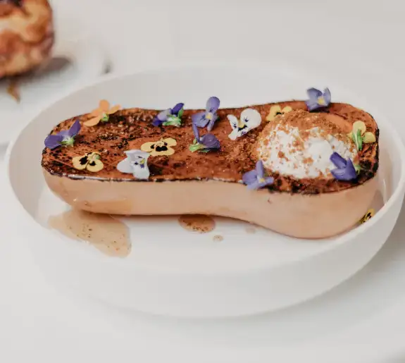
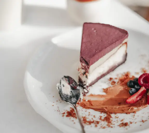
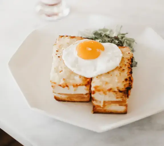
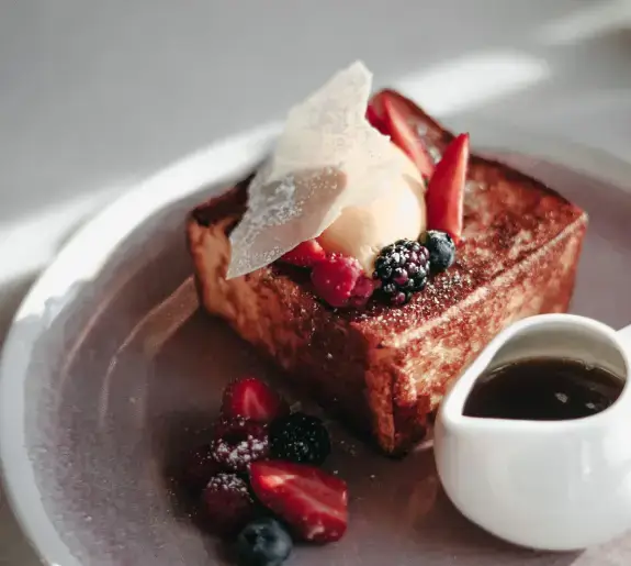
Imagine having a beautifully structured image layout that speaks directly to every food lover out there! Our design features a captivating multi-column format that’s bound to draw in readers with a mix of delicious visual treats. At the heart of this design is a bold header, with the compelling statement: “Nothing brings people together like good food.” This eye-catching opening sets the perfect tone for your food-filled content.
Detailed analysis of the design
Layout analysis
- Overall structure: Experience the beauty of a multi-column layout designed to draw in readers.
- Arrangement: A prominent row of four columns highlights distinct dishes and enticing text, making it easy for visitors to navigate and enjoy.
- Visual balance: Predominantly symmetrical with clean spacing, while varying dish titles introduce an artful asymmetry.
Element and feature description
- Visible elements:
- Header: The impactful headline sets the stage, inviting connections through shared meals.
- Images: Four vibrant dish images command attention and spark appetites.
- Text blocks: Provide engaging titles and descriptions, adding context to each dish.
- Interactive elements: While this design might initially appear static, consider interactive features for dynamic website enhancements.
- Typography: The bold header contrasts beautifully with the smaller, cleanly styled dish titles and descriptions.
- Icons/graphics: Minimalist design to focus on food without unnecessary distractions.
- Image characteristics: Clean presentation without borders allows the scrumptious dishes to take center stage, with a landscape orientation highlighting the food.
Unique design aspects
- Standout choices: The combination of bold typography and diverse dish displays creates an immediate focus on food quality, ideal for any [WordPress website design](https://maxiblocks.com/wordpress-websites/what-is-wordpress/wordpress-website-design/) related to dining.
- Dynamic potential: While this image is static, consider adding hover effects or animations to bring your layout to life.
- Responsive design: Anticipate a layout that adapts seamlessly to various devices, enhancing user experience across desktops and mobiles.
- Accessibility: High-contrast typography ensures readability, though including alt text for images can further enhance accessibility.
Overall design style
- Design aesthetic: This minimalist yet engaging style puts food front and center, inviting readers to explore and appreciate.
- Visual hierarchy: The bold header and orderly image display draw the eye naturally, guiding visitors through the culinary journey.
- White space utilisation: Thoughtful use of white space elevates the overall presentation, ensuring a clean look that captivates without overwhelming.
10 ways to organise content in WordPress
1. Categories and tags
Use categories to group your content into main topics, while tags add additional context. This helps readers find related posts and keeps your site organised.
2. Custom menus
Create custom menus to showcase specific content areas, making navigation seamless across your WordPress website. Custom menus are especially useful for linking to key pages like services, contact, and blog categories.
3. Widgets
Use widgets to place content like recent posts, archives, or custom text in sidebars or footers. Widgets are a flexible way to add additional content and navigation aids throughout your site.
4. Pages vs. posts
Pages are for static content like your homepage or about section, while posts are timely entries added to your blog. Understanding this difference helps in organising content appropriately on your WordPress website design.
5. Page builder plugins
Utilise page builders to create complex page layouts without coding. Builders like Elementor or Elementor Alternatives offer flexibility in design and content arrangement.
6. Content blocks
The Gutenberg editor’s content blocks allow you to add varying types of content like text, images, and galleries efficiently, facilitating versatile page designs.
7. Image galleries
Utilise image galleries to present visual content attractively. Galleries are ideal for showcasing portfolios, product ranges, or event photos, ensuring visual engagement.
8. Listicle posts
Create listicle posts to structure information clearly and concisely, enhancing readability and engagement. Lists are popular due to their easy-to-digest format, which captures user attention.
9. Sticky posts
Make use of sticky posts to feature important articles or announcements. By keeping key content at the top of your blog page, you ensure it captures visitor attention immediately.
10. Content tags and categories
Organise your articles by using relevant tags and categories, providing a better browsing experience for your users. Tags can add detailed descriptors, while categories offer broad sorting options.
10 different types of content in WordPress
1. Blog posts
Blog posts are the staple of any WordPress website, allowing you to share thoughts, updates, or news in a chronological order. They keep your site active and engage your audience.
2. Pages
Pages provide essential information that doesn’t change often, like your homepage, contact page, or about section. Unlike posts, pages aren’t subject to a timeline.
3. Image galleries
Image galleries collect a multitude of images in a gallery format, great for visual-centric blogs or portfolios. They enhance your site by making it more visually appealing.
4. Video posts
Incorporate video posts to visually engage your visitors. Whether it’s tutorials, reviews, or vlogs, videos widely complement your content strategy and enhance the multimedia appeal.
5. Audio posts
Integrate audio content like podcasts or music tracks easily within your WordPress templates. Audio files provide another channel for engaging a different segment of your audience.
6. Testimonials
Showcase customer feedback to build credibility and trust. Testimonials are persuasive content elements that can validate your services and encourage new clients.
7. eCommerce products
Extend your site into an online store by integrating eCommerce capabilities. Product pages allow you to showcase items for sale, complete with descriptions and purchase options.
8. Portfolios
Display creative work or projects in a portfolio format. Portfolios are excellent for freelancers and creative professionals to showcase their talents effectively.
9. Event calendars
Manage upcoming events efficiently with an event calendar. This feature keeps your audience informed about future happenings, boosting engagement and participation.
10. Infographics
Use infographics to present data or information vividly and understandably. Infographics engage viewers by turning complex information into an easy-to-understand visual.
Conclusion
With its structured multi-column layout and bold textual elements, this design is an ideal canvas for your food content. Enhance your WordPress website with sleek visuals and strategic design choices, creating an inviting atmosphere celebrating communal dining. Perfect for bloggers and restaurants alike, this format is ready to uplift your website and engage your audience. Whether you’re just starting or looking for free WordPress themes or seeking out a comprehensive [WordPress website builder](https://maxiblocks.com/wordpress-websites/wordpress-website-builder/wordpress-website-builders/), leveraging the right design elements ensures that your content stands out in a vibrant, memorable way.


