

Build WordPress sites with MaxiBlocks. All features free forever. No locked functionality. Optional Cloud Library saves you 10+ hours per project. Start free


Transform your website with an eye-catching hero banner that captures attention and boosts user engagement. Our simple yet effective layout features a striking single-column format, ensuring your message stands out.
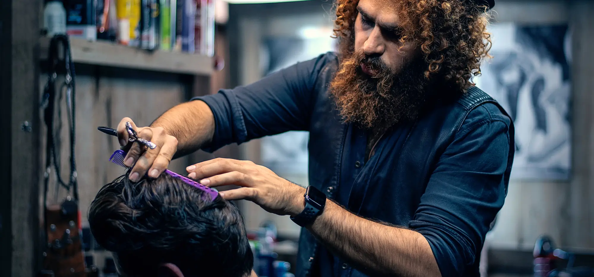
This hero banner showcases a modern and minimalist style with hands holding hair styling tools that create a dynamic visual impact. The centered content includes three essential rows:
Showcase your new product with a responsive hero banner that highlights features, encouraging users to explore further. Use striking images and clear call-to-action elements to drive conversions.
Display your salon’s range of services with a hero banner that emphasizes beauty and style. Include a booking button to increase user engagement.
Announce webinars with a hero banner that includes date, time, and a registration link. This direct approach ensures maximum attendance.
Freelancers can use high-resolution hero images to show off their work, linking to detailed project pages.
Schools can leverage website hero banners to announce courses, enrolment deadlines, and open days.
Tour operators can use animated hero images with scenic video backgrounds to inspire potential travelers and highlight special packages.
Raise awareness with a hero banner that tells your story and encourages donations, using images and a clear call-to-action.
Entice shoppers with a full-width hero image slider displaying discounted items for seasonal sales.
Promote club membership benefits with a hero banner that includes a video showcasing activities and testimonials.
Bloggers can use hero banners to feature trending topics or guest contributions, ensuring visitors are encouraged to delve deeper into content.
Add movement to your site with animated hero banners that capture interest and guide visitor attention towards key content.
Engage users right off the bat with fullscreen hero banners that immediately showcase your brand’s core message and visuals.
Create an immersive experience with parallax scrolling effects that add depth and encourage users to explore your site content.
Incorporate a video background in your hero banner to tell your story compellingly, perfect for brands wanting to make an emotional connection.
Incorporate interactive features like hover effects, sliders, or clickable icons to increase visitor engagement and user experience.
Enhance readability on busy images by using text overlays, ensuring your headlines and messages are perfectly clear.
Strategically place bold call-to-action buttons within hero banners to drive visitors to the next step, like a signup or a purchase.
Simplicity sells-use a clean, minimalistic hero banner to convey sophistication and focus user attention on your core offering.
Utilise customizable hero templates that allow for easy adaptations as your content and promotions change.
Ensure your hero banners are mobile-optimised and responsive for seamless viewing across devices, crucial for maintaining user engagement.
Incorporating a stunning hero banner into your WordPress site is a surefire way to captivate visitors and boost engagement. This WordPress website design strategy is ideal for promoting services and converting visitors into loyal customers. By incorporating eye-catching designs, bold typographies, and easy-to-use call-to-action buttons, your website is set for success. Whether you’re using WordPress website builders or exploring Elementor Alternatives, this strategy will help your WordPress website stand out.
