Meditation and yoga
Relax & Refresh


Build WordPress sites with MaxiBlocks. All features free forever. No locked functionality. Optional Cloud Library saves you 10+ hours per project. Start free
Meditation and yoga
Relax & Refresh

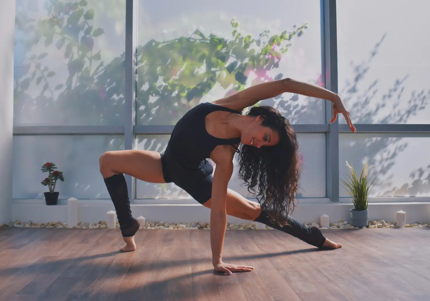
Unveiling a hero banner that seamlessly marries a modern and minimalist look with functionality, perfect for meditation and yoga WordPress web designs.
Crafted for simplicity, the banner utilises a single-column format divided into three distinct sections:
Calm and clarity. This banner’s website hero banner size aligns viewers from the bold header, through to the image and down to the subheader:
Elevate your WordPress website with this hero banner, offering an ideal balance of aesthetic appeal and functionality. Its design promotes tranquillity and directs visitor focus effectively. Perfect for making a significant impact, it enhances both visual appeal and your site’s message.
Enhance your blog’s homepage by integrating this hero banner for a tranquil and welcoming introduction. It’s perfect for establishing a zen-like appeal that visitors seek when exploring yoga lifestyles.
Use this banner design to create a calming first impression. Its minimalist aesthetic will welcome users seeking solace in guided meditation tutorials while ensuring a peaceful digital experience.
Display products that promote mindfulness and relaxation by setting the mood with this inviting banner. It will allure potential customers looking for resources promoting well-being.
Adapt this hero banner to highlight your coaching services, leveraging its powerful visual hierarchy to effectively communicate a message of health and support.
Promote rejuvenating retreats by adding this banner to engage visitors and instantly convey the relaxing environment you offer, encouraging bookings seamlessly.
Integrate this design to enhance your personal brands by emphasizing the mindful side of fitness, giving a harmonious visual introduction to your content.
Use the hero banner to warmly welcome participants, establishing a clear and calming starting point for their virtual learning journey.
Enhance the support message your site extends with this banner, encouraging visitors to explore further while reinforcing a safe and supportive atmosphere.
Communicate serenity and a personal connection with your audience through this banner, designed to reflect your unique voice and wellness insights.
Add this banner to your landing page for promoting user-friendly mindfulness apps, leveraging its inviting design to attract and retain users.
Replace the central yoga image with a visual more aligned with your niche; it’s an easy adjustment to fit the specific ethos of your platform.
Switch the colours of the dynamic shapes or background to match your brand or personal vibe. This can transform the default design into something distinctly yours.
Change the text style to convey your message in a voice that aligns with your unique style or branding-modern, bold, or calm and understated.
Enhance visitor interaction and conversion by integrating a “join now” or “learn more” button, effectively directing visitors to key areas of your site.
Incorporate subtle hero banner animation effects to bring dynamic energy, catching visitors’ attention as soon as they arrive.
Place your logo on the banner to ensure consistent branding and instantly convey your brand’s essence and recognition at the top of your site.
Modify text positioning to adapt to other visual elements or to accentuate various messages effectively, creating a cohesive look.
A video element could enhance engagement by dynamically illustrating a typical wellness session in a calming loop within the banner area.
Update the banner design seasonally to reflect changing themes, maintaining relevance and interest throughout the year.
Make sure your WordPress website is fully responsive, so your hero banner maintains its captivating design across all devices and screen sizes.
The hero banner is not just a design component; it’s a pivotal part of your WordPress website design that can elevate user engagement dramatically. With the right mix of design, resources, and adaptability, it can significantly enhance your site’s appeal and functionality. Whether through simple changes or comprehensive customisations, this banner is designed to be the ideal starting point for creating a truly unique and welcoming digital experience for your wellness site. To explore more ideas on WordPress website builders and approaches, dive into resources available for creating truly seamless and inviting designs.
