BG-Image-maxiblocks-1726746624-578207009

WordPress pattern: Hero Dark HOD-PRO-141


We are
a design studio
in Cape Town
hod-pro-141-img1-1702848397-1504076981

With an unwavering passion for design and an innate ability to bring ideas to life, our hero stands at the forefront of innovation and aesthetics. 

hod-pro-141-img2-1702848399-1846060635
hod-pro-141-img3-1702848379-436189775
hod-pro-141-img4-1702848381-1758914867

Meet out team

Build like a pro

Discover our modern hero banner design

In today’s fast-paced digital world, grabbing your visitors’ attention instantly is vital. Our hero banner design showcases a sleek, minimalist look that highlights your brand’s essence. With its single-column layout, this design blends striking visuals with powerful messaging effortlessly.

Layout overview

  • Arrangement: The layout features three distinct rows that boost user engagement. A strong header catches the eye in the top row, followed by a stunning image, and additional visuals with supporting text in the third.
  • Dynamic asymmetry: Clever asymmetrical placement of images and text ensures it’s visually captivating and invites viewers in.

Eye-catching elements

  • Bold header: Deliver a powerful message like “We are a design studio in Cape Town” ensuring it resonates with all visitors.
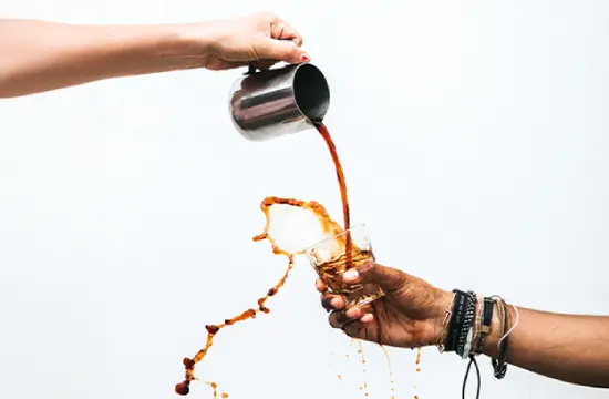
  • Engaging imagery: Action images combined with circular team member photos add personal touches fostering connection.
  • Interactive buttons: The “Meet our team” button entices further interaction and exploration.

Typography and accessibility

  • Contrasting fonts: A bold font for the header and a simpler one for descriptions enhance clarity and readability.
  • High contrast: Clear contrast between text and background promotes accessibility, making information effortlessly digestible for everyone.

Unique design features

  • Visual interest: A captivating narrative is shaped by contrasting a bold header with subtler text.
  • Responsive layout: Adapts smoothly to mobile screens providing seamless experiences across devices.
  • Ample white space: Strategic use of white space avoids clutter promoting balance, allowing vital elements to shine.

Why choose our hero banner design?

This hero banner isn’t just a visual treat but a smart tool for boosting visitor interaction. Perfect for design studios or any brand aiming to highlight their identity, this layout focuses on conveying essential messages with flair. Begin enhancing your WordPress website with our captivating hero banner design today!

10 types of websites to use this hero banner

  1. Design studios: Present your design projects and team with striking visuals and cohesive messaging, connecting instantly with clients.
  2. Portfolio sites: Showcase your creative work in an elegant, focused manner that draws visitors into your unique narrative.
  3. Online shops: Highlight products with clean, engaging hero banners that guide users swiftly to purchase decisions.
  4. Blogs: Keep your content front and centre with engaging hero images that set the tone and theme for your posts.
  5. Event pages: Entice attendees with event highlights and vibrant visuals, creating buzz from the very first click.
  6. Corporate sites: Reinforce your brand’s professionalism through clean layouts that align with your corporate identity.
  7. Non-profit sites: Share impactful stories and calls to action that inspire support and community involvement.
  8. Travel blogs: Take readers on a visual journey with stunning hero images displaying destinations and adventures.
  9. Educational websites: Feature clear, approachable hero images that welcome students into an engaging learning environment.
  10. Personal websites: Introduce yourself or a personal brand with a compelling hero banner that leaves a lasting impression.

10 ways to make the hero banner your own

  1. Personalized imagery: Use tailored images that reflect your brand personality and connect deeply with your audience.
  2. Custom typography: Choose fonts that echo your brand’s voice, ensuring they are both readable and aesthetically pleasing.
  3. Interactive elements: Incorporate buttons and hover effects to invite user interaction and exploration within the banner.
  4. Animation: Introduce subtle animations to grab attention while maintaining a sophisticated look.
  5. Colour schemes: Select colours that harmonize with your brand identity and evoke the desired emotional response from viewers.
  6. Call to action: Embed compelling calls to action that guide users towards desired actions on your site.
  7. Background videos: Utilize dynamic video backgrounds to create visually engaging atmospheres that tell a story.
  8. Brand storytelling: Craft narratives within your banner that align seamlessly with your overall brand message.
  9. Social proof: Highlight testimonials or client logos, fostering trust and community connection.
  10. User-generated content: Feature content from loyal customers to highlight real-world applications and experiences.

Conclusion

Embrace the potential of a modern hero banner design on your WordPress website design. Not only does it elevate your site’s aesthetic appeal, but it strategically enhances user engagement. Our hero banner design is versatile across numerous site types, with countless customization options to suit your brand’s unique vibe. Whether you want to explore WordPress website builder solutions or seek Elementor Alternatives, step up your WordPress website with our imaginative hero banner design today. Dive into designing with freedom and creativity, ensuring your first impression truly matters.

You may also like