Discover the perfect hero banner design for your WordPress site
Original Design Overview
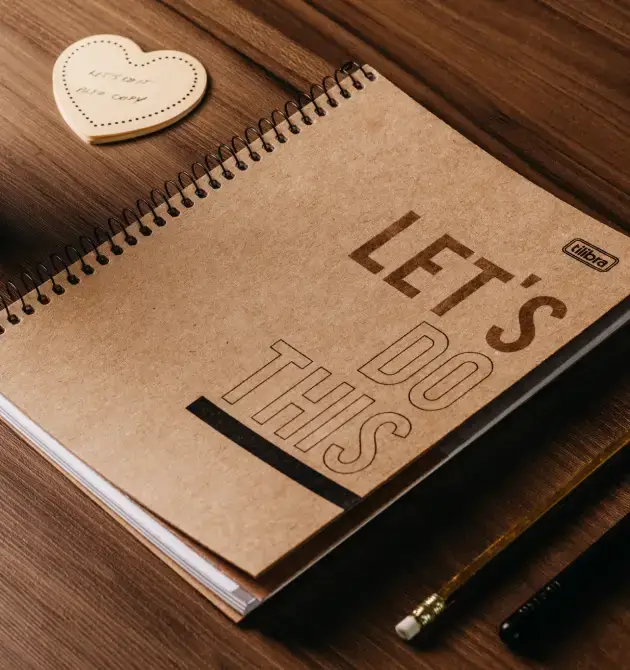
Imagine a stunning hero banner that captivates your visitors from the moment they land on your site. This design is built on a striking two-column layout that perfectly blends visuals and text. The left column showcases an inviting image featuring a notebook and pen, designed to spark curiosity. On the right, there’s a vibrant portrait of a person with a camera, paired with messaging that tells your story effortlessly.
Layout Analysis
- Structure: This two-column format effectively balances imagery and text, engaging viewers immediately.
- Arrangement: The asymmetrical layout creates dynamic visual appeal, drawing the eye naturally between the compelling images and text.
Element and Feature Description
- Headers: A bold title, “The story behind our company,” grabs attention.
- Text Blocks: Well-crafted paragraphs elaborate on your mission and values, accompanying the header.
- Images: Eye-catching visuals like a notebook and a person with a camera enrich the storytelling experience.
- Button: An inviting “Read more” button encourages deeper content exploration.
- Interactive Elements: The button serves as a focal point for user interaction.
- Typography: A mix of bold headings and easy-to-read body text provides clarity and emphasis.
Unique Design Aspects
- Standout Design Choices: A playful font for “story” and the asymmetrical layout contribute to a memorable first impression.
- Responsive Design: The two-column setup adjusts smoothly for smaller screens, ensuring user-friendly experiences.
- Accessibility Considerations: Clear headers and contrasting text enhance accessibility for all visitors.
Overall Design Style
- Design Style Category: This design features a blend of modern elegance and personal warmth, inviting connections with your brand.
- Visual Hierarchy: Elements are thoughtfully placed to guide viewers from the title to descriptive text effortlessly.
- White Space: Generous use of white space ensures a balanced, uncluttered look.
10 Types of Websites to Use This Hero Banner
1. Portfolio Websites
A hero banner with strong visuals and a clear story is perfect for [portfolio websites](https://maxiblocks.com/wordpress-websites/wordpress-templates/). Highlight your best work with inviting images and compelling text to attract potential clients or collaborators.
2. Personal Blogs
Engage readers right from the start by using a hero banner that tells your blog’s story. Combine personal images with an inviting “Read More” button to guide them into your world.
3. E-Commerce Sites
Capture the interest of shoppers with a captivating hero banner. Showcase your best products with enticing visuals and clear call-to-action buttons to improve conversion rates.
4. Travel Blogs
Use a hero banner to invoke wanderlust by featuring breathtaking travel imagery and enticing descriptions. Inspire readers to follow your adventures and explore the world.
5. Business Websites
Introduce your company effectively by using a hero banner that highlights your values and mission. Clear text and strong imagery help in making a professional first impression.
6. Non-Profit Websites
Communicate your cause and inspire action using a hero banner. Combine emotive images with a strong call to action to encourage donations and volunteer support.
7. Educational Websites
Engage students and educators alike with a hero banner that outlines your educational offerings, paired with relevant visuals to enhance learning experiences.
8. Restaurant Websites
Entice food lovers by featuring mouth-watering images and key information about your restaurant in your hero banner, combined with an easy reservation or menu access button.
9. Event Websites
Promote upcoming events with a visually appealing hero banner that includes event details and an easy-to-find registration button, ensuring a smooth visitor experience.
10. Tech Startups
Present your innovative solutions and cutting-edge technology with a hero banner. Use modern aesthetics and concise text to capture interest and explain your vision.
10 Ways to Make the Hero Banner Your Own
1. Personalise the Imagery
Choose images that are specific to your brand or story. By selecting visuals that speak directly to your audience, you increase the connection and make the hero image website more authentic.
2. Add Unique Typography
Experiment with different fonts to find the best fit for your message. Typography can drastically change how your hero banner appears, making it stand out even more.
3. Include Video Elements
Enhance your banner with video content instead of still images. An animated hero image can captivate viewers and present complex stories in a dynamic way.
4. Adjust Colour Schemes
Align the colour palette of your hero banner with your brand’s overall appearance. This consistency helps in reinforcing brand identity and creating a standout impression.
5. Use Parallax Effects
Introduce depth to your website hero image using parallax scrolling. This trendy technique creates an engaging, interactive experience that can draw visitors in.
6. Optimise for Mobile
Make sure your hero banner is fully responsive for a seamless mobile experience. Adapt images and text to maintain your design integrity on all devices.
7. Experiment with Button Styles
Switch up the look of your call-to-action buttons. Change their shape, colour, or hover effects to catch the visitor’s eye and drive more conversions.
8. Feature High-Resolution Images
Use high-quality visuals to make your banner crisp and appealing. Optimised images give an impression of professionalism and ensure quick loading times.
9. Introduce Storytelling Elements
Incorporate text that guides the viewer through your story in the banner. Highlight key points and narrative arcs that align with your brand’s mission.
10. Make it Interactive
Implement interactive elements such as clickable areas or sliders to engage users more deeply with your hero banner content, enhancing user experience.
Conclusion
Transform your WordPress website with an engaging hero banner. By incorporating strategic design elements like powerful images, bold typography, and interactive features, you can craft a memorable user experience that speaks to the heart of your brand’s story. Whether you’re running a business site or a personal blog, these design choices will help you make a lasting impression. For those looking to refine their WordPress website design, implementing these hero banner strategies is key to captivating your audience from the very first click.


