Committed to people, committed to the future
Donec nec justo eget felis facilisis fermentum. Aliquam porttitor mauris sit amet orci. Aenean dignissim pellentesque felis.

Build WordPress sites with MaxiBlocks. All features free forever. No locked functionality. Optional Cloud Library saves you 10+ hours per project. Start free

Donec nec justo eget felis facilisis fermentum. Aliquam porttitor mauris sit amet orci. Aenean dignissim pellentesque felis.
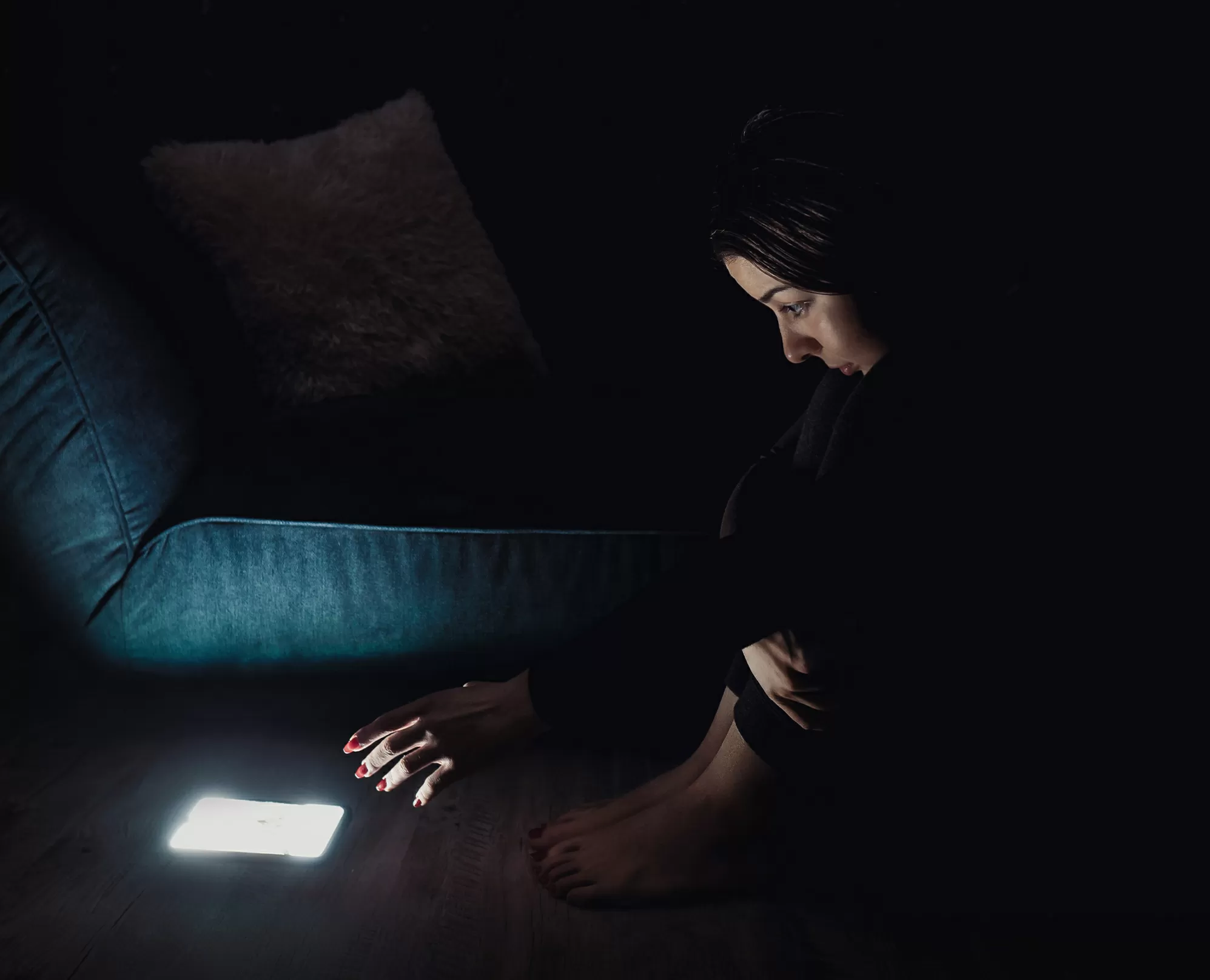
Unleash the power of visual storytelling with our striking hero banner design! Picture this: on the left, an evocative image of a person engaged with a smartphone in a low-light environment, capturing feelings of focus and reflection. This powerful imagery creates an emotional connection that is sure to draw in your audience.
Capture the spirit of innovation with our WordPress website hero banner design. The image of a tech-savvy individual in a focused state of reflection is perfect for highlighting your latest app or software solution. Complement this with clear, direct messaging on the right, inviting users to learn more or view introductory videos. This setup emphasises your commitment to cutting-edge technology and human-centric design.
For platforms offering courses like coding or design, the hero banner can serve as an engaging introduction. The image conveys a sense of learning and focus, drawing potential students in. The strong messaging communicates your commitment to education, with buttons that link to course details or interactive demos. This is a great fit for sites using WordPress website builders to craft their educational environments.
Showcase your work and unique creative process with this vivid, engaging design. The image can be a masterpiece from your collection, setting a mood that aligns with your style. The text invites potential clients to explore more or view a highlight reel through beautifully interactive buttons. This layout is perfect for merging visual allure with WordPress webdesign creativity.
Use this hero banner to underscore your agency’s focus on connection and innovation. The engaging image reflects your expertise in reaching audiences, while the bold, clear text elaborates on services and unique benefits. The clean, modern aesthetic of free WordPress themes shines through, allowing you to present a cutting-edge digital presence.
Ideal for platforms focusing on tech-based health solutions, this hero banner depicts technology’s role in personal wellness. The left-hand imagery conveys calm and focus, while the text offers a gateway to resources and videos on your wellness services. Perfect for sites leveraging Gutenberg blocks for engaging content delivery.
The hero banner effectively draws viewers into the online shopping experience. An engaging image depicting lifestyle products sets a tone, while responsive buttons guide visitors to special offers or new arrivals. This is an adaptable element for the AI website builder features that enhance user interaction and experience.
A corporate blog can benefit from this professional yet engaging hero banner setup. The image reflects insightful thought leadership, while the right-side text previews key articles or webinars. Promote your blog’s unique voice using WordPress block themes to enhance readability and interaction.
Transport visitors instantly into a captivating journey. Use an expressive hero image that highlights exploration and adventure, paired with text inviting users to learn more about specific destinations or lifestyle tips. The layout supports a rich narrative style suited to WordPress website designs that thrive on storytelling.
The hero banner is an ideal focal point for creative enterprises showcasing their portfolio. The image highlights creativity and engagement, with informative, action-oriented text guiding visitors further into your site. This design lends itself well to sites using Elementor Alternatives for enhanced customisation.
Engage supporters through a powerful introductory hero banner demonstrating your mission’s impact. Use an image that conveys empathy or community, paired with clear, actionable text that encourages involvement. This design shines on a WordPress site emphasising community engagement and support.
Start by choosing images that resonate with your brand’s message. Whether it’s a poignant photograph or an abstract design, the chosen picture should clearly engage viewers from the outset. Opt for high-resolution hero images that demonstrate your brand’s core values, providing an immediate visual impact that captures attention while aligning seamlessly with your site’s theme.
Experimenting with different fonts and sizes can greatly impact readability and mood. Consider using bold, modern sans-serif fonts for a clean look, or opt for serif fonts if you want to project a more traditional, authoritative image. Focus on ensuring that the typography is clear and aligns with your overall brand identity.
Enhance user engagement by incorporating interactive elements like hover effects or animation in your buttons. This doesn’t have to be overdone-sometimes a subtle animated effect when hovering over buttons can make a key difference in how users interact with your site, transforming a static design into a dynamic user experience.
Replacing or complementing static images with video can enhance engagement. A short video loop on autoplay might capture a user’s attention better and succinctly tell your brand story. Ensure your video content is as captivating and focused as a photograph would be, keeping it concise to maintain fast load times on your WordPress website.
Your call-to-action buttons are vital in driving user interaction. Experiment with different placement, sizes, and colours to find what influences clicks most effectively. A/B testing can pinpoint the best approach for motivating users to act, whether it’s signing up, learning more, or making a purchase.
Weave your brand’s colour palette throughout the hero banner to reinforce brand identity. Consistent colour schemes across all web design elements build visual unity and enhance user experience by becoming instantly recognisable and familiar with visitors.
The tone of the text within your hero banner should mirror the overall tone of your site and brand ethos. Whether employing formal language for corporate clients or a casual tone for lifestyle brands, aligning text with brand identity enhances authenticity and enhances engagement.
Incorporate elements like shapes or patterns to create a more visually layered look within your banner. Lines or frames can guide the eye towards important information, adding an extra dimension to your banner while reinforcing the design structure.
Ensure your design is inclusive, allowing all potential visitors to engage meaningfully. High contrast ratios and legible fonts ensure readability, while alternative text descriptions for images improve navigation for users relying on assistive technology.
Seamless customisation across device types is essential in today’s mobile-first world. Test your hero banner’s adaptability on different screens to guarantee that your design maintains its appeal across devices, using responsive hero banners on a responsive WordPress design framework.
Elevate your site with a hero banner design that masterfully blends an engaging image and clear text. With its high contrast, modern minimalistic style, and emphasis on accessibility, this layout is perfect for communicating powerful themes of connection and innovation. For those aiming to revolutionise their WordPress website design, this banner integrates seamlessly with any theme, proving its value across industries. Don’t wait-transform your WordPress website today!
