

Build WordPress sites with MaxiBlocks. All features free forever. No locked functionality. Optional Cloud Library saves you 10+ hours per project. Start free


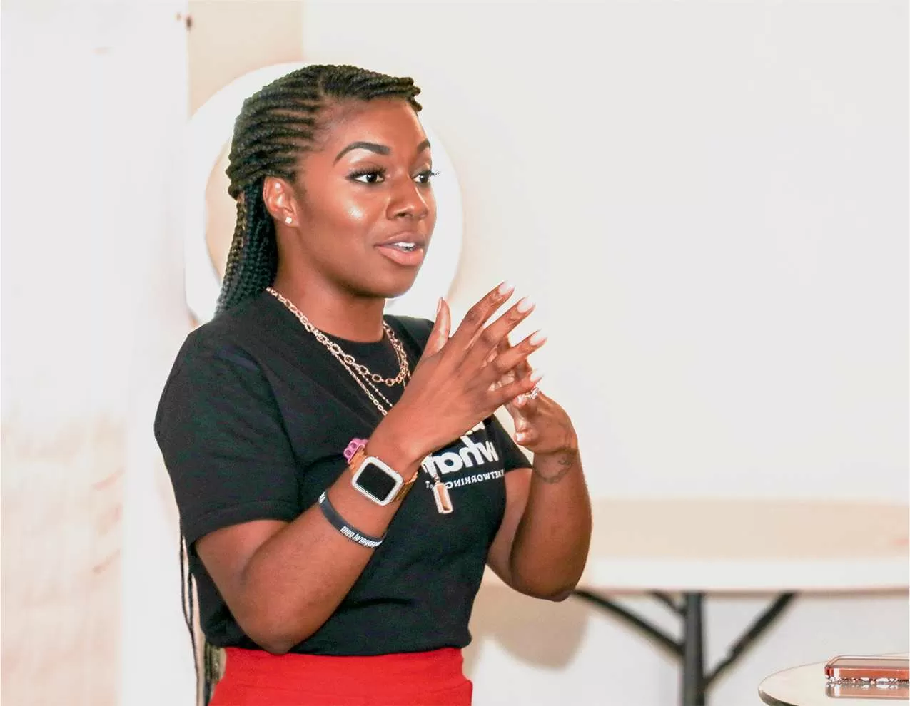
Visualise a modern, multi-column hero banner that easily captures attention and engages your visitors. This design has a clever two-column layout: the left side highlights vibrant images of your event speakers and participants, while the right side presents crucial event details and bold call-to-action buttons.
Unveil your new product with a hero banner that highlights its features and benefits. With a captivating hero image and a powerful call-to-action, you can entice potential customers to explore more about your release. Using bold headers and crisp, clear copy, communicate the unique selling points and encourage visitors to make a purchase or sign up for exclusive early access. This setup ensures your product launch stands out, maximising visibility and engagement from the get-go.
Use your hero banner to deliver important company news efficiently. Whether it’s a merger, a significant hire, or a new partnership, a well-designed banner can convey the message effectively. The dual column layout can pair an official statement with relevant images or a video, reinforcing the announcement’s impact. This setup not only attracts attention but also ensures that your key messages are understood at first glance.
Promote your upcoming webinars with a banner design that details the agenda, speakers, and how to participate. Use high-resolution images of your key speakers next to engaging text that outlines the benefits of attending. By incorporating interactive buttons such as “Register Now” or “View Details”, you invite your audience to engage directly, driving both awareness and sign-ups for your events.
Set the stage for your annual conference with a hero banner that showcases keynote speakers and key themes. Use striking visuals and concise copy to highlight what makes your event unmissable. The design should facilitate a seamless journey from interest to registration, with bold calls to action and quick links to secure their spots, ensuring your event attracts the audience it deserves.
Boost your online store’s visibility with seasonal promotions highlighted using a hero banner. Utilize compelling product images alongside offers or discounts to capture customer interest. Effective calls-to-action can lead customers directly to the featured product pages, encouraging impulse buys and increasing sales volumes. An attractive, limited-time offer banner is just what you need to catch and convert visitors during peak shopping periods.
Generate interest in your latest content by featuring it on a hero banner. This not only keeps your content fresh and engaging but draws additional traffic to important blog posts. The banner should briefly summarize the content while an interactive button invites readers to dive deeper. This approach ensures that your top-tier content receives the attention and readership it deserves, extending its reach and impact.
Artists and freelancers can effectively use hero banners to showcase their portfolios. With high-resolution images of past projects and client testimonials, these banners can bridge the gap between visitor curiosity and client acquisition. Highlight key projects with a brief description of your work, drawing in potential clients who admire your style and approach. It’s all about showcasing your unique offerings where they’re most visible.
Feature your latest courses with a hero banner that emphasises the value and benefits they offer. Combining an engaging hero image with key course details helps captivate potential students. Complement with interactive buttons that drive enrollment, ensuring an increase in course participation. This method not only spreads the word about your educational offerings but encourages immediate action from those on the lookout for knowledge.
Hero banners are an efficient way to spotlight your non-profit campaigns, driving awareness, support, and engagement. Use compelling images and impactful copy to tell the story of your cause, encouraging people to participate in or donate to your mission. Inspire your audience with a moving call-to-action that nudges them to make a difference today, ensuring your efforts reach and motivate the wider public.
Enhance brand recognition through a hero banner that resonates with your corporate identity and values. This becomes a strategic way to reinforce your company’s narrative and position in the market. Well-chosen visuals and succinct messaging can explain why your brand is the top choice. Capture user interest with a strong call-to-action that aligns with your business goals, fostering a closer connection between you and your target audience.
Take advantage of the calendar to run seasonal promotions using your hero banner. Add striking images and bold calls to action to draw in those browsing for deals. This approach not only increases sales but also boosts customer retention, by offering timely value and reminding existing customers why they should return.
Refine your approach by conducting A/B testing with different hero banners. Test variations in image choice, messaging, and call-to-action placement to evaluate what attracts your audience most effectively. Using these insights, optimise your banners to align with audience preferences, ultimately increasing conversions and engagement levels.
Enhance storytelling with dynamic video backgrounds in your hero banner. A short clip can transport visitors into the heart of your brand story or convey profound insights, making a lasting impression. Use a concise, engaging call-to-action button to lead viewers to the desired action after making your impact.
Boost trust through real customer testimonials in your hero banner. Genuine feedback from satisfied clients can convince potential customers of your brand’s worth. Coupled with eye-catching design, these words can drive conversions by reassuring visitors about the value they’re about to experience.
Capture urgency with countdown timers embedded in your hero banner for limited-time offers. This enhances the impulse to act immediately before time runs out, consequently raising conversion rates. Visitors are more likely to take swift action when realising the opportunity is fleeting.
Embrace simplicity with a minimalistic hero banner design that maximises whitespace and sharpens focus on your key messages. This style fosters a calm, focused viewing experience, allowing your core calls-to-action to shine through without distraction.
Build credibility by displaying a row of well-known client logos within your hero banner. This communicates reliability and trustworthiness, crucial for prospective customers on the verge of making a buying decision. Make an immediate visual impact by aligning these logos with your brand’s visual style.
Experiment with bold typography in your hero banner to create a striking first visual impact. Provocative headlines, when paired with powerful images, can immediately engage your audience. Typography is a key element in drawing attention and effectively communicating your core messages at a glance.
Add dynamism by integrating social media feeds directly into your hero banner. Keep content fresh and engaging while encouraging visitors to connect and interact with your brand’s social media presence, fostering a robust community engagement experience that aligns with your digital marketing strategy.
Ensure seamless user experiences by optimising hero banners for mobile platforms. With more people browsing via mobile, it’s crucial that your banners maintain their aesthetic and function across all screen sizes. Responsive designs will cater to all users, ensuring you don’t miss out on interactions or conversions.
This captivating hero banner design doesn’t just impress visually; it’s engineered for maximum user engagement. By integrating interactive elements, maintaining a strong visual hierarchy, and deploying a responsive layout, it’s perfectly suited for marketing your next event or campaign. Enhance your event promotion strategy today and witness your engagement metrics soar. WordPress website design offers endless possibilities; don’t miss out on elevating your message and capturing audience attention with precision and flair!
