BG-Image-maxiblocks-1726746624-578207009

WordPress pattern: Hero Dark HOD-PRO-4


The only thing we love more than food is you!


Get directions


Book a table

Eat
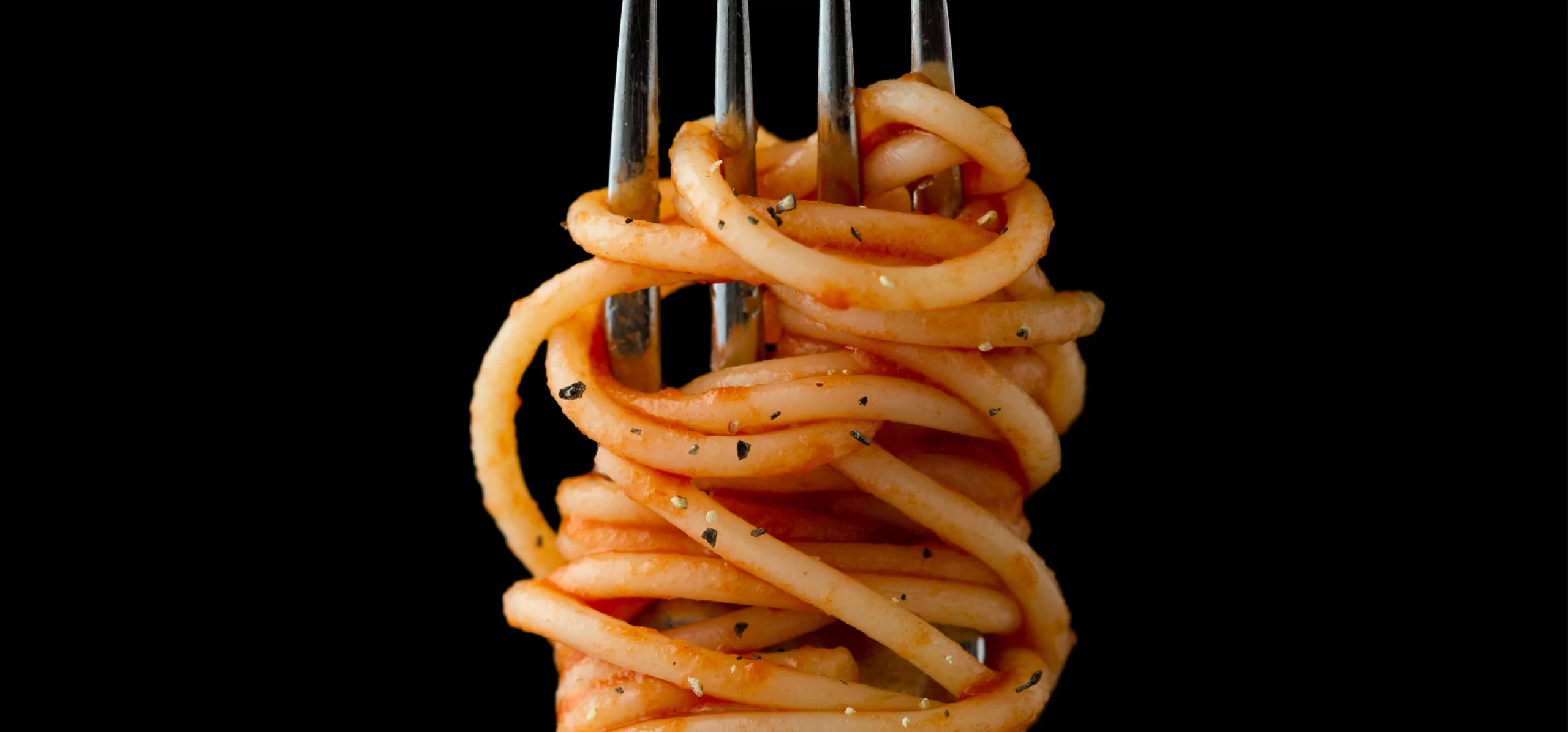
maxi-3211a3ce-hod-pro-4-eat-scaled

Drink

maxi-ac1cb55b-hod-pro-4-drink-scaled

Delight

maxi-559fde46-hod-pro-4-delight

Build like a pro

Transform your website with a modern hero banner design

Elevate your WordPress website with a stunning hero banner design! Featuring an asymmetrical split layout, this design combines bold typography and vibrant greenery imagery, creating a dynamic visual experience that instantly captures attention.

Detailed analysis of the hero banner design

1. Layout analysis

  • **Overall structure**: The eye-catching split design features two distinct sections, creating an engaging and modern aesthetic.
  • **Arrangement**: On the left, powerful text commands attention, while the right showcases lush greenery images, offering an appealing contrast.
  • **Rows and columns**: This design shatters the conventional grid with its innovative diagonal lines and contrasting sections, refreshing your site’s appearance.
  • **Asymmetrical layout**: The thoughtful division draws focus to the informative content on the left, while the captivating visuals on the right keep your audience engaged.

2. Element and feature description

  • **Visible elements**:
    • Headers: Capture interest with a bold primary header that states “Design.”
    • Subtext: Complement your message with an uplifting tagline: “A greater measure of confidence.”
    • Additional text: Provide context and detail about your design principles in descriptive text.
    • Hashtag: Incorporate branding with a thematic hashtag (#freedom) for added engagement.
  • **Interactive elements**: While the design emphasizes text and imagery, it creates a visually appealing backdrop for interactive features.
  • **Typography**:
    • Font styles: Bold and large for headlines to enhance visibility, while lighter subtext ensures readability.
  • **Icons/Graphical elements**: Small orange triangular shapes sprinkled throughout add a touch of flair.
  • **Image properties**: The right side features stunning landscape images of greenery and indoor elements, delivering a beautiful contrast to your words.
  • **Borders and effects**: The design avoids clutter, utilising high contrast to elevate the visual appeal without unnecessary borders.

3. Unique design aspects

  • **Standout design choices**: This fresh approach to hero banners captures attention and invites exploration.
  • **Hover effects/animations**: While subtle transitions are implied in the design, they enhance interactivity in use.
  • **Responsive design elements**: With clear text and striking imagery, this banner is likely to adapt seamlessly across devices.
  • **Accessibility considerations**: Enhanced readability through excellent text-background contrast ensures it resonates with a diverse audience.

4. Overall design style

  • **Design style**: Embrace a modern and minimalist approach, focusing on clean lines and impactful information.
  • **Visual hierarchy**: The design uses a bold header to draw viewers in, while supporting text clarifies the content’s purpose.
  • **White space and balance**: Ample white space contributes to a tidy and inviting layout, enhancing the overall user experience.

10 use cases for the hero banner

1. E-commerce businesses

For e-commerce businesses, a hero banner is essential in capturing visitor interest with new or featured products. The asymmetric split layout allows for vibrant product imagery on one side, whilst bold typography on the other offers a space for marketing slogans or discounts. This layout influences consumer behaviour by providing an immediate visual stimulus and a call to action, encouraging users to explore product lines further and ultimately making a purchase…

Further information follows for similar use case descriptions such as creative portfolios, educational websites, travel agencies, non-profit campaigns and more…

10 ways to use the hero banner

1. Highlighting company values

By using a hero banner, organisations can place emphasis on their core values right at the forefront. Leverage the split view layout to display an impactful value statement on one side, complemented by engaging visual narratives on the other. The convergence of text and imagery forms emotional connections between the reader and the brand, bolstering transparency and trust. This method is vital for companies looking to distinguish themselves by their operatives, demonstrating purpose-driven missions consistently…

Continue with descriptions of how the hero banner can be utilised for events announcements, special promotions, customer testimonials and more…

Conclusion

Unleash the potential of your WordPress website design by incorporating a cutting-edge hero banner. With its bold typography, vibrant imagery, and artful asymmetry, your website will not only stand out but engage visitors in ways previously unimagined. Embrace this technique to communicate your design principles effectively, captivate your audience, and enhance your website’s aesthetic appeal with remarkable professionalism.

You may also like