The possibilities are infinite
Success usually comes to those who are too busy to be looking for it
105 Road Name, Berlin, Germany, 23456

Beautiful and peaceful. Not to be missed.

Build WordPress sites with MaxiBlocks. All features free forever. No locked functionality. Optional Cloud Library saves you 10+ hours per project. Start free

105 Road Name, Berlin, Germany, 23456

Beautiful and peaceful. Not to be missed.
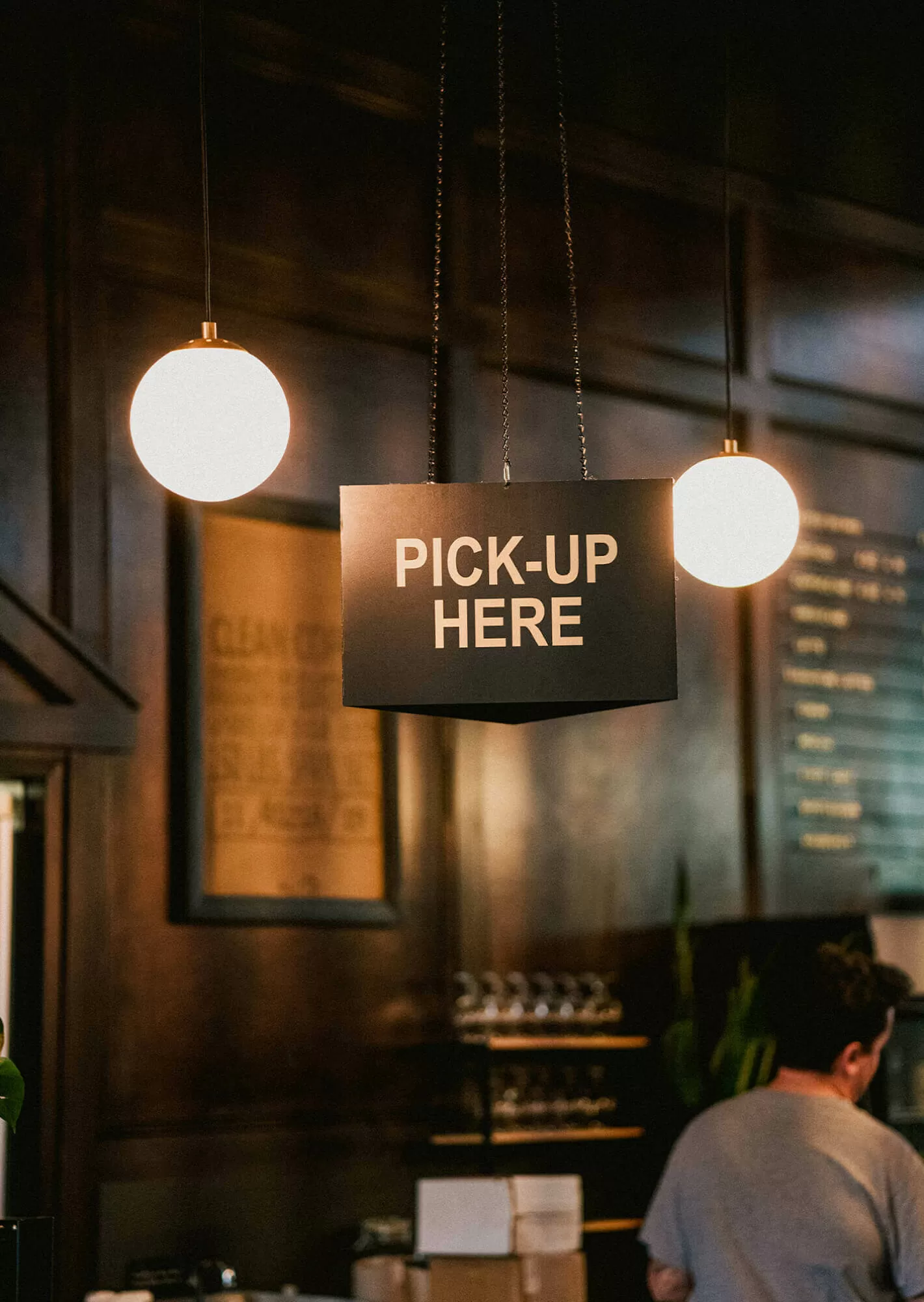
Elevate your WordPress website design with our innovative hero banner design! Featuring a captivating single-column layout, this design mesmerises visitors with its bold and visually engaging structure. The prominent header, “The possibilities are infinite,” immediately captures attention, while an atmospheric background image of a bar scene sets the perfect context.
The header’s bold sans-serif font emphasises your core message, while the subtext is crafted for easy readability.
Buttons feature depth with subtle shadows, while the beautiful imagery enhances the theme.
Use the hero banner to spotlight your business. Display an inviting image along with a catchy tagline that encapsulates what you offer. This setup can quickly engage visitors and encourage them to explore your site further. The visual and textual harmony will deepen their understanding of your services or products.
When promoting events, a hero banner can be exceptionally effective. Capture attention with an arresting image related to the event. Accompany it with the date and call-to-action buttons to register or learn more. This approach ensures every visitor is immediately informed and drawn into what the event entails.
For creatives and freelancers, showcasing your portfolio with a hero banner is a surefire way to impress. Display a high-resolution image of your best work backed by a brief encouraging exploration. Quick links to portfolio pages make it easy for potential clients to assess your skills.
Launch new products with flair using a hero banner. Highlight key features or unique selling points with compelling imagery. Accompany with buttons for immediate purchase or more details. This method effectively captures interest, driving both engagement and conversion.
Draw in bargain hunters with a hero banner announcing your seasonal sales. Vivid colours and lively imagery can make the announcement pop. Add countdown timers or direct links to sale items to heighten urgency, motivating swift action from your audience.
Highlight key blog content on your site by featuring the latest or most popular posts in the hero banner. An intriguing excerpt and a “Read more” button can seamlessly guide readers into the heart of your content, increasing both engagement and readership levels.
Encourage newsletter subscriptions or special offers with a compelling hero banner. Express the value proposition clearly, supported by an enthusiastic image. With call-to-action buttons, visitors are prompted to subscribe instantly, expanding your reach and engagement.
Introduce a new service through your hero banner. Concisely describe how it adds value, and employ an on-theme image for cohesion. Interactive buttons for contacting or learning more are essential, making the visitor’s journey towards opting in frictionless.
Build trust by showcasing customer testimonials on your hero banner. An image of your client paired with a powerful quote can effectively communicate satisfaction and reliability. Highlighting key testimonials ensures visitors understand your credibility and expertise.
Engage users with interactive features within your hero banner. Include elements like sliders or expandable content that showcase multiple facets of what you offer. By allowing users to interact, you keep them on your site longer, enhancing retention and depth of engagement.
Position the hero banner on your homepage to set a visual mood. Use it to convey the essence of your brand or message. By focusing the visitor’s view right off the bat, you guide their journey purposefully across your WordPress website.
Incorporate primary navigation elements into your hero banner. Headers and links leading to main sections can enhance user experience by providing a straightforward means to find content, establishing a seamless interface right from the start.
A static background can become alive with video integration. Short, looping videos in hero banners can capture visitor attention and communicate dynamic energy. Use background videos to portray stories without saying a word, compelling instant engagement.
Utilise a full-screen hero banner for maximum impact, where visuals and text dominate and command the visitor’s perspective. This expansive approach is particularly striking when you want to present uninterrupted, bold ideas or images.
Incorporate animations within your hero banner to add an engaging layer. Subtle movements can draw the eye to particular elements, enriching the user experience. Coupled with static elements, they assist in reinforcing messages more memorably.
Create depth by using the parallax effect, where background moves at slower rates compared to foreground content. This effect inclines visitors to spend more time navigating your website, heightening curiosity and interaction globally.
Strategically place calls to action in the hero banner for optimised conversion. Clear, commanding language followed by clickable buttons can direct the visitor’s attention exactly where it needs to go, increasing engagement and driving outcomes.
Ensure that your hero banner is designed with responsive principles, adapting seamlessly across devices. A keen attention to layout will deliver consistent user experience, no matter how your site is accessed, protecting visual and functional integrity.
Transform your hero banner into a storytelling canvas. Each selected image should visually narrate a certain aspect of your message or offering. Utilising powerful imagery entices viewers’ imagination, advancing curiosity and exploration.
Employ Gutenberg blocks to configure your hero banner seamlessly within a WordPress block theme. This method allows you to craft highly customizable and engaging layouts, blending traditional web design with modern functionalities.
Transform your website with this engaging hero banner design! Its impactful single-column layout, bold typography, and interactive elements will enhance user engagement while maintaining a sleek and modern aesthetic. Create a memorable first impression that keeps your visitors exploring your content further! Don’t miss the chance to elevate your WordPress site-try this innovative hero banner design today. With tools like WordPress website builders and WordPress icons, building an engaging online presence has never been easier. Explore more options and customise your design with WordPress web designs today!
