Let’s make things better
Lorem ipsum dolor sit amet, consectetuer adipiscing elit. Donec odio. Quisque volutpat mattis eros.
Innovation & excellence
Lorem ipsum dolor sit sectetuer elit.
Expanding possibilities
Lorem ipsum dolor sit sectetuer elit.


Build WordPress sites with MaxiBlocks. All features free forever. No locked functionality. Optional Cloud Library saves you 10+ hours per project. Start free
Lorem ipsum dolor sit amet, consectetuer adipiscing elit. Donec odio. Quisque volutpat mattis eros.
Innovation & excellence
Lorem ipsum dolor sit sectetuer elit.
Expanding possibilities
Lorem ipsum dolor sit sectetuer elit.

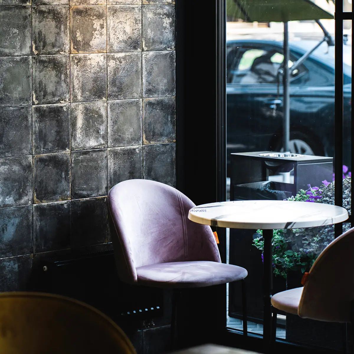
Imagine a hero banner that grabs attention with a dynamic and minimalist design. Its asymmetrical layout perfectly balances engaging text on the left and a striking café or workspace image on the right, creating a warm and inviting atmosphere. This blend is perfect for making your message stand out.
Showcase your creative work with a WordPress website using a stunning hero banner. A fullscreen hero banner can highlight your best work while introducing yourself or your brand to potential clients. Use captivating imagery and engaging text to make a memorable first impression. Consider adding interactive elements like portfolio filters or a “View Work” call-to-action. Whether you’re a photographer, designer, or artist, a well-designed hero banner can visually narrate your story, attracting clients and showcasing your talent effectively.
A hero banner is invaluable for event promotion. For instance, a festival or seminar website can use a large hero image to relay the event’s essence. Incorporate a countdown timer and an eye-catching call-to-action button for ticket purchases. The hero banner’s visual appeal conveys excitement and urgency, drawing visitors in and encouraging them to participate or buy tickets.
Use a hero banner on your WordPress website to spotlight product launches or sales events. Highlight special offers or showcase best-sellers with an attractive call-to-action like “Shop Now”. Include high-resolution product images to create a desire for purchase. The fullscreen hero banner makes the buying process intuitive and visually compelling, driving conversions higher for your online store.
Hero banners can effectively drive attention to a cause or campaign. Utilize powerful imagery and striking text to tell meaningful stories and provoke emotional responses. Encourage donations or volunteer participation with a clear call-to-action button. This compelling visual storytelling can bolster engagement and support for your non-profit’s objectives.
Introduce your company through a hero banner, creating an engaging first impression with prospective clients or partners. Use clean designs, icons, and powerful headers to communicate key messages. Incorporate a video or moving graphics for a dynamic effect, which can narratively tell your company story or showcase your offerings effectively.
A hero banner on a blog can highlight featured articles, popular categories, or a captivating blog image. This draws blog readers in, ensuring key content isn’t missed. Enhance user interaction by incorporating a carousel or sliders, urging readers to delve deeper into your posts. This can elevate a blog from typical to memorable, molding reader’s experiences.
For SaaS websites, a hero banner can effectively communicate product essence or benefits. Highlight key features using a minimalistic hero banner. Interactive elements can provide short demo videos. A clear call-to-action like “Start Your Free Trial” can help in converting potential customers by providing visual satisfaction along with content.
Travel agencies can engage potential travellers with vibrant destination images. Use a hero image carousel displaying stunning vistas and experiences. Add interactive features like booking widgets or search filters, allowing users to initiate the booking process directly from the hero banner. This turns the visitor’s journey of inspiration into actionable steps toward their dream vacation.
For restaurants, hero banners can showcase appetising images that entice customers to visit. Use high-resolution food photography and engaging visuals to convey the essence of your cuisine. Integrate a table reservation system within the banner to ensure diners can conveniently book their next meal, maximizing the impact of visual temptation through immediate engagement.
Educational websites can benefit from hero banners highlighting courses or educational achievements. Create urgency with a “Register Now” call-to-action and visually separate different courses or subjects using dynamic hero images. This enhances the platform’s credibility, displaying an organised and professional learning environment to potential students.
Use hero banners to accentuate seasonal sales or special promotions prominently. Change your website’s hero image seasonally or during special holiday sales to stay updated and engage users with minimal efforts. Including a countdown timer fosters a sense of urgency, enticing visitors to act quickly and partake in time-sensitive deals. This method can significantly boost sales by making offers visible and compelling with an attractive banner presentation.
A hero banner provides an ideal platform to introduce new products or services dynamically. Employ bold typography and compelling imagery to showcase new launches. By instantly capturing user attention with appealing visuals, feature key details like launch dates or exclusive benefits to drive curiosity and engagement. Integrate a direct “Discover More” button for seamless navigation to product pages.
Demonstrate your brand’s values and ethos through an evocative hero banner. Use impactful images or video backgrounds to visualise your brand story, aligning with your strategic message. Bold headlines summarising core values can engage the audience and evoke emotional connections, helping to shape lasting brand impressions and attract customer loyalty by visually embedding your values in their memory.
Turn your hero banner into an interactive space showcasing customer testimonials or reviews. Let users see real-world satisfaction through rotating endorsements, reinforcing brand credibility. Pair testimonials with engaging customer scenario images to ensure authenticity and engage viewers. Direct users to discover more testimonials by embedding “Read More” links, improving customer confidence and trust.
Maximise newsletter signups with a strategically designed hero banner. A prominent call-to-action enticing visitors to join your community can drive engagement. Use a simple form or link within the hero area to invite newsletter readers effectively. Highlight exclusive content, offers, or updates they’ll receive by joining to enhance appeal, turning your hero banner into a responsive lead-capture tool.
Hero banners serve as a powerful tool for highlighting fundraising campaigns. Utilize persuasive visuals and strong call-to-action buttons encouraging donations or participation. Vibrant images or video clips related to the cause can evoke an emotional response. This approach directly communicates urgency and empathy, effectively driving support and involvement in fundraising efforts while enhancing narrative connection through impactful visual presentation.
Introduce key team members or leadership figures with a personalised hero banner. Use professional but inviting images, paired with brief biographies to create a sense of connection for your website visitors. Links directing users to full profiles or LinkedIn pages encourage deeper engagement. This adds a human touch, highlighting the faces behind your brand ethos.
Direct visitors to popular or trending sections of your website through a hero banner. Highlight key categories, blog posts, or product pages with enticing visuals and succinct headlines. Dropdown options or carousel features can house multiple sections within the banner, enhancing navigability and user experience. A well-structured hero banner facilitates seamless exploration, catering to diverse interests.
Use hero banners to build anticipation for upcoming events, webinars, or launches. Create a sense of urgency and excitement through engaging visuals and prominent calls to action. Countdowns or teasers foster enthusiasm, prompting users to register or save event dates. By pre-announcing details creatively, the hero banner can cultivate anticipation, retaining visitor interest and encouraging event participation through strategic visual storytelling.
Spotlight career opportunities using hero banners to attract top talent. Highlight open positions or company culture to entice potential candidates to join your team. Incorporate a direct application or inquiry link for easy navigation, streamlining the application process. By crafting a visually compelling banner, you can effectively communicate what makes your company an exciting workplace, encouraging high-caliber talent recruitment.
The hero banner design effectively combines an asymmetrical layout with bold typography and engaging visuals, instantly capturing and retaining user attention. Its unique composition and potential interactive features make it a valuable tool for showcasing innovative concepts on your WordPress website design.
Incorporating a hero banner can heighten visitor engagement on your WordPress website, driving your content strategy seamlessly to life. By adopting these elements into your website’s structure, expect a rise in interaction and communication, paving the way for a successful digital presence.
