Unforgettable experiences tailored to you
The only thing we love more than food is you!

Lorem ipsum dolor sit amet, con sectetuer adipiscing elit. Donec odio. Quisque volutpat mattis eros. Nullam malesuada erat ut turpis.
Name Surname
95%
1450

Build WordPress sites with MaxiBlocks. All features free forever. No locked functionality. Optional Cloud Library saves you 10+ hours per project. Start free


Lorem ipsum dolor sit amet, con sectetuer adipiscing elit. Donec odio. Quisque volutpat mattis eros. Nullam malesuada erat ut turpis.
Name Surname
95%
1450
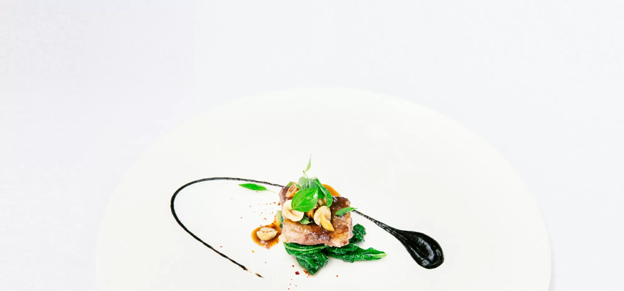
Imagine a striking hero banner that instantly captures attention! This innovative design boasts a modern, asymmetrical layout where a stunning image of a delicious food dish takes center stage on the right. The bold colours and enticing details of the dish draw the viewer in, setting the perfect backdrop for your message.
The layout features a multi-column, asymmetrical design that stands out.
It includes two main sections: a text and call-to-action area on the left and a captivating image with a user login element on the right. The left displays a single column layout, while the right organizes the image and login details in a neat column format.
The unique arrangement of the image adds visual interest and breaks free from typical grid patterns, making it truly one-of-a-kind.
The engaging “Book now” button encourages user interaction, alongside input fields in the login section.
Featuring a bold font for the main header, the subheader contrasts well with a lighter font, while the login section utilizes a neutral standard font for clarity.
The design likely includes an icon in the logo area of the login section, adding a polished touch.
The image has a natural, borderless presentation with a landscape orientation that enhances the visual storytelling of the dish.
The balance of concise text, an eye-catching image, and an asymmetrical layout makes for a harmonious blend of aesthetics and information.
While specifics aren’t detailed here, you can expect modern designs to include hover effects on buttons, amplifying user interaction.
The clear separation of the text and image hints at a mobile-friendly design that’s adaptable across different screen sizes.
Thoughtful use of contrasting text sizes and prominent buttons showcases an awareness of accessibility, although text readability and inclusive image descriptions are essential for full compliance.
This design radiates a modern and inviting aura, emphasizing food culture and experience.
It effectively guides the viewer’s attention; starting from the bold header, flowing to the subheader, and culminating in the call-to-action button.
Generous white space around the text and images enhances clarity, leading to a well-balanced visual experience.
Perfect for showcasing your culinary delights, this hero banner brings your dishes to life, inviting patrons to indulge in your offerings. The asymmetrical layout captures the essence of your restaurant, setting the tone for an unforgettable dining experience. It’s more than just a visual treat-it’s a gateway to your brand, accentuating the quality and taste of your cuisine.
A cooking blog gains a captivating edge with this design, creating a visually appealing front that piques curiosity. With stunning imagery, it’s the ideal way to share recipes and culinary stories. Draw readers in, inviting them to explore new recipes, enhance their cooking skills, and share in a communal love for food.
Bring a fresh appeal to your online food delivery service. With enticing food images and clear calls-to-action, users are encouraged to place orders seamlessly. It’s a perfect blend of functionality and allure, making the ordering process as delightful as the food itself.
This banner can elegantly display your catering services for weddings, parties, and corporate events. Capture the essence of your culinary expertise, emphasizing your commitment to quality and excellence. It’s more than showcasing food; it’s about presenting an experience that leaves a lasting impact.
Highlight nutritious and delicious meals that align with health objectives. This design not only emphasizes visual appeal but also reinforces your commitment to promoting healthy lifestyles. Engage visitors with tantalising images that encourage healthier food choices.
Showcase your culinary teaching platform with this striking hero banner. Feature images from your classes, inviting potential students to join and enhance their cooking abilities. It’s about inviting them to embark on a culinary journey, fostering skills and passion for cooking.
A great platform for photographers to display their food artistry. The hero banner emphasizes visual storytelling, capturing details that define high-quality culinary images. It’s an invitation to explore the intricate beauty of culinary art through the lens of the camera.
Communicate the freshness and quality of your farm fresh produce. Highlight your dedication to sustainable farming and enriching culinary experiences. This design enhances your brand’s authenticity and commitment to quality, from farm to plate.
Engage gourmet enthusiasts with elegant, visually enticing recipes. This design attracts users to delve into intricate recipes and discover sophisticated culinary techniques. It’s more than just recipes; it’s about inviting users into a world of culinary craftsmanship.
Feature your hotel dining experience, capturing the essence of luxury and culinary excellence. This hero banner shines with details that accentuate the quality of your service, making it irresistible for guests. It’s not just dining-it’s an experience characterized by sophistication and high standards.
Adjust colour schemes and typography to align with your brand identity. These tweaks make the hero banner uniquely yours, enhancing your brand image and ensuring a cohesive appearance across your digital platform.
Add animations or hover effects to buttons to boost engagement. Such dynamic interactions can make the user experience more exciting and enticing, encouraging visitors to click through and explore further.
Incorporate personalised images that resonate with your audience. Images that tell your story can create a stronger emotional connection with users, making your site more relatable and inviting.
Revamp the call-to-action button text to reflect your marketing objectives. Tailored messaging can drive conversions, resonating with your audience’s needs and prompting decisive actions like bookings or subscriptions.
Ensure the hero banner is responsive and mobile-friendly. Adaptations for smaller screens are vital, ensuring usability and an attractive display regardless of the device used, enhancing overall user experience.
Implement accessibility features such as alt text for images. Enhanced accessibility ensures inclusivity, making your site navigable for all users, regardless of disabilities, and adhering to web content accessibility guidelines.
Experiment with different layout configurations to find the optimal user experience. Unique layouts can set your site apart, creating a fresh look that captures your audience’s attention.
Incorporate videos or music for rich media experience. Multimedia elements can enhance engagement, appealing to different senses and offering a more immersive experience on your site.
Enhance your brand identity with customised icons. These elements add personality to your site, improving navigation and making the user journey more intuitive and visually pleasing.
Use A/B testing to optimise the design elements and user interaction. This strategy helps refine your design, ensuring each component aligns with audience preferences, resulting in higher engagement and conversion rates.
This hero banner design merges a modern, asymmetrical layout with engaging text and a visually striking food image. The emphasis on user-friendly interactive elements, especially the “Book now” button, makes it perfect for capturing the attention of your audience. It’s an ideal choice for anyone in the food service industry looking to elevate their WordPress website with a compelling and inviting presentation.
If you’re ready to take your website to the next level, look no further than this captivating hero banner block pattern. Whether you’re using WordPress website design or exploring Elementor Alternatives, this hero banner can be your gateway to enhanced user engagement. For those considering exploring or switching to new design possibilities, don’t forget to take advantage of the numerous resources available, such as free WordPress themes and powerful WordPress website builders.
