About us
Lorem ipsum dolor sit amet, consectetuer adipiscing elit. Donec odio quisque volutpat mattis eros. Nullam malesuada erat ut turpis. Suspendisse urna nibh viverra non semper suscipit pede.


Build WordPress sites with MaxiBlocks. All features free forever. No locked functionality. Optional Cloud Library saves you 10+ hours per project. Start free


Discover how this striking hero banner block design can capture your audience’s attention and elevate your WordPress website. Featuring a visually appealing multi-column structure, it combines engaging text with captivating images.
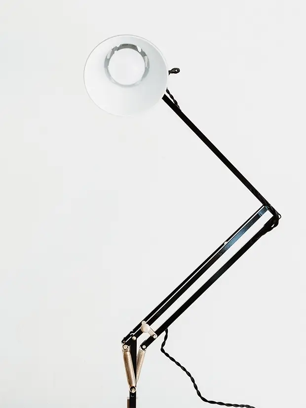
This hero banner employs a distinct two-column layout: the left column showcases a bold header (“About us”), followed by a brief description and a prominent call-to-action button (“Learn more”). Meanwhile, the right column displays two striking images-one of a giraffe in portrait orientation and another of a modern desk lamp in a square format-vertically aligned for added dynamism.
Showcase your creative work with style and clarity. The hero banner grabs attention immediately, setting the perfect stage for your showcase pieces. The vibrant imagery and clear branding message captured in the hero banner demands visitor attention and engagement.
Feature new products or promotions prominently. The two-column design allows you to present products and offers in a clean, organised manner, invariably boosting conversion rates.
Highlight your latest posts or key messages. The sleek design provides a professional touch to your blog, inviting readers to delve deeper into your insights.
Communicate your brand’s core message effectively. The distinct design and call-to-action button are ideal for driving action and ensuring your audience is engaged with your company narrative.
Promote campaigns or calls for support. The compelling imagery combined with persuasive text enhances emotional engagement and helps in rallying support.
Announce events with flair and effectiveness. This hero banner captures the excitement and importance of your event, enticing visitors to learn more and participate.
Position your personal brand prominently. The design’s clear structure allows your personal message to shine through beautifully, establishing your footprint firmly in a crowded digital landscape.
Entice viewers with stunning destinations and offers. Using this hero banner, the first impression will be one of beauty and opportunity, encouraging travelers to book memorable experiences.
Communicate educational offerings directly. The structured presentation is perfect for showcasing courses, highlights, and important updates to students and potential enrollees.
Promote healthy living tips or services authoritatively. The inviting and professional layout fosters trust and encourages visitors to explore your offerings further.
Select images that speak to your brand’s soul. Customised visuals ensure visitors immediately understand your message while feeling a connection to your content.
Experiment with fonts that reflect your brand’s tone. Pair bold, legible fonts to convey your message with the correct emphasis and readability.
Choose a palette that embodies your brand personality. Consistent colours across your website enhance brand recognition and appeal.
Add elements like hover effects or animations. This infuses your hero banner with dynamic elements that captivate audience attention and improve user interaction.
Craft CTAs that resonate with your audience. Words matter, so use phrases that motivate action while being aligned with your ultimate goals.
Prominently display your logo and branding assets. This helps with brand cohesion and creates an instant visual connection.
Incorporate short, impactful video snippets. Videos quickly convey messages that visuals or text might find challenging to communicate alone.
Experiment with different layouts and arrangements within the banner. This can highlight specific elements more effectively than a standard layout.
Use bold or highlighted text for emphasis. Important points within your descriptions become even more striking, making them memorable for the visitor.
Ensure that your messaging is consistent with your broader website narrative. Cohesive narratives reassure visitors, building trust and credibility.
This hero banner block design offers a dynamic approach to enhance the visual appeal of your WordPress website design. Incorporating modern minimalist aesthetics, engaging elements, and unbeatable user-friendly features, it’s a perfect fit for anyone wanting to elevate their site and ensure that visitors remember their brand. Whether using website builder WordPress or exploring Elementor alternatives, this hero banner can be tailored for any digital landscape. Explore the possibilities of our hero banner and watch your site reach new heights today!
