Creating value through true convergence
Lorem ipsum dolor sit amet consectetuer adipiscing elit. In nisi neque aliquet vel dapibus id.


Build WordPress sites with MaxiBlocks. All features free forever. No locked functionality. Optional Cloud Library saves you 10+ hours per project. Start free


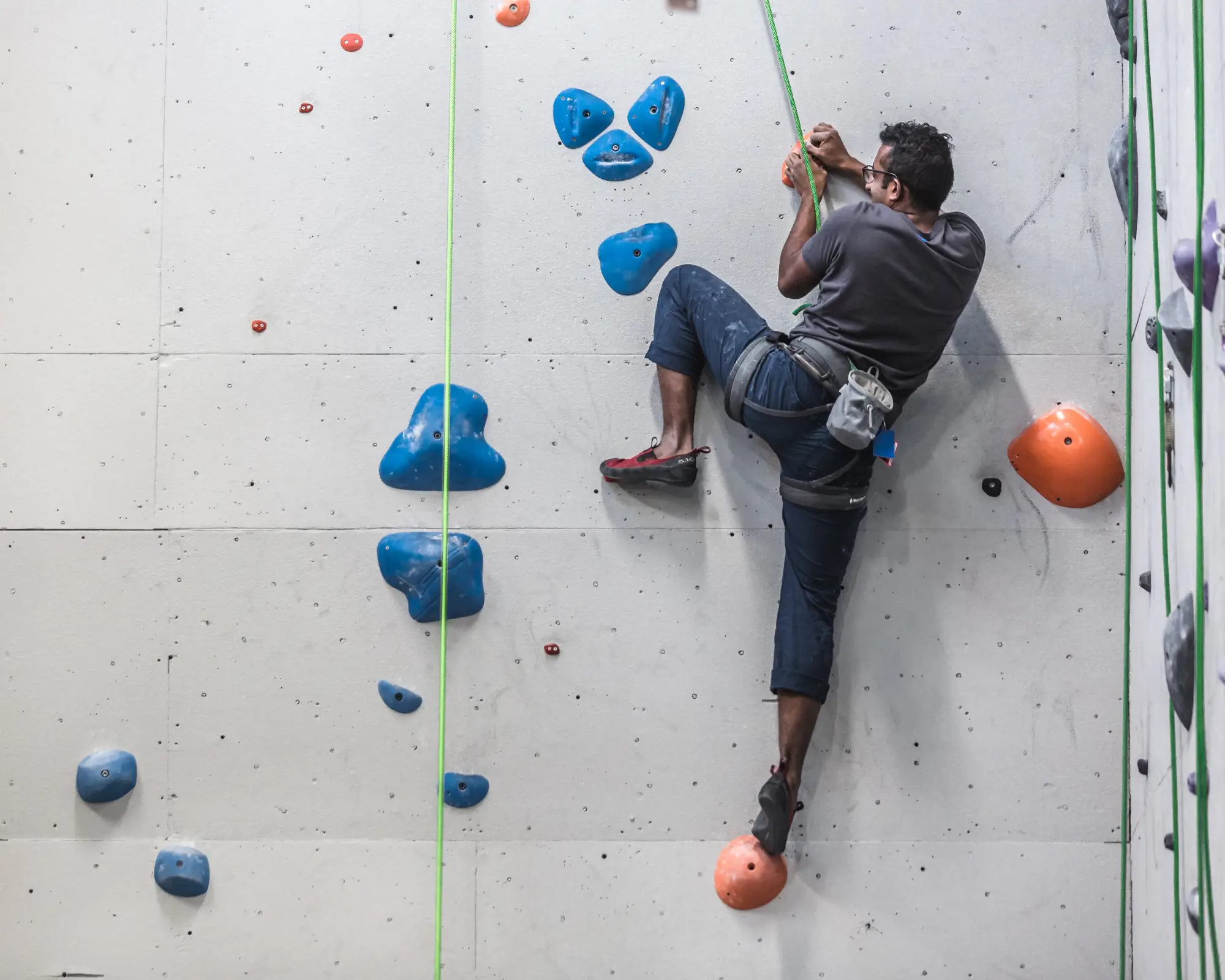
Picture this: a stunning hero banner that grabs your audience’s attention right away. It features an asymmetrical two-column setup with bold text on the left and a mesmerizing image on the right. The header boldly states, “Creating value through true convergence,” setting the tone for a compelling message. Over on the right, an engaging image of a person climbing a wall adds a dynamic touch, making the banner visually inviting.
This unique asymmetrical hero banner design boosts user engagement and delivers your brand’s value message with impact, offering a strong introduction to your WordPress website. Embrace dynamic and modern aesthetics-elevate your site with this WordPress website design.
A hero banner on an e-commerce platform acts as a primary visual that can showcase new or popular products. With a bold design and clear call-to-action buttons, it invites users to explore different categories or ongoing sales. It serves not just to captivate but to convert, directing visitors to purchase effectively.
For creatives like designers or photographers, a hero banner can exhibit standout works right off the bat. This visual impact instantly communicates style and quality, making potential clients and employers eager to see more. An attention-grabbing layout effectively sets the stage for the rest of the portfolio, inviting exploration through interactive elements or navigation.
Capture wanderlust with a striking visual paired with meaningful text or adventure calls. Dive right into the captivating narratives of places with imagery that tells a thousand words. Pair the magic of travel with compelling content that drives reader engagement, exciting users to travel vicariously through your journey, or plan their adventures.
In online education, first impressions matter. A visually appealing hero banner can attract learners with inspiring messages. Include call-to-action options to enrol or explore courses, setting the stage for educational pursuits. The ideal balance of engaging text and relatable visuals delivers the institution’s mission effectively.
Make an emotional impact right from the homepage. Highlight causes with heartfelt images and compelling taglines, directly engaging potential supporters. Feature donation calls-to-action or volunteer sign-ups, fostering community involvement and encouraging users to act on their philanthropic instincts.
Introduce innovation with a futuristic design that reflects the brand’s cutting edge. Show images that convey technical prowess, combined with powerful messaging. Use the hero banner to spotlight product highlights or a unique selling proposition effectively, aiming to capture investors, partners, and clients alike.
Set the scene for your upcoming event with an engaging, multi-layered banner. Entice users with exciting visuals and motivating text-whether it’s for a concert, conference, or festival. Effortless integration of dates and call-to-action buttons for ticket purchases can ensure maximum turnout and user engagement.
Tempt tastebuds with mouth-watering imagery and engaging descriptions. Highlight signature dishes or new menus, complete with special offers or reservation links. Creating a story through visuals and text promotes a deeper connection with your audience, adding a flavourful element to your WordPress site design.
Motivate and engage potential members with compelling images of active lifestyles and motivational quotes. Use the hero section to showcase class schedules, trainer profiles, and interactive sign-up offers, setting an energizing precedent for the rest of the site’s content.
Infuse personality and passion using a hero banner that resonates with your blog’s theme. Whether it’s lifestyle, music, or personal reflections, a strong opening visual sets the tone for storytelling, drawing readers in with authenticity and charm.
Instead of using stock images, incorporate custom-made graphics or photographs. Personal imagery adds a bespoke touch and aligns better with your brand story, engaging users more genuinely. Tailoring imagery to your content ensures coherence and offers an authentic brand presence.
Understandably, words matter. Explore interactive text elements that react to user behaviour, such as hover effects or animated typography, making the banner interactive and engaging. These details enrich the user’s experience, guiding them to delve deeper into your site’s offerings.
Colours influence first impressions. Reflect your brand’s identity by adapting the colour scheme of your hero banner. Choose contrasting colours for readability and to create a visual hierarchy, improving both the aesthetic and functional appeal.
Introduce subtle animations to breathe life into static elements. Whether it’s a gradual reveal of text or an interactive button pulse, animations enrich the visual impact without overwhelming, making the banner more inviting and modern.
Consider a video banner to tell your story more dynamically. A short, impactful video, set as a background for the text, adds depth to your narrative and can captivate users effectively, promoting prolonged engagement and exploration.
Ensure your banner contributes positively to your site’s SEO optimization. Use clear, concise keywords and alt texts for images, boosting data’s reach and improving search engine ranking.
Integrate clear and compelling call-to-action buttons that direct user interactions effectively. Customising these buttons to match your brand’s tone and style can increase conversion rates and help achieve specific business goals.
Boost user trust by incorporating elements of social proof, like testimonials or partnership logos, directly onto the banner. This can reassure users and encourage them to commit actions like purchases, subscriptions, or sign-ups.
Ensure your banner appeals to wider audiences by integrating multi-language support options. This accessible approach allows you to welcome diverse user groups and expand your site’s reach across various regions.
Ensure your design stays ahead by implementing adaptive design elements that respond effortlessly to different devices and screen sizes. Prioritise a seamless experience for both desktop and mobile users, retaining design integrity and user engagement.
A well-crafted hero banner does more than make your WordPress website look good. It captivates, engages, and converts visitors into loyal users. With modern design elements, responsive layouts, and interactive features, your hero banner can effectively communicate your brand’s essence. So, why not elevate your site’s opening act right now? Start by choosing remarkable designs and making them uniquely yours, ensuring your online presence is as compelling as it is functional.
