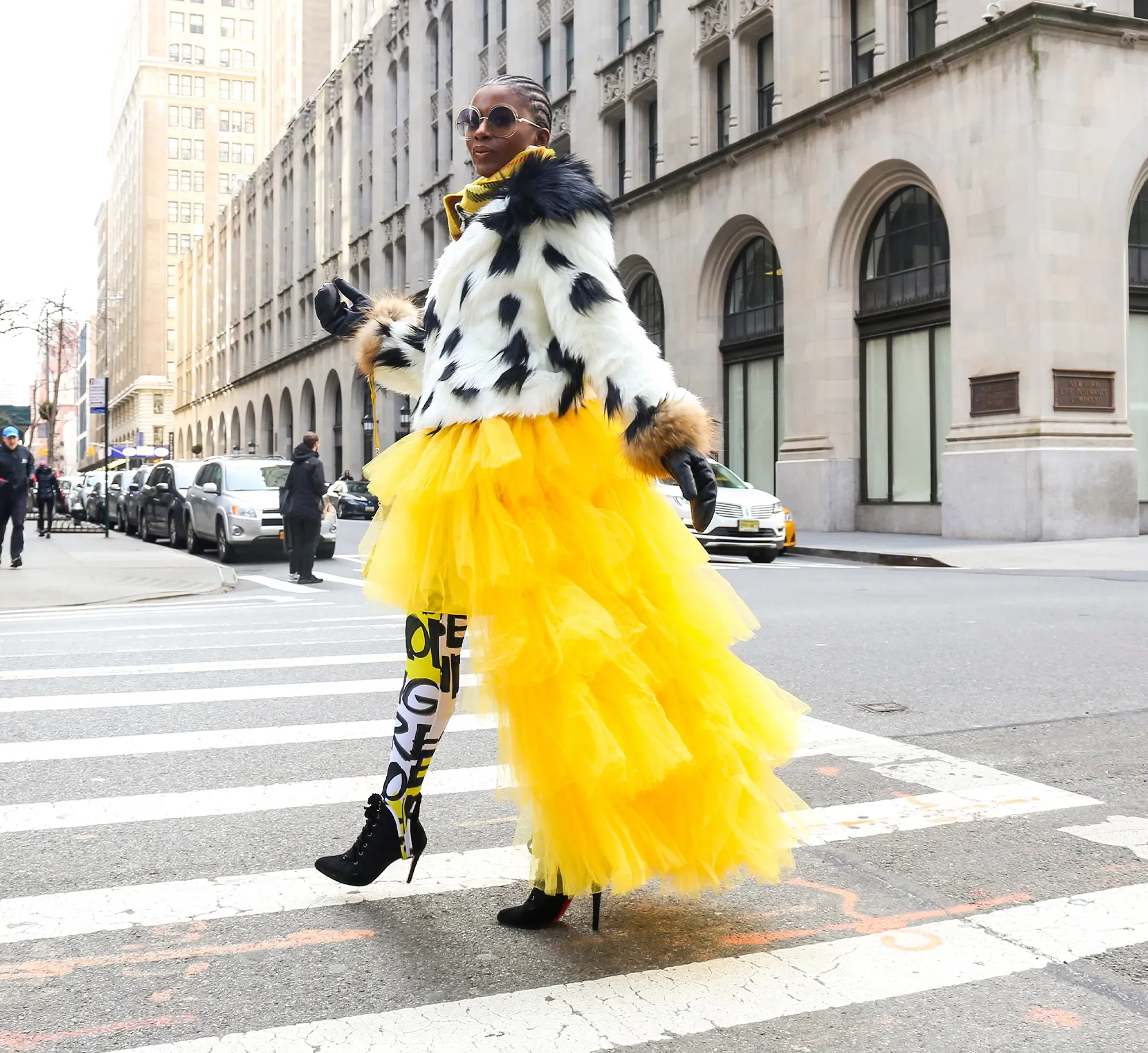

WordPress pattern: Hero Light HOL-PRO-110
Build WordPress sites with MaxiBlocks. All features free forever. No locked functionality. Optional Cloud Library saves you 10+ hours per project. Start free

Elevate your WordPress website with an engaging hero banner block design
Want to make your WordPress website stand out? Our eye-catching hero banner block design could be just what you need. Featuring a striking split structure, it masterfully combines vibrant imagery and dynamic text for maximum impact.
Original design overview
Our design features a captivating split layout with bold text on the left and an eye-catching image on the right. This clever arrangement ensures a visually appealing balance that instantly captures your visitors’ attention.
Detailed analysis of the hero banner block design
1. Layout analysis
- Overall structure: The split design features two sections-text and image-creating a balanced focal point.
- Arrangement: A single row divided into two columns for a seamless and organized look.
- Asymmetrical choices: Uneven distribution draws the eye across the design, enhancing visual interest.
2. Element and feature description
- Visible elements: The big, attention-grabbing header states, “We have a team of experts who can help you with anything.” Meanwhile, the dynamic right-side image of a person in a vibrant outfit adds to the appeal.
- Typography: Bold and modern fonts ensure clarity and impact.
- Interactive elements: Circular dots at the bottom hint at a slider feature, inviting user interaction.
- Image borders and orientation: A landscape-oriented image without borders enhances the design’s dynamism.
3. Unique design aspects
- Standout features: The bold imagery and bright yellow elements create a stunning contrast.
- Hover effects/animations: These effects can further engage users.
- Responsive design elements: The layout adapts fluidly to different devices, ensuring a great experience everywhere.
- Accessibility considerations: Large text and clear visuals improve readability for everyone.
4. Overall design style
- Design style: A modern and playful vibe combines bold typography with striking imagery to grab attention.
- Visual hierarchy: The prominent header ensures users get your message immediately.
- Use of white space: Strategic use of space keeps the design clean and key elements prominent.
10 types of website that can use this hero banner
1. Business consulting services
Highlight your expertise with a hero banner that showcases your trusted team and solutions. The striking layout and professional imagery will help establish credibility right on your homepage.
2. Creative agencies
Flash your creativity straight away with vibrant visuals and dynamic text, making a strong first impression on potential clients or partners.
3. Online clothing stores
Entice shoppers instantly with bold fashion images that speak volumes about your brand style. Use the banner to feature select items or upcoming sales.
4. Nonprofit organisations
Drive empathy and action with compelling imagery and clear messaging about your mission, encouraging visitors to learn more and get involved.
5. Health and wellness coaches
Create a peaceful yet engaging introduction to your services with serene images and encouraging words that draw potential clients in.
6. Travel blogs
Showcase stunning travel destinations with gorgeous images and inviting text, transporting visitors from the comfort of their screen.
7. Start-ups
Introduce your innovative solutions compellingly with attention-grabbing visuals and bold text that communicate your unique value proposition.
8. Restaurants and cafés
Whet appetites with tempting food photography paired with engaging text about your latest offerings or promotions.
9. Educational platforms
Include clear calls to action alongside enlightening images and text that reflect your educational offerings, guiding visitors smoothly.
10. Art portfolios
Deliver a visual punch by showing off your best works front and centre, creating an engaging viewer experience right from the start.
10 ways to make the hero banner your own
1. Customize with brand colours
Integrate your brand’s colours into the banner to reinforce your identity and make it unmistakably yours.
2. Use personal imagery
Swap the template image with custom graphics or photography that more accurately represent your brand and message.
3. Add interactive elements
Incorporate interactive elements like sliders or buttons for deeper engagement and a richer user experience.
4. Adjust text placement
Modify the position or size of text blocks to better fit your message and aesthetic preferences.
5. Experiment with fonts
Use different fonts for a unique look while maintaining legibility-know your limits and keep it professional.
6. Include a personal message
Add a personal touch by including a message from the founder or a brief introduction to your team.
7. Integrate a call to action
Guide users clearly by including calls to action, encouraging specific interactions like subscribing or exploring further.
8. Optimize for performance
Ensure that images are the appropriate size and resolution for quick loading without sacrificing visual quality.
9. Experiment with animations
Add subtle animations or transitions to grab and hold visitor interest without overwhelming them.
10. Make use of video elements
Substitute static images with short background videos for a dynamic and immersive experience.
Conclusion
The hero banner is a pivotal part of WordPress website design that can significantly enhance visitor engagement. With its strategic layout and appealing elements, our hero banner design is ideal for anyone looking to make a strong impression. Keep exploring ways to tailor this powerful tool for your own WordPress website builder, and enjoy the benefits of increased interaction and conversion. For more on creating stunning visuals, check out the assortment of free WordPress themes or discover excellent Elementor Alternatives.


