Meditation and yoga
Relax & Refresh


Build WordPress sites with MaxiBlocks. All features free forever. No locked functionality. Optional Cloud Library saves you 10+ hours per project. Start free
Meditation and yoga
Relax & Refresh

Elevate your WordPress site with this beautifully crafted hero banner design, specifically tailored for wellness enthusiasts! Featuring a striking layout, this design maximizes engagement with its minimalist aesthetic and dynamic imagery.
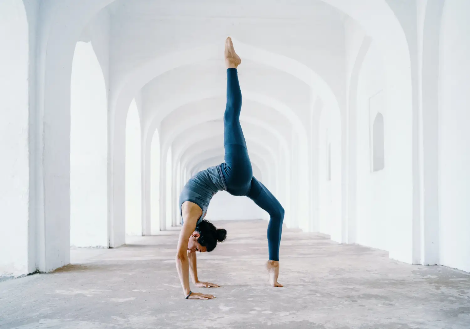
The hero banner showcases a captivating landscape-oriented image of a person executing a yoga pose at its center, encouraging viewers to connect with the serenity and focus of wellness practices. This image is complemented by bold headers: Meditation prominently displayed, with “and yoga” as a supportive subheader, all presented in a sleek sans-serif font.
For yoga studios, this hero banner can highlight your serene space and expert instructors. Showcase class schedules or special events using dynamic imagery that resonates with mindfulness.
Promote a calming atmosphere in your meditation centre with this banner’s meditative imagery and soothing text. Emphasise your guided sessions and workshops, inviting visitors to explore inner peace.
Highlight the tranquility of your retreat with this hero banner, capturing the essence of relaxation through compelling visuals and engaging text. Promote key retreat experiences that rejuvenate your audience.
This hero banner suits fitness clubs that offer yoga and meditation classes. Use it to draw in members seeking a holistic approach to wellness, showcasing your unique programs.
Enhance your spa’s allure by showcasing the peaceful environment and wellness treatments with an inviting hero banner, reflecting the calming nature of your services.
Use this banner on a wellness blog to draw readers into articles focusing on mindfulness, yoga, and meditation, setting a tranquil tone that encourages further exploration.
For online stores selling natural health products, this banner can highlight the benefits of wellness products with a focus on lifestyle and improving quality of life through vivid imagery.
Promote your online courses on wellness topics using this banner to communicate the quality and experiential learning approach of your offerings.
Attract clients to lifestyle coaching services by depicting a successful, serene experience through this visually captivating and informative banner.
Influencers in the wellness space can use this hero banner to highlight personal tips and product recommendations, creating an inviting and personal connection with followers.
Use your own high-resolution images to infuse personal branding and authenticity into the banner, ensuring it effectively represents your unique style and message.
Introduce subtle animations that reflect the calming theme, adding a dynamic layer that enhances the user experience without distracting from the main content.
Add call-to-action buttons to guide users towards particular actions on your [WordPress website](https://maxiblocks.com/wordpress-websites/), such as signing up for newsletters or exploring course offerings.
Experiment with different fonts, ensuring they maintain readability while giving the banner a fresh look that aligns with your brand identity.
Adapt the colours to match your brand’s palette, ensuring consistency across your website and giving the banner a distinctive touch.
Incorporate overlay effects that enhance the text’s readability against the image while maintaining the overall aesthetic and feel of the banner.
Regularly update the content to highlight new offerings or promotions, keeping the banner relevant and engaging for returning visitors.
Integrate short video clips instead of static images for a more immersive experience, capturing attention and conveying your message effectively.
Add icons linking to your social media platforms, encouraging visitors to connect and explore your brand further across different channels.
Ensure the banner is optimised for all devices using responsive design techniques, providing a seamless experience for users on mobile, tablet, and desktop devices.
This hero banner design uniquely combines a minimalist single-column layout, bold typography, and dynamic visuals to effectively engage your audience. Perfect for wellness-focused websites, its clear visual hierarchy and effective use of space invite visitors to explore more of what you have to offer. Leverage WordPress website design to ensure your site not only looks great but functions smoothly. Discover more tools and wordpress templates that enhance your site’s appeal with this standout design!
