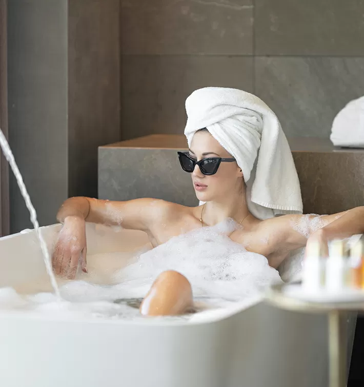
An incredible spa experience
Lorem ipsum dolor sit amet, consectetuer adipiscing elit. Donec odio. Quisque volutpat mattis eros.
Trusted by


Build WordPress sites with MaxiBlocks. All features free forever. No locked functionality. Optional Cloud Library saves you 10+ hours per project. Start free
Lorem ipsum dolor sit amet, consectetuer adipiscing elit. Donec odio. Quisque volutpat mattis eros.
Trusted by


Discover an eye-catching hero banner design that redefines visual storytelling! This unique layout features a striking asymmetrical format, perfect for WordPress users looking to make a memorable first impression.
The design showcases a multi-column layout with staggered rows that offer a dynamic flow. Instead of a traditional grid, the varied sizes of image blocks create an engaging experience, pulling viewers in with its modern aesthetic.
For photographers keen on showcasing their work, this hero banner design provides an ideal way to make their images the focal point. The asymmetrical layout and dynamic flow ensure that photos of varied subjects all have a place to shine, giving viewers an immersive visual experience. It’s a stylish method to captivate potential clients or employers at first glance.
Fashion boutiques looking to make an impact with free WordPress themes can utilise this layout to display their latest collections. The staggered alignment adds creativity and flair, whilst the clean design ensures the clothes remain the star, enticing style-conscious shoppers and creating a chic online storefront.
Travel bloggers can benefit from a hero banner that presents stunning landscapes and intriguing destinations. The varied image sizes allow bloggers to weave a captivating narrative, bringing readers along on their adventures. This layout enhances storytelling, transforming any travel tale into a vibrant journey for the audience.
An online art gallery can use this AI website builder layout to display masterpieces in all their glory. Its minimalistic style puts the artwork front and centre, allowing each piece to draw the eye. This design highlights the unique features of every artwork, making it an art collector’s delight.
Restaurants can harness this hero banner design to feature mouth-watering images of their signature dishes. The juxtaposition of food imagery and elegant typography creates an inviting atmosphere, tempting visitors to explore the menu and make dining reservations.
Interior designers can showcase their projects with this WordPress design layout. Its spacious feel and modern touches present interiors in a sophisticated manner, offering potential clients a glimpse into a designer’s vision and style.
A fitness blog can attract and engage visitors through vibrant imagery depicting workouts, healthy meals, and wellness tips. The asymmetric design provides a dynamic way to convey energy and positivity, which is crucial in the wellness space.
A tech news site can utilise this layout to feature the latest gadgets, innovations, and stories compactly. The varied image blocks allow for the hierarchical presentation of news articles, so important stories catch the reader’s eye immediately.
Non-profits can use this hero banner to tell impactful stories through emotive images. The layout supports a multimedia approach, encouraging powerful visual narratives that engage viewers and inspire them to support and participate in causes.
Event websites can benefit by showcasing their activities through a combination of images and interactive elements. This layout effectively highlights speakers, activities, and venues in an attractive, organised manner, enticing audiences to attend.
Infuse your brand’s identity by selecting images that represent your vision. Opt for unique, high-resolution photographs to maintain professionalism and relevance. Tailoring images ensures that your site aligns with your brand’s goals, creating an authentic online presence.
Enhance user engagement with simple interactive elements, such as clickable buttons or hover effects. These invite users to explore content further, turning static visuals into interactive experiences.
Integrate your message seamlessly into the banner with thoughtful text placement. Choose fonts that complement the overall design while reflecting your site’s tone. Consider layout space to avoid clutter and maintain readability.
Add subtle animations to elements like text or icons to capture attention without being intrusive. Smooth transitions enhance the viewing experience, elevating the overall aesthetic of your website.
Employ overlays for added depth and to highlight specific sections within your imagery. Transparent or colour-accented overlays can create contrast, helping to draw focus towards key content.
Ensure your design is inclusive by incorporating accessibility-friendly features. Clear text, alt tags for images, and keyboard navigation capabilities are simple yet impactful changes.
Experiment with variations in layout to determine which best suits your needs. Consider user feedback and analytics to refine and enhance the user journey continuously.
Consistency in branding elements, such as colours and fonts, reinforces your identity across all platforms. Ensure your banner aligns with your overarching brand strategy.
Adopt a responsive design strategy to maintain performance across devices. Prioritise load speed and adjust assets for optimised viewing on smaller screens.
Take advantage of existing hero banner templates to streamline the design process. Curated layouts provide a starting point, ensuring a cohesive look with the flexibility for personalisation.
This asymmetrical multi-column hero banner design invites a diverse array of content into an elegant, minimalist presentation. By thoughtfully employing elements and whitespace, it’s an excellent choice for showcasing your work and creating an impactful visual experience on your WordPress website design. Transform the way you present content and captivate your audience today with this sophisticated approach!
