Inspire the next
It’s time to clarify your direction
Get your free transformation guide now
Trusted by


Build WordPress sites with MaxiBlocks. All features free forever. No locked functionality. Optional Cloud Library saves you 10+ hours per project. Start free

Inspire the next
Get your free transformation guide now
Trusted by


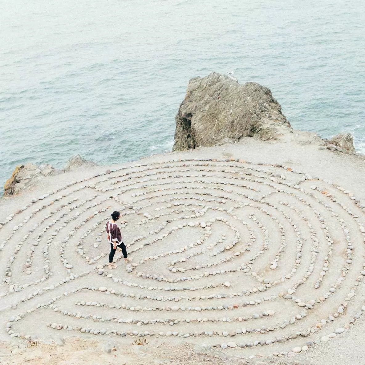
Transform your website’s appearance with our thoughtfully crafted hero banner design! Featuring a stunning outdoor image paired with impactful text, this design brings clarity and focus to your message.
The CTA button enhances interactivity, encouraging users to take action. The logos may also function as clickable links, adding value and connectivity.
Contrasting font styles and sizes-bold for the main message, lighter for the header-create visual interest and help users navigate the content easily.
This hero banner design seamlessly combines stunning visuals with powerful messaging, creating an engaging user experience that drives interaction and reflects professionalism. Perfect for promoting downloads and clarifying your offerings, this layout is an ideal choice for WordPress website users looking to elevate their site’s aesthetic and effectiveness. Start transforming your website today!
A WordPress website with a hero banner can significantly enhance your blog’s visual appeal, creating a personal statement that captures your essence and captivates the reader at first glance.
Utilise the hero banner to highlight your best-selling products, upcoming sales, or new arrivals. It’s a fantastic way to grab the attention of visitors and convert their curiosity into sales.
For artists and freelancers, showcasing your work using a hero banner is a great way to introduce your best projects at first sight, drawing potential clients in to explore further.
Use the hero banner to communicate corporate values or announce major services. This direct approach can enhance customer engagement, presenting a professional image.
Draw in students by spotlighting key courses or discounts with impactful banners, making your educational offerings hard to resist.
Highlight your event with an eye-catching hero banner to ensure it’s the talk of the town. It’s the perfect way to announce the date, theme, and key attractions.
Drive action and donations with a stirring hero banner showcasing your mission or cause, encouraging visitors to support or volunteer.
Entice customers with stunning imagery of destinations or trip offers, instantly immersing them into their travel dreams through the hero banner.
Hero banners are an amazing way to feature your most striking photographs, capturing the essence of your style and talent in an instant.
Tempt your audience with mouth-watering images of your latest culinary creations, presented beautifully in the hero banner.
Select a colour palette that reflects your brand or personal style. Play with contrast and harmony to ensure the text remains readable and visually appealing.
Choose fonts that resonate with your message. A bold typeface for the main text and a lighter one for subtexts can help convey tone effectively.
Use images that represent your brand or story. An authentic photo can establish an emotional connection quickly.
Incorporate hover effects or animations on your CTA buttons to draw attention and prompt action.
Consider video backgrounds for a more dynamic and immersive experience. Ensure videos are high quality and don’t slow down loading times.
Experiment with text overlay effects to add depth to your hero banner, enhancing visual appeal without compromising readability.
Integrate intuitive navigation within the hero banner to improve user experience, allowing users to explore the content smoothly.
Add alt-text for images and ensure text contrast meets accessibility standards, making your banner inclusive for all users.
Try different layout styles. An overlapping layout can create a sense of depth, while a centred layout focuses attention directly.
Keep content fresh by rotating images or messages regularly, keeping your site dynamic and engaging for returning visitors.
By implementing a WordPress website design with our hero banner, you’re not just enhancing aesthetics-you’re boosting user engagement and delivering clear, impactful communication. Whether you’re using free WordPress themes or exploring Elementor alternatives, this is your chance to wordpress website builder and stand out from the crowd. Embrace these exciting hero banner techniques and watch your WordPress website transform!
