The only thing we love more than food is you!
Get directions
Book a table
Eat

Drink

Delight


Build WordPress sites with MaxiBlocks. All features free forever. No locked functionality. Optional Cloud Library saves you 10+ hours per project. Start free
Get directions
Book a table


Elevate your WordPress website with our captivating hero banner block design! This eye-catching layout seamlessly combines bold typography with illustrative imagery, creating a visual centrepiece that demands attention.
The hero banner’s innovative design incorporates an asymmetrical layout featuring a dominant text block on the left and a striking image on the right. The composition’s balance draws viewers in while breaking away from the confines of a strict grid, setting the stage for a unique and engaging user experience.
Bring a captivating shopping experience with a hero banner on your WordPress website templates. Display your products in high resolution and ensure visitors get hooked immediately. Showcase promotions, new arrivals, or bestsellers right on the homepage to boost sales.
Use your hero banner to highlight your blog’s core message. With the right image, you’re inviting readers to dive deeper into your stories. The right touch of typography ensures your words leave a lasting impact. Transform your narrative today!
Inspire wanderlust with a hero banner displaying breathtaking travel destinations. Entice visitors with compelling visuals and calls to action. Let the world of wonders begin on your homepage!
Showcase your personal or business projects with striking imagery and succinct text. A hero banner emphasizes your uniqueness and professionalism from the get-go. Introduce your work with flair!
Draw in potential students with an eye-catching hero banner. Highlight your unique courses and success stories. Convey learning as an exciting journey, piquing curiosity and interest in your educational offerings.
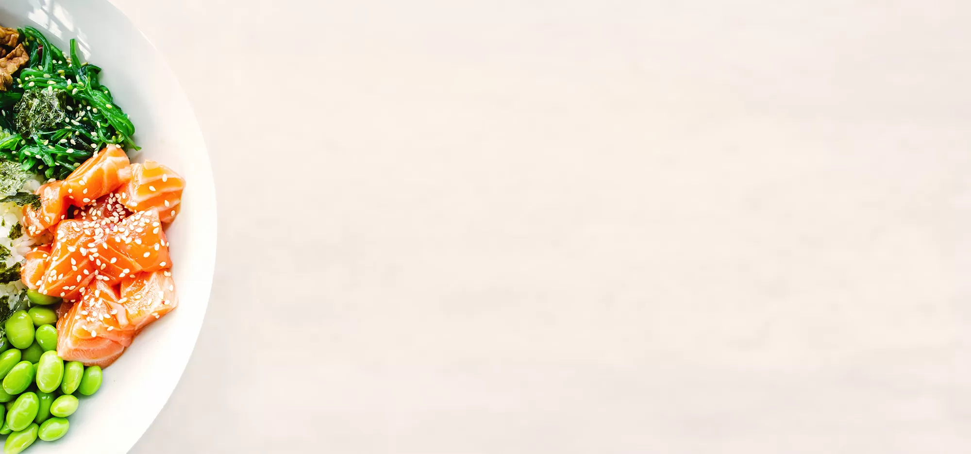
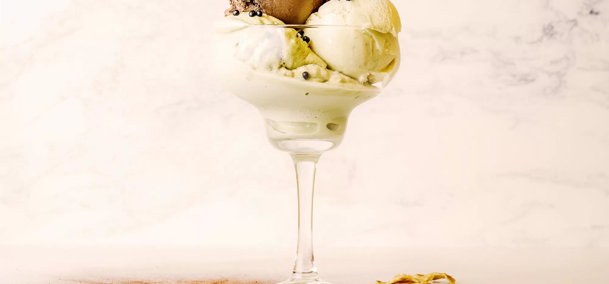
Awaken appetites with hero banners showcasing your culinary masterpieces. Instantly grab attention with mouth-watering images and appealing taglines. Let guests experience a taste of what they can expect!
Feature upcoming events in style using dynamic hero banners. A well-crafted design captures interest and conveys urgency, motivating visitors to save the date or secure tickets straight away!
Engage sympathetic hearts on your charity website using a hero banner with an inspiring image or video. Clear messaging and prompts encourage donations or participation in future activities.
Present your services and design prowess with a hero banner that mirrors your brand’s creative essence. Stunning visuals, clever text, and CTAs make an unforgettable first impression, showcasing the agency in its full glory.
Show off cutting-edge solutions and innovations with well-positioned hero banners. Display impactful imagery coupled with a gripping narrative, ensuring potential clients see your technological credibility from the first glance.
Customise your hero banner by selecting fonts that reflect your brand’s personality. Whether sleek and modern or bold and traditional, typography communicates beyond words.
Incorporate custom images or illustrations exclusive to your brand. Avoid stock photos when possible – original visuals more effectively capture attention and convey authenticity.
Experiment with a colour palette that aligns with your branding. Colours evoke emotions and establish mood-ensure yours resonates with the message you’re conveying through your hero banner.
Engage users with subtle animations, such as fade-ins or slides. Movement draws attention and can imbue your hero banner with dynamism and modernity.
Drive – visitor actions using distinct, easily identifiable CTA buttons on your hero banner. Guide users towards desired goals like signing up, purchasing, or learning more.
Utilise parallax scrolling effects to create added depth in your hero banner. This trendy feature promotes an immersive experience, making interactions intriguing and memorable.
Design responsively, guaranteeing your hero banner adapts beautifully across all devices. With mobile users representing a significant part of web traffic, flawless performance is essential.
Use contrasting elements to enhance topic clarity. Strong contrast facilitates text readability and ensures that critical components stand out effectively in your hero banner.
Experiment with different variations, comparing performance outcomes for each. A/B testing allows insights into what resonates best with audiences, optimising conversion rates.
Update hero banners seasonally, reflecting holidays or special occasions. Timely adaptations offer fresh engagement opportunities and demonstrate your business’s attentiveness and adaptability.
This hero banner design embodies a minimalist approach, featuring an asymmetrical layout complemented by bold typography and well-integrated imagery. Its sophisticated use of space and contrasting elements ensures effective visual communication-perfect for today’s digital applications. Don’t miss out on the opportunity to elevate your WordPress website design experience-adopt this awe-inspiring hero banner block design today!
