BG-Image-maxiblocks-1726746624-578207009

WordPress pattern: Hero Light HOL-PRO-43


#freedom

Design

A greater measure of confidence

Proin congue sodales velit et commodo. Fusce efficitur sapien ante, ut auctor enim viverra luctus. Nam in consectetur ante, at dignissim ipsum. Maecenas at nunc vehicula.

hol-pro-43-2
hol-pro-43-1

Build like a pro

Transform your WordPress site with a stunning hero banner design

Elevating your website’s visual appeal is easier than you think with a thoughtfully crafted hero banner design. This design features a captivating asymmetrical layout, combining bold typography with striking imagery to leave a lasting first impression.

Layout highlights

  • Dynamic structure: A multi-column setup emphasizes text and visuals, balanced perfectly for effective communication.
  • Split arrangement: Large text on the left and compelling images on the right direct the viewer’s gaze with ease.
  • Visual movement: Diagonal shapes and varied image placements create dynamism, engaging visitors further.

Key features

  • Bold headers: Catch eyes instantly with a large, striking header, like “Design,” paired with insightful subtext such as “A greater measure of confidence.”
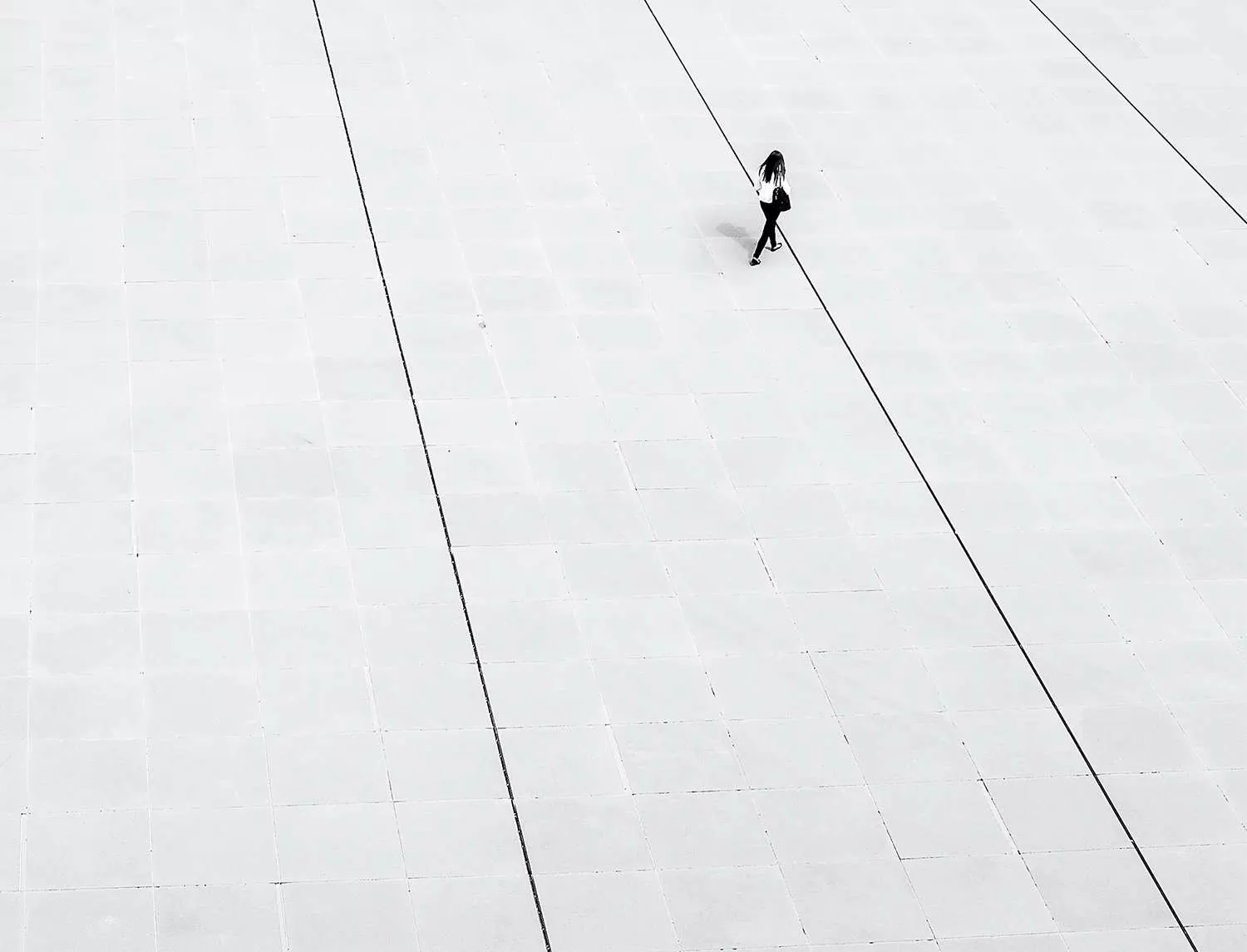
  • Engaging imagery: Thoughtfully placed human figures in the background highlight themes like freedom.
  • Potential for interaction: Integrate calls to action seamlessly, with button or link placements.
  • Clear typography: Bold sans-serif fonts against lighter subtext ensure readability.
  • Graphic elements: Small triangular icons add visual interest and interactive engagement.
  • Soft borders and depth: Framed images enhance appeal and create depth with subtle shadowing.

Unique design aspects

  • Modern aesthetic: Angular designs contrasted with text and imagery offer a contemporary feel, ideal for corporate or creative settings.
  • Responsive and accessible: Adaptable layouts ensure stunning displays on any device, with high contrast and clear typography promoting inclusivity.

Overall style and impact

  • Minimalist elegance: This hero banner blends minimalism with corporate sophistication, focusing on key messages.
  • Effective visual hierarchy: A strategic flow guides users naturally from the bold header through supporting text and imagery.
  • Balanced white space: Ample white space around elements enhances readability and aesthetics.

Types of websites suited for this hero banner

  • Corporate websites: Showcase professionalism with a sleek finish. This hero banner leverages strong graphics and text to establish authority and convey essential messages with clarity.
  • Creative portfolios: Highlight your work with style. The design accommodates vibrant images, allowing users to focus on your projects and artistic excellence seamlessly.
  • E-commerce platforms: Turn visitors into customers with bold messages and product images, facilitating easy navigation through engaging content.
  • Agency websites: Present agency capabilities with confidence. Engage potential clients by showcasing successful projects and service expertise.
  • Educational websites: Establish educational prowess. Start strong with a well-designed banner that guides students and educators through your offerings.
  • Blog sites: Captivate your audience from the first scroll. Feature standout articles and themes with a minimalistic and clean design.
  • Charity websites: Drive attention to your cause. Compelling images and impactful text can inspire empathy and prompt action from visitors.
  • Travel sites: Inspire wanderlust with stunning visuals. Highlight destinations and experiences with a layout that speaks adventure.
  • Event landing pages: Build excitement for events. Featuring event highlights and details prominently will ensure quick visitor conversion.
  • Healthcare websites: Convey trustworthiness and care. Use the layout to focus on health services, ensuring easy navigation to vital information.

Ways to personalise your hero banner

  • Custom images: Use high-resolution, relevant images that reflect your brand identity and message, ensuring a unique visitor experience.
  • Typography variations: Experiment with different font sizes and styles to complement your message and maintain legibility.
  • Colour schemes: Tailor colours to fit your brand palette, creating harmony and reinforcing brand identity.
  • Interactive elements: Add hover effects or animations to buttons and images for added engagement.
  • Brand messaging: Craft a headline that aligns with your brand’s voice, embedding it naturally into the hero banner.
  • Video backgrounds: Incorporate a looping video for a dynamic, immersive experience.
  • CTA optimisation: Design prominent calls to action, guiding users towards desired interactions.
  • Graphic overlays: Use shapes and icons to highlight areas of interest or provide additional context.
  • User testimonials: Include quotes or reviews to establish credibility and galvanise trust.
  • Seasonal themes: Update the layout with seasonal elements to keep content fresh and relevant.

Conclusion

This hero banner design is a perfect blend of engaging visuals and powerful messaging. It’s an excellent choice for WordPress website users aiming for impact. With its minimalistic and adaptable approach, it accommodates various content types while ensuring your site stands out. Explore this design by diving into WordPress website design choices and transform your site today!

For those seeking more customisable options, consider exploring WordPress website builders to find the ideal fit for your needs. Embrace the flexibility of free WordPress themes for your site’s unique requirements, or look into Elementor Alternatives for innovative page-building solutions. Maximise your hero banner design potential with these incredible tools!

You may also like