Let’s make things better
Lorem ipsum dolor sit amet, consectetuer adipiscing elit. Donec odio. Quisque volutpat mattis eros.
Innovation & excellence
Lorem ipsum dolor sit sectetuer elit.
Expanding possibilities
Lorem ipsum dolor sit sectetuer elit.


Build WordPress sites with MaxiBlocks. All features free forever. No locked functionality. Optional Cloud Library saves you 10+ hours per project. Start free
Lorem ipsum dolor sit amet, consectetuer adipiscing elit. Donec odio. Quisque volutpat mattis eros.
Innovation & excellence
Lorem ipsum dolor sit sectetuer elit.
Expanding possibilities
Lorem ipsum dolor sit sectetuer elit.

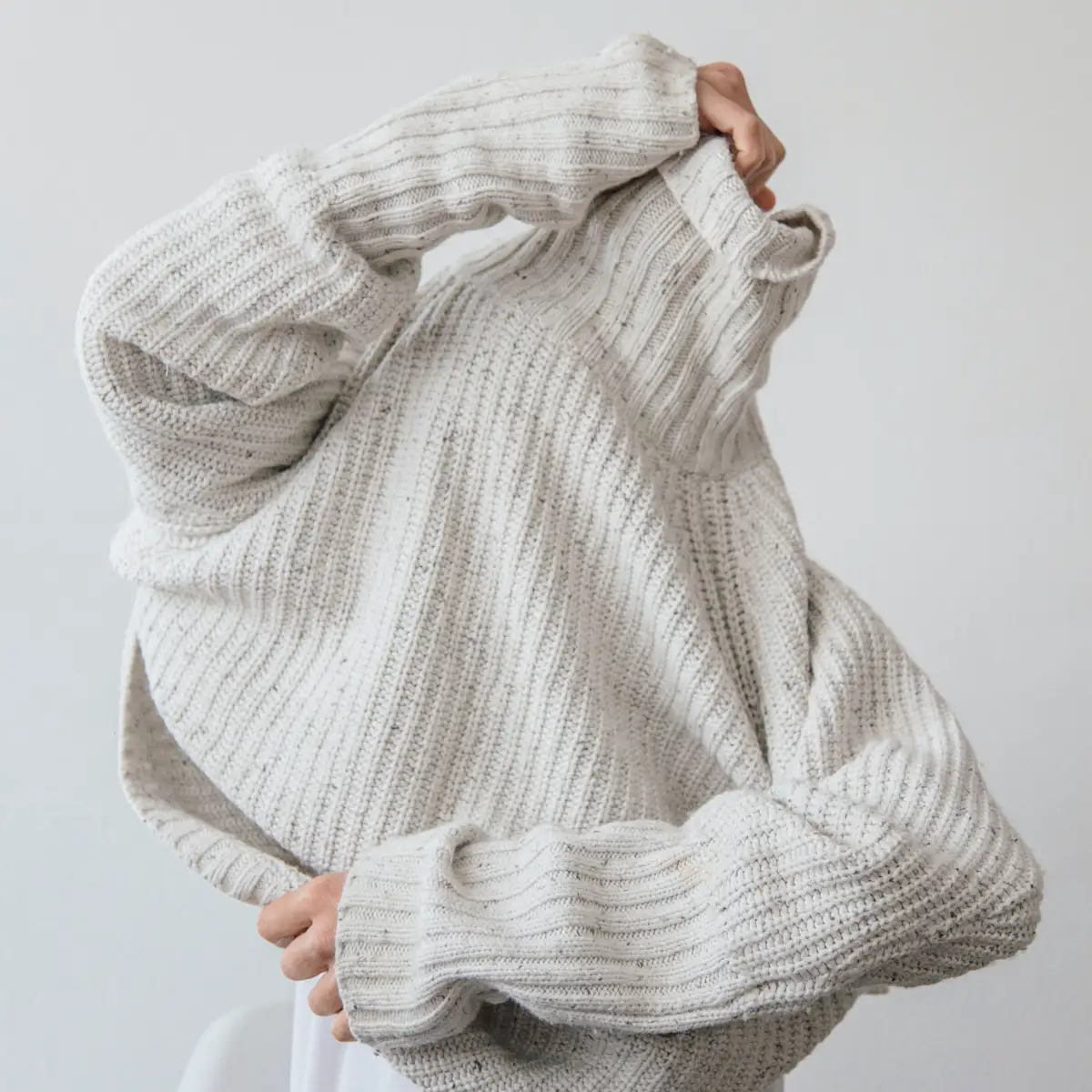
Transform your WordPress site with our eye-catching hero banner design! Featuring a contemporary and unique asymmetrical layout, this design effortlessly combines bold visuals and informative text. The left side showcases an engaging message, “Let’s make things better,” poised above a paragraph that encapsulates your brand ethos. To the right, a relatable image of a person interacting with a garment draws the viewer in, enhancing the human connection.
A sleek single-column design that promotes a linear flow of information, ensuring your message is clear.
Breaking away from traditional formats, this layout presents a text block on the left and a captivating image block on the right, creating a fluid and dynamic arrangement.
The distinct separation between the text and image fosters intentional asymmetry, ensuring equal attention is given to both components.
While specific buttons aren’t included, the presence of WordPress icons hints at potential interactive features.
Bold, attention-grabbing header paired with a lighter, more readable paragraph, establishing a clear hierarchy.
Features a relatable human element that enhances engagement, with rounded edges for a softer look and no distracting overlays.
An elongated red marker-like shape on the right side adds a playful twist, breaking the monotony of traditional layouts.
While specific animations aren’t detailed, the foundation is set for dynamic integrations.
The wide design is adaptable to various screen sizes, ensuring a seamless user experience.
The clean typography and contrasting elements enhance readability, with room for improvements like alt text for images.
This design embraces a contemporary and approachable style, with minimalist elements that promote usability.
The bold header takes centre stage, effectively guiding the viewer’s attention through a structured format.
Skillful use of white space balances the layout, enhancing both readability and visual comfort.
This hero banner design is the perfect blend of modernity and functionality. Its responsive design elements and thoughtful arrangement of elements captivate while delivering your message clearly. Ideal for elevating any digital interface, this design not only showcases your brand’s personality but also ensures a holistic user experience. Don’t miss out on upgrading your WordPress website with this standout design, particularly when using WordPress website design techniques and themes.
