Inspire the next
Lorem ipsum dolor sit amet, consectetuer adipiscing elit. Donec odio. Quisque volutpat mattis eros. Nullam erat ut turpis.


Build WordPress sites with MaxiBlocks. All features free forever. No locked functionality. Optional Cloud Library saves you 10+ hours per project. Start free
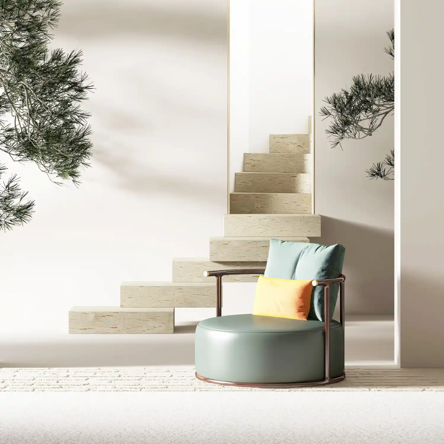
Elevate your website’s visual appeal with a striking hero banner featuring a modern, single-column layout. This design showcases a large header area with the powerful title, “Inspire the next,” which immediately grabs attention. Below this captivating header, a text block provides essential context, complemented by a striking circular image of a stairway and a chair that breaks conventional symmetry. This unique arrangement results in a fresh, contemporary style that is bound to impress your visitors.
Use the “Inspire the next” hero banner to captivate your readers with a modern design that puts the spotlight on your latest posts. The clear call-to-action button encourages visitors to explore more, enhancing engagement with your content.
Showcase your creative work with a visually stunning hero banner that emphasises your artistic journey. A bold title and inviting button guide visitors to your portfolio sections, highlighting both your creativity and professionalism.
A hero banner with a strong visual and inviting message can draw customers into your business story. With strategic elements like the circular image breaking symmetry, your site leaves a lasting impression, adapted for all screens with responsive designs.
Drive sales with a hero banner that places your bestselling or new products front and centre. The prominent title and interactive button seamlessly guide shoppers toward featured items, utilising effective navigation menus for ease of use.
Captivate supporters with an impactful banner that tells your story. The design helps convey your mission through engaging visuals, promoting action through a powerful layout designed to draw more volunteers.
Entice learners with an innovative hero banner that communicates your educational offerings. Through clever visual elements and Gutenberg blocks, offer a seamless experience that guides users effortlessly to courses or resources.
Create anticipation for your next event with a bold hero banner. Capture attention with creative layouts, and clear CTAs ensure attendees can easily register or get additional information with minimal clicks.
Transport users with a stunning visual journey via your travel site’s hero banner. Break away from the ordinary with an eye-catching image and engaging title; entice your audience to explore breathtaking destinations through beautiful themes aligned with the excitement of exploration.
Encourage healthier lifestyles with a designed hero banner featuring soothing imagery and engaging texts. The simple layout helps convey important wellness messages while leading users to tools or informative sections, strengthened by customisable templates.
Highlight your innovative tech solutions with a hero banner that emphasizes cutting-edge designs and functionality. Capture investor and consumer interest alike by leveraging the latest design trends and straightforward CTA buttons to demonstrate your digital prowess.
Swap the circular image with something more relevant to your brand. Incorporate high-resolution graphics that resonate with your website’s message and create a cohesive visual style unique to your personal or company ethos.
Alter the colour palette to reflect your brand identity. By doing so, you ensure the hero banner seamlessly integrates with your site’s overall aesthetic and engage users through a more personalised visual interaction.
Change fonts to match your brand’s voice-whether it’s casual or formal. Adjusting typography can reinforce your online identity and align with broader organisational messages, ensuring consistency across all touchpoints.
Introduce subtle animations to draw attention and maintain engagement on your WordPress website. This could be slight hover effects or more elaborate visual transitions, mirroring innovation and dynamism.
Revise the call-to-action button text to better align with site goals. Experiment with motivational language to encourage visitors to click, whether it’s joining a community, viewing products, or reading articles.
Adjust the three-section format to a split-screen or parallax scrolling design. Customise elements placement to enhance user navigation and create a bespoke experience that reflects specific brand messages or purposes.
Add motion by embedding background videos within the hero banner. This can enrich storytelling and engagement, showcasing products or company ethos in a lifelike fashion, ensuring a memorable visual and informational impact.
Incorporate graphic elements like icons and symbols that support the website’s message. These elements can subtly reinforce what you stand for and visually anchor components to streamline message delivery.
Ensure that the hero banner is optimised for search engines by using appropriate keywords and tagging conventions. This not only improves visibility but substantiates your site as highly relevant in search engine prioritisation.
Tweak designs for optimal mobile viewing. Reducing file sizes, simplifying CTAs, and adjusting typography will preserve layout efficiency and accessibility, ensuring passive users are dynamically catered to across smaller screens.
A well-crafted hero banner can significantly enhance your WordPress website, capturing visitor attention and encouraging interaction. By focusing on a streamlined design with bold imagery and strategic call-to-action points, you not only reinforce your message but also create an inviting digital atmosphere resonating with users. Whether you’re using fins like Elementor alternatives or trying to master responsive hero banners, this structure provides an adaptable foundation for varied web applications. Let this layout guide the journey towards achieving a visually compelling WordPress website design, effectively communicating your unique story to right audience.
