Expanding
possibilities

Hello there
Don’t let the fear of losing be greater than the excitement of winning

Build WordPress sites with MaxiBlocks. All features free forever. No locked functionality. Optional Cloud Library saves you 10+ hours per project. Start free
Expanding
possibilities

Hello there
Don’t let the fear of losing be greater than the excitement of winning
Elevate your website with a stunning hero banner that captures attention and inspires action. Our modern design features a bold and engaging layout that’s perfect for showcasing your message.
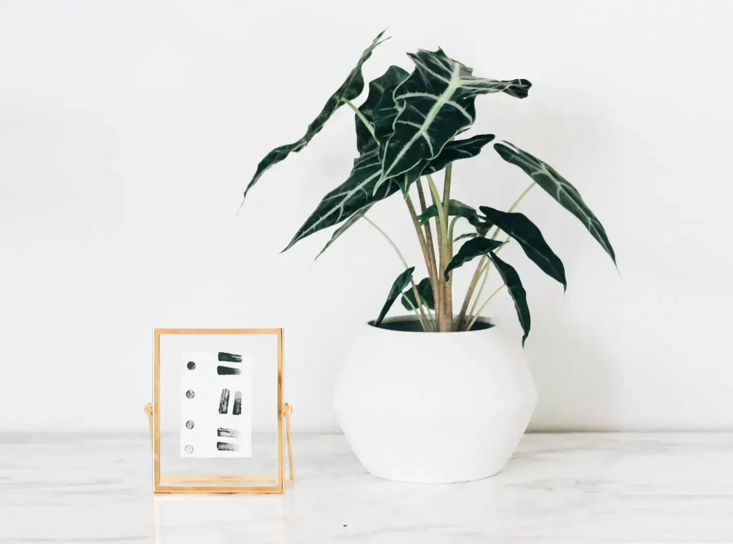
The layout presents a sleek, vertically oriented block, balancing content and visuals in a captivating two-column format. On the left, there’s key messaging emphasized with powerful typography, while the right side bursts with eye-catching decorative imagery, making it a standout choice for any WordPress website.
Creative agencies can benefit from a hero banner that showcases their innovative work and services. By integrating modern aesthetics and interactive elements, the banner serves to capture the imagination of potential clients, perfectly aligning with the brand’s ethos.
E-commerce websites thrive on user engagement. Implementing hero banners with compelling visuals and clear call-to-action buttons invites visitors to explore products, enhancing sales potential.
Educational sites seeking to attract students can utilise hero banners to present course offerings and educational achievements.
For hospitality and travel sites, a hero banner with captivating images and structured navigation menus can spark wanderlust and drive bookings.
Personal bloggers can express their brand through customised banners that reflect their content style and personality, engaging the audience right from the start.
Non-profits can create awareness and inspire action with banners highlighting their mission and recent projects.
Fitness and wellness sites benefit from banners that motivate and energise users, using dynamic imagery and motivational text.
Photographers can display their works prominently, using a minimalist banner design that focuses on high-resolution images.
Event planners can announce upcoming events with visually appealing banners, providing key information efficiently.
Startups can highlight their latest innovations and technology through dynamic banners that convey their unique selling points.
Utilise a colour scheme that reflects your brand’s identity, choosing tones that resonate with your audience and enhance readability.
Incorporate videos or sliders to add dynamic elements, providing more interaction and engagement opportunities.
Select fonts that complement your brand’s voice and add a personal touch to the text elements within the banner.
Use images that relate directly to your products or services, ensuring they are high-quality and aligned with your site’s theme.
Engage users with hover effects and animations to encourage exploration and interaction.
Crafted messages that speak directly to your audience add depth and relevance to your hero banner.
Add depth to your banner design with parallax effects, providing an immersive experience for your visitors.
Ensure your banner is responsive and provides an optimal viewing experience on all devices, aligning with WordPress website design cost best practices.
Consider accessibility features by using appropriate contrast and descriptive alt texts for images, making your banner inclusive to all users.
Highlight what sets your business apart right in the hero banner to attract and retain user attention.
This hero banner combines a modern, minimalist design with engaging elements that draw users in. The unique asymmetrical layout, bold typography, and interactive call-to-action make it a powerful addition to any WordPress website design. Upgrade your website’s aesthetic and functionality today!
