Discover the perfect multi-column layout for your WordPress site!
Are you looking to enhance your WordPress website with a striking and modern design? This unique multi-column layout could be just what you need! Featuring a bold left section with an eye-catching image, paired with a concise grid of textual elements on the right, this design effortlessly combines visuals and content to engage your audience. Let’s dive into why this layout is perfect for your site.
Layout overview
- Overall structure: This design showcases a multi-column format that creates a clear division between visual content and text, making it easy for visitors to navigate.
- Arrangement: The prominent left section displays a captivating image, while the right section encompasses four neatly organized rows of content-each with a title and a description.
- Asymmetry: The intentional imbalance draws attention and establishes a dynamic separation between media and text, enhancing the user experience.
Key features and elements
- Visible elements:
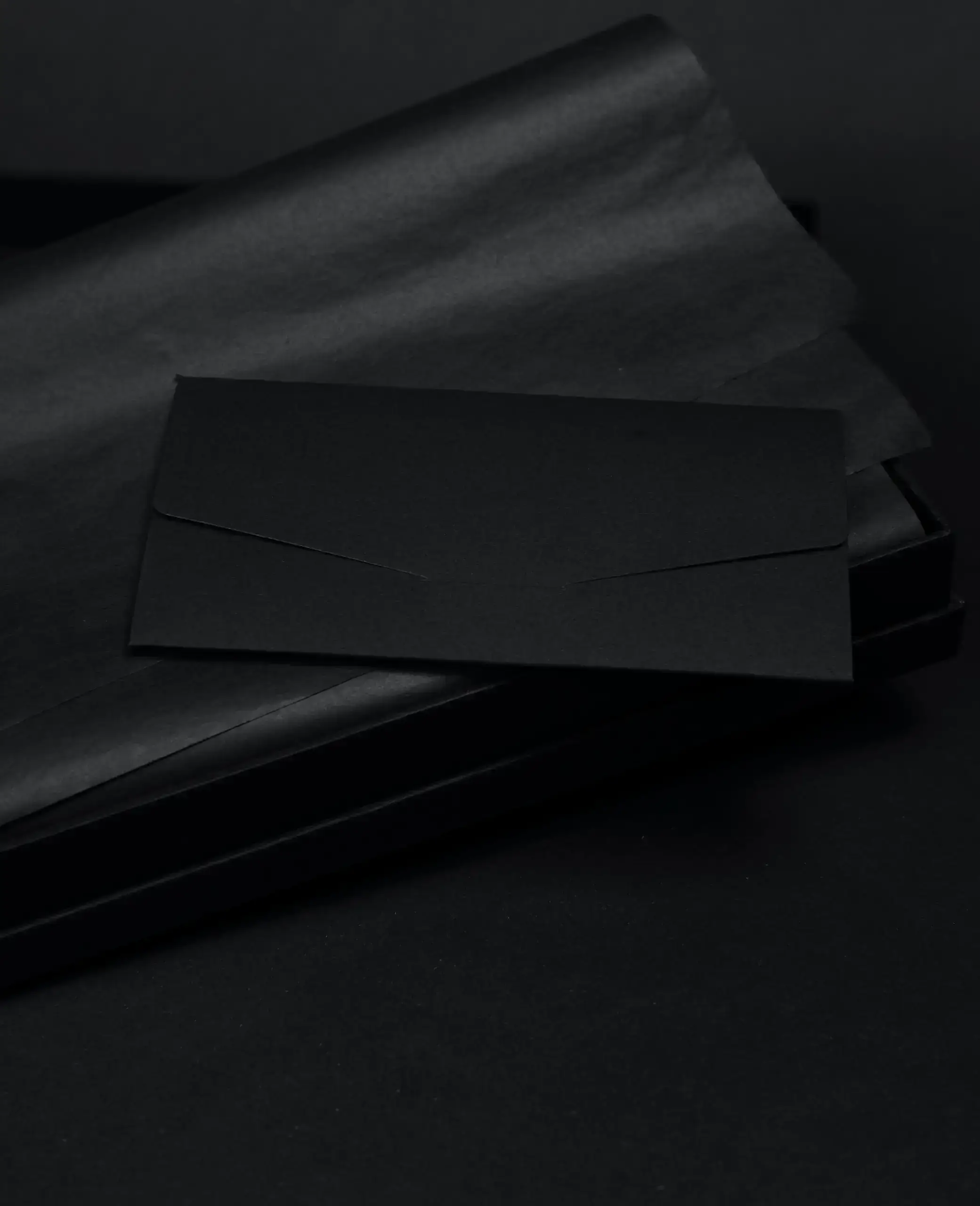
- Left section: A stunning background image of an envelope paired with a textured surface captivates interest and adds depth.
- Right section: Showcasing an inspiring quote, “If everyone is moving forward together, then success takes care of itself,” this section includes four informative blocks: Branding & Strategy, Experiments, User Experience, and Product Strategy.
- Typography: Employing a bold and modern font, the design prioritises readability. Titles are emphasised with a larger size, while descriptions maintain a clear structure.
- Icons: Each category is complemented by simplistic, illustrative icons that visually represent the textual descriptions, making the content more engaging.
Unique design aspects
- Standout choices: The impactful image on the left combined with the grid layout on the right creates a focal point that draws viewers in.
- Responsive design elements: With its modular layout, this design adapts seamlessly to various screen sizes, ensuring a consistent experience across devices.
- Accessibility considerations: High-contrast text improves readability. However, consider adding alternative text for images to enhance accessibility for screen readers.
Overall design style
- Minimalist aesthetic: The clean lines and ample negative space contribute to a sleek, modern look that is both professional and inviting.
- Visual hierarchy: The layout naturally guides users’ attention from the striking phrase to the categorised grid, positioning the most important aspects prominently.
Why use this design?
This layout not only boasts clarity and modern appeal, but it also prioritises user engagement. With its minimalist style and clear visual hierarchy, it’s perfect for professionals wanting to convey their brand effectively. Elevate your WordPress site today with this exceptional design that combines visual allure and functional content!
Use cases for this WordPress icon pattern
1. Portfolio websites
Creatives can showcase their work beautifully with this layout, using the left section for stunning portfolio images and the right section for project details.
2. Business landing pages
Businesses can convey their message effectively by using the left space for key visuals and the right section for information on products and services.
3. Blog homepages
Blogs can employ this design to feature top posts on the left and a curated list of categories or recent posts on the right.
4. Online magazines
Online publications can highlight feature stories with captivating images while organizing other articles in the right grid.
5. E-commerce sites
For retailers, this design allows highlighting a hero product image alongside curated collections or categories.
6. Non-profit site
Non-profits can use the left image for impactful photos and the right section for detailing campaigns, events, or causes.
7. Event promotion
Promoters can utilise the image for an event teaser and the right section for essential details such as date, venue, and speakers.
8. Service oriented web pages
Service providers can showcase a key image and provide succinct, categorized service descriptions on the right.
9. Educational websites
Education sites may display featured courses or faculty members on the left, with details on classes and requirements on the right.
10. Company ‘about us’ page
Companies can present a visual story with a key image and outline their mission or team members in structured blocks on the right.
Themes for WordPress icons
1. Flat design
Flat icons offer a simple, modern aesthetic, popular for its clean lines and absence of embellishments, making it ideal for minimalist web design.
2. Line art
Line art icons deliver an elegant and lightweight option, using simple strokes to create clear visual representations without heavy fills or shading.
3. 3D icons
3D icons add depth and detail, providing a dynamic effect that captures attention and enhances engagement with a more realistic appearance.
4. Gradient
Gradient icons leverage a mix of colours, transitioning smoothly to create an eye-catching effect that adds depth and vibrancy.
5. Monochrome
Monochrome themes employ a single colour, adding versatility and a cohesive look that’s easy to adapt across various platforms and designs.
6. Geometric
Geometric icons use basic shapes and form, providing a structured, often symmetrical appearance that works well for tech-focused sites.
7. Hand-drawn
Hand-drawn icons add a personal and authentic touch, giving a relaxed, approachable vibe that’s great for creative and lifestyle brands.
8. Retro
Retro-styled icons borrow from past trends, incorporating nostalgic elements perfect for targeting an audience with a fondness for vintage design.
9. Animated
Animated icons add a dynamic and interactive element, capturing users’ attention and enhancing engagement with subtle, eye-catching movements.
10. Minimalist
Minimalist icon designs focus on essential forms, stripped of excess to ensure clarity, often using simple lines and spaces to convey meaning.
Conclusion
Embracing a WordPress website design that integrates a multi-column layout can transform your site’s appeal and functionality. This layout doesn’t just look great; it enhances user engagement through its strategic structure and presentation. For businesses and creatives alike, it provides a platform to showcase content effectively. If you’re exploring WordPress website builders, consider incorporating this visually compelling and user-friendly design to differentiate your brand.


