WordPress pattern: Pure Image Dark PID-PRO-09
Build WordPress sites with MaxiBlocks. All features free forever. No locked functionality. Optional Cloud Library saves you 10+ hours per project. Start free
Showcase Your Culinary Creations with a Stunning Multi-Column Layout!
Imagine captivating your audience with a modern, sleek design tailored for food enthusiasts. This eye-catching multi-column layout features four distinct vertical sections, each showcasing a mouth-watering image alongside compelling text. The clean, structured arrangement makes it perfect for culinary showcases or promotional content that demands attention.
Original design overview
- Overall structure: The design is crafted with a striking multi-column formation, presenting four sections stacked in a single row, each dedicated to a unique food-related image and accompanying text.
- Asymmetrical choices: While the layout maintains symmetry in column count, the diverse content within each column adds visual interest and invites exploration.
Element and feature highlights
- Visible elements:
- Headers: A bold header “Hello there” welcomes visitors at the top of the layout.
- Text blocks: Each column features a prominent text block, such as “Pushing limits,” complemented by a brief descriptive text below.
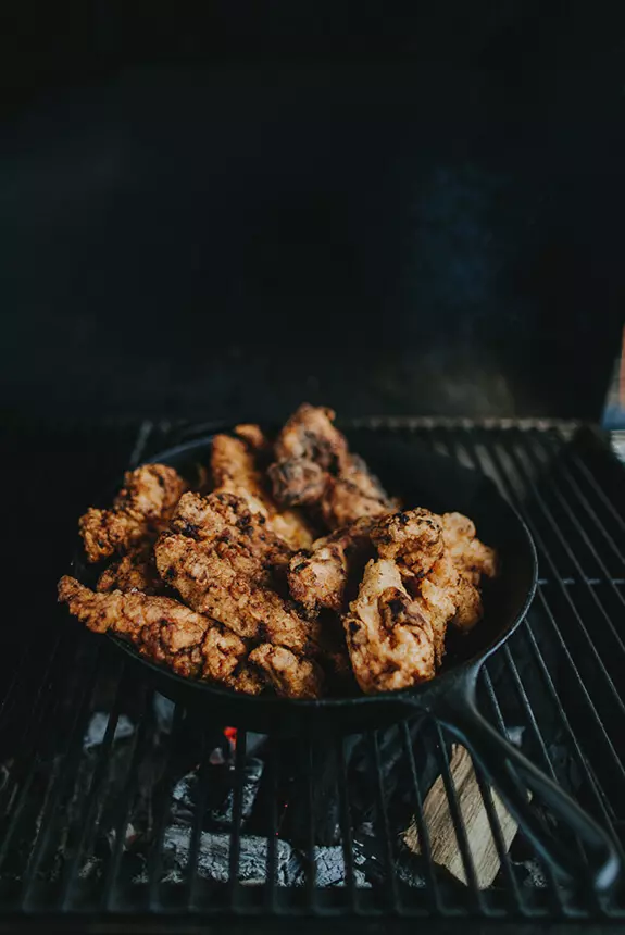
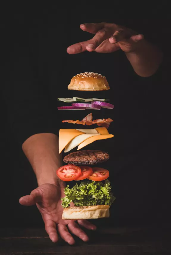
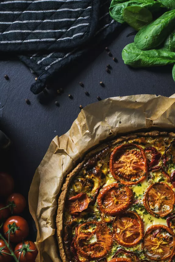
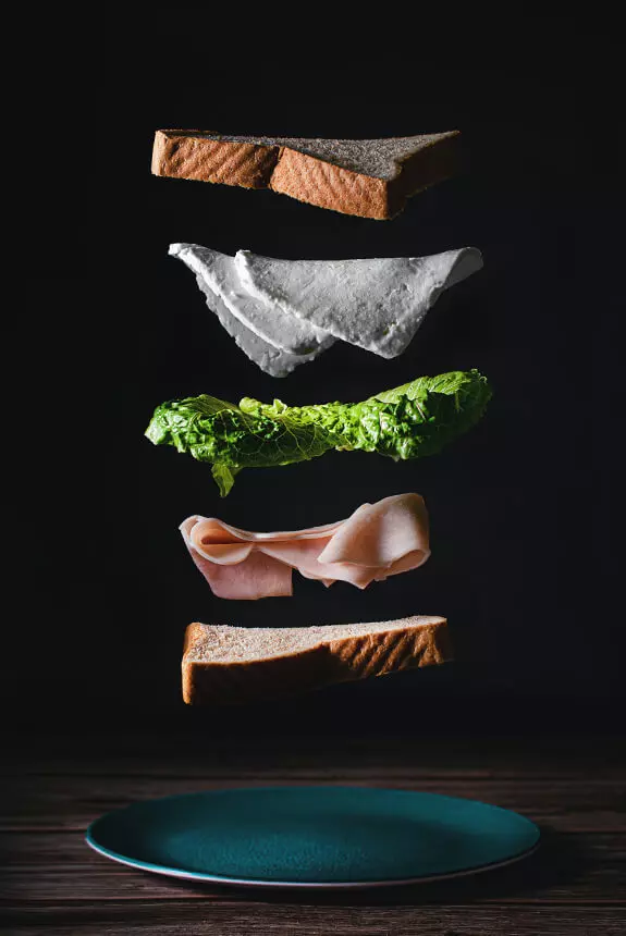
- Images: Vivid, full-width landscape-oriented images highlight the culinary theme, drawing the viewer’s eye.
- Typography: Utilising a sophisticated sans-serif font, the layout balances bold section titles with clear, readable descriptive text for easy navigation.
Unique design aspects
- Thematic coherence: The striking food images create a unified theme, beautifully set against a stark black background that enhances visual contrast.
- User-focused design: Although static in nature, the layout’s clean lines and legibility guide visitors seamlessly through the content.
- Responsiveness: The adaptable multi-column structure is designed with various screen sizes in mind, ensuring a consistent look across devices.
Overall design style
- Modern flair: Combining culinary passion with a contemporary twist, this design is both functional and visually appealing.
- Visual hierarchy: The compelling header commands attention first, leading the viewer’s eye down to the captivating images and thoughtful descriptions.
- Mindful use of white space: The black background provides ample breathing room, emphasising the brilliant food imagery and supporting text.
Use cases for your WordPress website design
1. Food blogger’s haven
Transform your WordPress website into a feast for the eyes by showcasing your culinary tales in a visually stunning way. Capture your audience’s tastebuds with enticing images and engaging narratives, making food blogging an art form. Whether you’re sharing your latest avocado toast creation or delving into the history of sourdough, let your passion for food shine through this carefully crafted layout. Bring people to your site like bees to honey, and let them leave with recipes they’ll be excited to try.
2. Restaurant portfolio
Present a dynamic online menu for your restaurant using this sleek multi-column layout. From appetisers to desserts, tempt your visitors with images so vivid they can almost taste the dishes on their screens. Integrate reservation options seamlessly, making dining a click away. This modern design not only boosts appetite but ensures customer engagement, turning casual browsers into loyal patrons. Elevate your website navigation menu experience, streamlining customer interactions effortlessly.
3. Culinary photography portfolio
For photographers specialising in the food industry, this layout provides a beautifully curated space to showcase your work. Display your collection of vibrant, high-resolution images that capture the perfect blend of artistry and deliciousness. Allow potential clients to view your style and approach, emphasising your unique ability to marry aesthetic appeal with culinary allure. This design is the perfect tool to attract new projects and collaborations.
4. Recipe collection showcase
Create a digital cookbook with this organised layout, making it a breeze for users to browse through your recipes. Group them into meaningful categories, each presented with a tantalising image and enticing description. Make cooking simple and enjoyable by providing one-click access to measured ingredients lists and step-by-step guides. Whether it’s family favourites, secret recipes, or health-conscious meals, let readers discover their next go-to dish with ease.
5. Product launch teaser
Launching a new food product? Use this dynamic layout to build anticipation and buzz. Feature mouth-watering photos and engaging stories about the product’s journey from farm to table. Engage customers with captivating “behind-the-scenes” content, turning curiosity into demand.
6. Culinary course promotions
Promote your cooking classes or workshops with this appealing design. Showcase the learning experience with intriguing images and straightforward calls to action. Whether it’s a baking workshop or a culinary masterclass, let the vibrant presentation draw in aspiring chefs and food enthusiasts alike.
7. Food festival highlights
Highlight key moments from recent food festivals, capturing the excitement and flavours in a visually rich narrative. Use this layout to tease upcoming events and encourage community engagement. With each column, transport your audience directly into the buzz of the festival scene.
8. Gourmet travel diary
This design is perfect for travel bloggers who love to explore global cuisines. Craft each section as an immersive tale from your culinary adventures around the world. Share images and stories that invite readers to taste and travel the globe from the comfort of their home screens.
9. Cooking competition coverage
If you’re involved in hosting or covering cooking competitions, this layout can bring the excitement to life. Showcase the participants’ talents, their standout dishes, and the thrill of competition. With vivid imagery and detailed descriptions, capture the essence of culinary artistry and rivalry.
10. Ingredient spotlight blog
For food bloggers focusing on specific ingredients, this structured design lets each section highlight a different culinary star. Use captivating imagery and informative text to educate and inspire your audience to discover the magic of these essential ingredients in their cooking.
Exploring website image based themes
1. Dynamic gallery view
Inject life into WordPress web designs with a dynamic gallery theme. Prioritise visual content, offering an immersive browsing experience that keeps users engaged. Galleries are ideal for photographers, designers, and anyone with a strong emphasis on tangible artistry or portfolios.
2. Minimalist focus
Strip away the extras and let images speak for themselves with a minimalist theme. By decluttering the design, each image claims the stage it deserves. It’s an effective approach for artists and designers wishing to highlight form and content without distractions.
3. Magazine-inspired layout
Replicate the sophisticated polish of a glossy magazine with a theme that combines images and text seamlessly. Perfect for bloggers and content marketers wanting to balance storytelling with striking visuals, capturing readers who crave beauty and information in equal measure.
4. Interactive feature image
Create an engaging experience with interactive feature images. The addition of hover effects and clickable elements turns visual browsing into an adventure, encouraging users to explore deeper. Ideal for innovative products or unique service showcases seeking to enthral and inform audiences.
5. Portfolio showcase design
Spotlight professional portfolios with layouts that celebrate projects and creativity. This design helps freelancers and artists exhibit their versatility and depth through well-curated content blocks, making a compelling case for potential clients.
6. Story-telling theme
Fuse words with visuals in a story-telling theme where each picture is a visual chapter in a larger narrative. Suited for bloggers and content creators, this theme enhances storytelling with evocative imagery, creating a memorable user journey.
7. E-commerce image focus
Encourage customer conversion with an image-focused e-commerce theme, prioritising product photos to entice buyers. Craft galleries that let users view items in detail, ensuring they picture them in their own lives. Engage shoppers visually and elevate online store experiences.
8. Event highlight theme
Events come alive on screen with image-centred themes that transport users to the heart of the action. Ideal for organisers and photographers, this theme offers a comprehensive view of past highlights and upcoming attractions, keeping the community informed and engaged.
9. Travel log theme
World travelers can document their journeys with a theme that integrates breathtaking images into a travel log. Emphasising experiences and destinations, this theme appeals to readers with wanderlust, providing destination details paired with eye-catching visuals.
10. Infographic integration design
Combine statistics with visual storytelling using infographic-integrated designs. By carefully curating images and infographics, informational content becomes visually compelling and easily digestible. Educators, analysts, and business strategists find this theme useful for sharing knowledge effectively.
Practical FAQs on website images
To get an image for a website, explore platforms like Unsplash or Pexels that offer free images online; ideal solutions also include public domain images from sites like Pixabay. Alternatively, create original visuals or invest in a professional photographer to ensure unique content. Remember to credit appropriately if required.
The website image used as a bookmark icon is known as a “favicon.” Understanding dimensions and placement is critical, as it affects brand recognition across web browsers. Managing WordPress icons effectively ensures a cohesive favicon display.
To avoid copyright issues, explore resources like Google Advanced Search and filter results marked for reuse. Always respect copyright laws and provide appropriate attributions. For detailed navigation into optimising this for your WordPress site, tap into resources like the WordPress icon library and navigate image selection efficiently while maintaining brand integrity.
Conclusion
Transform your WordPress site with this modern, multi-column layout that pairs stunning food visuals with clear typography. The unique black backdrop elevates your content, while the structured design invites your audience to engage with your culinary showcases. Don’t miss the opportunity to create an unforgettable experience-implement this layout today and watch your culinary creations shine! Umbrageous digital design and responsiveness across devices rely heavily on the right combination of visual assets-aligning perfectly with the principles of WordPress website design.


