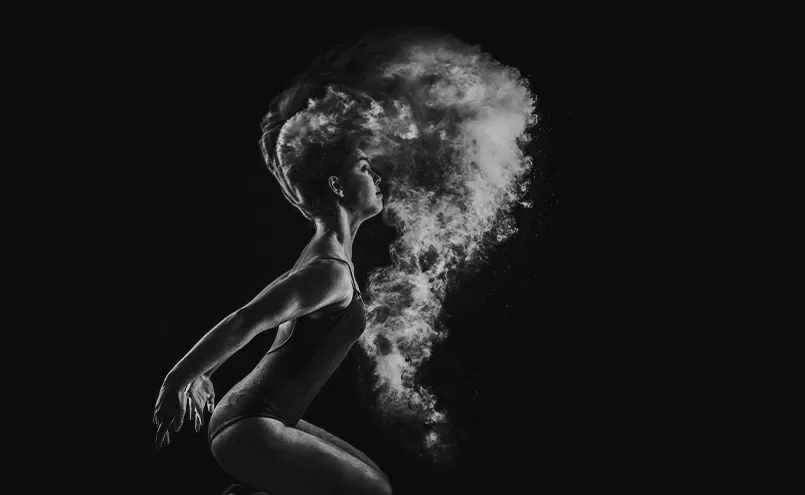


Let’s make things better
Lorem ipsum dolor sit amet, con sec tetuer adipiscing elit.
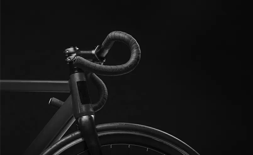
Better sound through research
Lorem ipsum dolor sit amet, con sec tetuer adipiscing elit.

Digitally yours

Build WordPress sites with MaxiBlocks. All features free forever. No locked functionality. Optional Cloud Library saves you 10+ hours per project. Start free


Lorem ipsum dolor sit amet, con sec tetuer adipiscing elit.

Lorem ipsum dolor sit amet, con sec tetuer adipiscing elit.


Want to give your WordPress website a fresh look? Try a multi-column layout. It’s not just for show; it captivates your audience and makes them stick around!
Featuring catchy headers such as “Let’s make things better” and “Digitally yours,” each image is accompanied by concise, descriptive text to enrich the experience.
The layout mixes portrait and landscape images showcasing everything from actors to landscapes, all with rounded corners for a modern touch.
The bold headers and smaller descriptive text create a clear hierarchy, making it easy to digest information.
A dark background amplifies the black and white aesthetic of the images and text, making for a stunning visual impact.
Perfect for any device, this layout seamlessly fits mobile screens while retaining its engaging structure.
High contrast and clear text hierarchy enhance readability, ensuring everyone can navigate easily.
Emphasising key visuals and messages, this clean approach ensures nothing overwhelms the user.
The clever placement of large images and bold headers effectively guide viewer attention, fostering interaction.
Ample white space around elements maintains focus and prevents clutter, enhancing user experience.
Looking to make an impact? With its smart composition and clarity, this layout is perfect for creatives, bloggers, and businesses looking to keep audiences captivated. It’s just what you need to elevate your WordPress website design.
Artists and designers can showcase their work with flair using this visually rich layout. Whether it’s digital art, paintings, or photography, the multi-column approach draws attention to each piece, letting the art speak for itself. Plus, the WordPress pattern library offers plenty of inspiration.
Draw readers in from the get-go with eye-catching images paired with intriguing article headlines. This setup isn’t just about aesthetics; it substantially enhances user engagement, inviting users to delve deeper into the site’s content.
Showcase your products in a compelling way using varied image sizes to highlight best sellers or new arrivals. This approach makes browsing an immersive experience, appealing to both the casual browser and the serious buyer. Try combining with open-source website builders for added flexibility.
Let pictures speak a thousand words! Use this layout to share your travel adventures. The asymmetrical design creates an enticing storytelling flow that guides readers through your journey, evoking wanderlust.
Make viewers’ mouths water with beautifully displayed images of your culinary creations or restaurant visits. Pair each dish with a brief story or recipe to engage your audience and keep them coming back for more.
Show off your latest styles with a layout that mimics the feel of a glossy magazine. The modern and sleek design highlights each fashion piece, ensuring your collection stands out. Consider aligning it with your own WordPress block templates.
For painters and sculptors, displaying works in a structured yet artistic fashion can elevate a simple portfolio into an immersive gallery experience. Each work becomes a focal point within the multi-column display.
Highlight modern, stylish rooms with a multi-column image layout that brings out the grandeur and detail of interior design projects. This format allows viewers to appreciate the nuances of each space.
This eye-catching layout is perfect for showcasing wedding event photos, from grand venues down to intricate table details. It helps potential clients visualise the dream wedding experience you can provide.
Capture the essence of architectural projects or property listings in a dynamic format that invites detailed examination. This layout approach is ideal for providing a virtual tour-like experience to remote clients.
Transform your home page into a visual spectacle with a responsive image layout that highlights key sections of your site. It draws visitors in and guides them smoothly through what you have on offer.
Especially useful for e-commerce sites, an image-rich page effectively highlights products, creating an engaging browsing experience that encourages conversions and provides clarity at a glance.
Highlight successful case studies using images to convey before-and-after scenarios, including process shots and client testimonials. Website design in WordPress can facilitate engaging layouts that support storytelling through visuals.
Visuals aid in explaining complex services or processes. An image layout complements text, making information digestible and appealing. Use relevant WordPress icons to further illustrate points clearly.
Generate buzz for upcoming events with vibrant imagery of past events, guest speakers, or venue setups. This dynamic presentation sparks interest and encourages attendance.
Highlighting customer experiences through images adds authenticity and relatability, offering potential clients a tangible sense of trust and credibility in your services.
Use a multi-column format to visually break down steps of a tutorial to help users easily follow instructions. Pairing images with text can make complex processes seem simple to even the freshest beginner.
Whether individual or agency-based, a visually captivating portfolio can be the difference between standing out or blending in. Multi-column layouts make skills come to life through rich media.
Engage potential donors or volunteers with powerful images depicting your projects in action, highlighting the impact and reach of your charitable activities effectively.
Showcase team members and their roles with images that add a personal touch and humanise your brand, improving connection with both clients and stakeholders.
For anyone looking to elevate their WordPress website design, a multi-column image layout is an ideal option. It’s not just about aesthetics; it fosters engagement and clarity. Plus, combining this with other best website builder software enriches the creative process, making your site more inviting and impressive. From enabling users to easily find free WordPress themes and understanding the best WordPress website builders, to exploring WordPress favicon dimensions, leveraging these tips will set your website image in the best light. Make sure to keep your eyes peeled for the best Elementor Alternatives for flexible Gutenberg blocks that will further enhance your designs.
