What makes us stand out?

WordPress pattern: Pure Image Dark PID-PRO-13
Build WordPress sites with MaxiBlocks. All features free forever. No locked functionality. Optional Cloud Library saves you 10+ hours per project. Start free
Transform Your WordPress Site with Our Eye-Catching Image Block Pattern!
Get ready to elevate your WordPress website‘s aesthetic with a stunning image layout! Our design features a balanced 3×2 grid structure, showcasing key offerings in a modern, minimalist style. Each of the six blocks is arranged in two rows of three, making it not only visually appealing but also easy for your visitors to navigate and engage with.
Layout Analysis
- Overall Structure: Organised in a neat 3×2 grid format.
- Arrangement: Contains six distinct blocks laid out in two rows, perfect for displaying varied content.
- Asymmetrical Choices: While the grid appears symmetrical, the varying content within each block adds dynamic visual interest.
Element and Feature Description
- Visible Elements:
- Headers: Each block features a catchy title (e.g., “Suites & rooms,” “Fine dining”) to grab attention.
- Text Blocks: Below each title, you’ll find engaging descriptive excerpts that invite further reading.
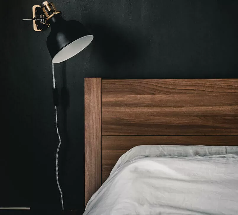
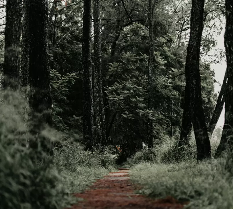
- Images: Each block is accompanied by a striking image relevant to its theme, enhancing appeal.
- Interactive Elements: While interactions aren’t explicitly shown, the design hints at seamless links to comprehensive content, enhancing user navigation.
- Typography:
- Headings: Bold, sans-serif fonts that stand out to draw the eye.
- Body Text: Smaller and lighter font for a clean, modern look.
- Graphical Elements: Each image block features defining borders or shadows, ensuring they pop against the background.
Unique Design Aspects
- Standout Choices: A dramatic dark background contrasts beautifully with vibrant images, creating an unforgettable visual impact.
- Hover Effects: Subtle hints of hover effects can enhance user interaction as they engage with your content.
- Responsive Elements: The adaptable grid structure is designed for mobile, allowing elements to stack neatly on smaller screens.
- Accessibility Considerations: Strong contrast between text and background enhances readability. Incorporating alt text for images will further improve accessibility.
Overall Design Style
- Design Style: A modern and minimalist approach, with a clear focus on high-quality visuals and content clarity.
- Visual Hierarchy: Prominent headings guide user attention effectively, while captivating images serve as focal points.
- White Space and Balance: Ample white space around each block ensures a clutter-free, harmonious appearance.
Use Cases for Our Website Image-Based Patterns
1. Hotel Showcases
Present various suites and amenities elegantly using our 3×2 grid, enhancing the user experience as they browse different offerings. The intuitive layout draws visitors deeper into each aspect of your hospitality service.
2. Restaurant Menus
Feature your signature dishes and entice potential diners with mouth-watering images, complemented by brief descriptions that evoke taste and aroma, ultimately driving more reservations.
3. Online Portfolios
Artists and designers can display their masterpieces efficiently. Each art piece or design project can be vividly showcased, giving viewers the opportunity to appreciate your creative journey.
4. E-commerce Product Displays
Retailers can highlight new arrivals and bestsellers, providing an elegant and accessible shopping experience that aligns with modern consumer behaviour and aesthetics.
5. Business Service Listings
Highlight your core services with accompanying images, elevating the presentation and making the services more appealing to potential clients.
6. Travel Destination Guides
Engage your audience with beautiful photographs of travel destinations, inspiring them to explore further and plan their adventures.
7. Educational Course Overviews
Educational platforms can attract potential students by presenting course highlights with relatable imagery and engaging titles.
8. Event Promotions
Promote upcoming events by showcasing previous highlights, artist line-ups, and venue features, encouraging ticket sales through appealing visuals.
9. Real Estate Listings
Realtors can enhance property listings by providing a comprehensive view of interiors and exteriors, bridging the gap between virtual tours and physical visits.
10. Charity and Fundraising Campaigns
Capture the essence and impact of humanitarian initiatives, inspiring donations and volunteerism through compelling stories told via images and succinct narratives.
10 Different Types of Website Image-Based Themes
1. Bold Contrast
This theme employs sharp contrasts between text and images to capture attention quickly, suitable for high-impact storytelling on platforms like news sites and blogs.
2. Minimal Elegance
Clean lines and ample white space create a sophisticated look, ideal for creative portfolios where content focus is crucial.
3. Vintage Charm
Infuse your website with nostalgic vibes using sepia tones and classic fonts, perfect for retro-themed businesses and craft stores.
4. Urban Groove
A modern, edgy look combining bold typography with cityscape backdrops, suitable for sites targeting young, dynamic audiences.
5. Nature’s Palette
Incorporate earthy tones and rustic elements for eco-friendly brands and outdoor adventure services, invoking a sense of environmental consciousness.
6. Tech Savvy
Sleek and futuristic designs with metallic hues and minimal embellishments cater to tech companies seeking to reinforce innovation.
7. Art Nouveau
Flowing lines and organic forms create an artistic aesthetic, perfect for showcasing intricate designs in art galleries or boutiques.
8. Whimsical Wonderland
Bright colours and playful elements offer a fun environment for child-centric services, craft stores, and entertainment agencies.
9. Modern Luxury
Lavish imagery and elegant fonts bring a luxurious touch to high-end product websites, emphasising quality and exclusivity.
10. Industrial Edge
Raw, gritty textures combined with minimalist design capture the essence of industrial chic settings, suitable for furniture stores and architectural firms.
Conclusion
This versatile 3×2 grid layout not only highlights your essential offerings but also embraces a sleek, minimalist design. The combination of high-quality visuals, clear typography, and potential for interactivity makes it a perfect choice for any WordPress website design looking to boost user engagement and aesthetic appeal. Don’t miss out on this opportunity to transform your free WordPress themes website!
For those interested in building a WordPress website builder or looking for Elementor Alternatives, these best website builder software options are a great place to start. Unleash the potential of WordPress block templates in your WordPress block themes and enjoy the benefits of a stunning web design for WordPress.


