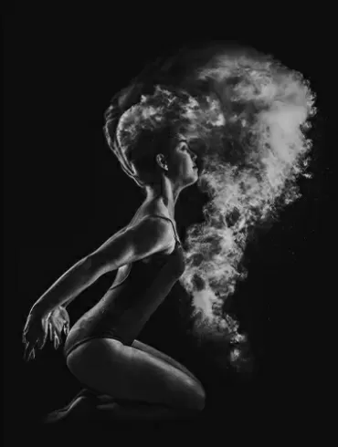
Get in the game
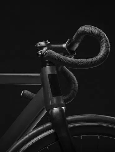
Ideas for life
Born to play

Choose freedom

A better way
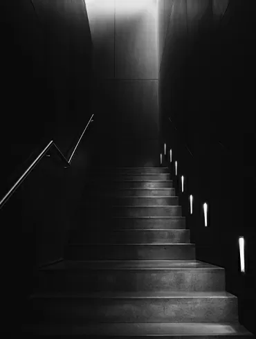
Don’t do evil

Build WordPress sites with MaxiBlocks. All features free forever. No locked functionality. Optional Cloud Library saves you 10+ hours per project. Start free

Get in the game

Ideas for life

Born to play

Choose freedom

A better way

Don’t do evil
Unlock the potential of your WordPress website design with our sleek layout designed to grab your audience’s attention. This minimalist design features a six-column grid showcasing monochromatic images with concise captions, providing visual impact while clearly communicating your message. Let’s dive into the elements that make this design both striking and functional.
Embrace a modern, multi-column format that lends an organised look to your WordPress website.
Display your content in a single row of six uniform columns, each featuring a powerful image with a caption beneath it.
The evenly spaced columns create a harmonious design that’s visually pleasing, free from the distractions of asymmetry.
Monochromatic images against a dark background create a striking contrast that captures attention.
Without hover effects, the focus remains on the content, which takes centre stage.
Optimised for various screen sizes, the high-contrast elements ensure readability for everyone.
By focusing on essential elements, the design remains clean and highlights your content.
Placing captions beneath images leads the viewer seamlessly through the content.
The dark background makes your images and text pop, while strategic white space keeps it all balanced.
This layout is perfect for creators who need to display an online portfolio. By using diverse images that best represent their work, designers, artists, and photographers can present their projects effectively and attractively. The captions provide essential details without overwhelming the visuals, making it a favourite for those looking to emphasise their creativity. Whether you’re a budding artist or an established professional, the clean and organised display ensures your work takes the spotlight, offering potential clients and audiences a memorable browsing experience.
Bloggers can use this grid to feature snippets from their latest or most popular posts. By showing representative images with brief descriptions, readers get a quick glimpse of what’s in store, enticing them to delve deeper into the content. This method enhances user engagement and helps bloggers maintain a dedicated readership. It’s an excellent strategy for content-heavy blogs needing to highlight a broad range of topics in a digestible format. With intuitive navigation, readers can easily find and explore stories that pique their interest.
Online stores can benefit from the straightforward display of products, each image accompanied by a catchy headline and key information like price or features. This setup allows customers to browse effortlessly while gaining necessary details before making a purchase decision. It supports various product types, from apparel to gadgets, ensuring consistent branding across the board. The minimalist design emphasises product quality and appeal without unnecessary distractions, making it easier for shoppers to connect with the brand’s offerings.
Travel agencies and bloggers can share breathtaking destinations using this grid. Each photo can depict a beautiful scene or attraction, with captions that entice potential travellers to seek more information. This visually engaging format nurtures wanderlust, encouraging viewers to imagine themselves in the destinations showcased. By briefly highlighting what makes each location special, viewers are drawn into dreaming and planning their next adventure. It’s a powerful tool to evoke curiosity and inspire action among travel enthusiasts.
Companies eager to put faces to their brand can use this design to introduce key team members. Alongside professional portraits, short bios or roles can be highlighted, thereby fostering a personal connection with clients and visitors right from the start. This authenticity helps humanise the business and build trust with potential partners and customers. Whether aiming to showcase leadership or highlight a diverse workforce, it’s an effective way to celebrate the people behind the brand.
After hosting an event or conference, organisers can use this format to share highlights. By choosing images that capture the essence and excitement of the day, along with pertinent details, attendees and non-attendees alike can reflect on or learn about the event’s success. This approach not only celebrates what went well but fosters anticipation for future endeavors. By immortalising key moments through stunning visuals, you ensure the event lives on in the minds of your audience.
Food bloggers and chefs can present mouth-watering images of dishes, each labelled with enticing descriptors, to inspire visitors to try new recipes. This captivating display of culinary artistry can engage the senses and encourage site visitors to explore further. The allure of visually appealing dishes paired with the promise of delicious results makes for an irresistible combination. It’s a tantalising way to make recipes accessible and stir the curiosity of culinary explorers.
Non-profits and foundations can employ this layout to share impactful stories through imagery, each photo highlighting a different aspect of their mission. Captions serving as a call to action or brief explanation can rally support and encourage donations or participation. This visual narrative approach helps communicate the organisation’s vision effectively and fosters empathetic connections. By showcasing positive changes and efforts, the design allows audiences to engage emotionally and contribute actively.
Businesses can showcase case studies through this pattern, each image representing a different project or result. Captions can briefly summarise the outcomes, offering flexibility and motivation for readers to follow links for detailed explanations. As an effective method to build credibility, this approach demonstrates successful endeavours and challenges solved. It helps potential clients or partners envision how their own issues might be addressed, creating a compelling case for collaboration.
Fashion designers can use these grids to present their latest creations, giving each outfit or accessory its own spotlight. Short, evocative captions set the stage for theming and styling inspirations, creating a dynamic and attractive overview. This method draws attention to craftsmanship, innovation, and trends, inviting fashionistas to delve deeper into the collection’s nuances. It’s an excellent way to communicate a designer’s vision and encourage exploration of their unique style.
A striking grid on your homepage can immediately captivate visitors. Featuring your most significant content or categories ensures they know exactly what to explore first. By organising sections visually, users can easily navigate and interact with elements of interest. It’s also a brilliant way to reflect your brand’s essence and message. Whether it’s a product-focused introduction or thematic overview, a well-designed homepage boosts user engagement and presents your site’s purpose clearly from the start.
About pages enhanced with image-based designs can vividly tell your story. Using visuals to complement your narrative offers viewers a more engaging experience, portraying your company’s journey and values. By weaving captivating visuals alongside textual milestones, the essence of your brand becomes easier to grasp. Highlighting your team, offices, or products can add a personal touch, making your journey relatable and fostering a connection with your audience.
Increase the appeal of your service pages by showcasing visuals that highlight what you offer. This can enhance comprehension and persuasion, providing visitors with a clear picture of the value they can expect. With captivating imagery, the unique benefits of each service become easier to communicate. Whether presenting past success stories or process infographics, the emphasis on visual storytelling makes complex information more accessible and intriguing.
Presenting work in a portfolio format benefits immensely from image-based designs. Select visuals that best represent your capabilities or projects to capture attention and demonstrate expertise instantly. Coupled with brief text explanations, viewers can quickly understand and appreciate the scope and quality of your work. This dynamic showcase encourages visitors to explore in-depth, more actively engaging with your best creations and understanding the breadth of your talents.
Images and grid designs can illustrate upcoming events’ appeal, enticing visitors to participate. With visuals depicting past events and detailed descriptions, the forthcoming experiences become more tangible. This approach fosters excitement and anticipation among potential attendees. Alongside logistic details, these visuals can help ensure that visitors comprehend an event’s value, easing decision-making and leading to higher attendance and participation rates.
Blog overview pages benefit from image-based patterns that highlight featured or recent posts. With eye-catching images, these grids can increase click-through rates while making the navigation process straightforward and appealing. Coupled with intriguing captions, readers can easily locate articles that interest them, enhancing their overall experience. This visually engaging format entices audiences to stay longer, organically promoting further content exploration.
Encourage purchases by showing detailed product grids, each with illustrative images, prices, and quick information on features. This format makes browsing quick and intuitive, enabling customers to efficiently compare options and make informed decisions. By presenting all relevant details upfront, the design supports ease of use and accessibility, reducing barriers to purchase. Adaptable to various industries, this design consistently enhances the online shopping experience.
Images accompanying client testimonials can add authenticity. By highlighting their experiences visually, you create a trustworthy narrative that captivates potential customers. Featuring candid photos and descriptive captions humanises endorsements, building confidence in your brand’s reputation. This engaging setup ensures viewers deduce the true value of your solutions, encouraging them to place their trust and expectations in your offerings. It’s a compelling strategy for fostering loyalty and credibility.
Minutes is employed by galleries and photographers, image-based designs effortlessly display collections in an accessible and immersive manner. Use grids to curate and present visuals in an organised fashion, encouraging exploration and appreciation. Whether highlighting featured works or a series of related images, the direct access and focus on visual integrity inspire audiences to browse extensively, enjoying each piece to its fullest.
Leveraging image-based designs can increase landing page efficacy. By pinpointing your aim with commanding visuals, you create a powerful message that invites viewers to act. Use imagery to support headlines and calls to action, ensuring they’re eye-catching and impactful. Designed to convert visitors with concise text and supplementary graphics, landing page success is enhanced by visual engagement, making it a crucial tool for effectively connecting with your audience.
Embrace this minimalist, grid-based design to elevate your WordPress website design. With its striking monochromatic images and succinct captions, this layout not only captivates but communicates effectively. High contrast ensures accessibility, making it an ideal [solution](https://maxiblocks.com/wordpress-websites/) for anyone aiming to relay themes and concepts with style. Experience a refined presentation that resonates, encouraging your audience to explore further.
