Modern grid design for engaging imagery
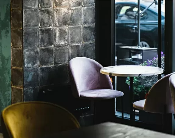
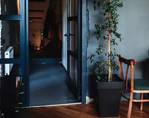
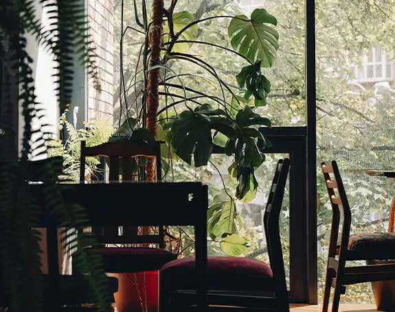
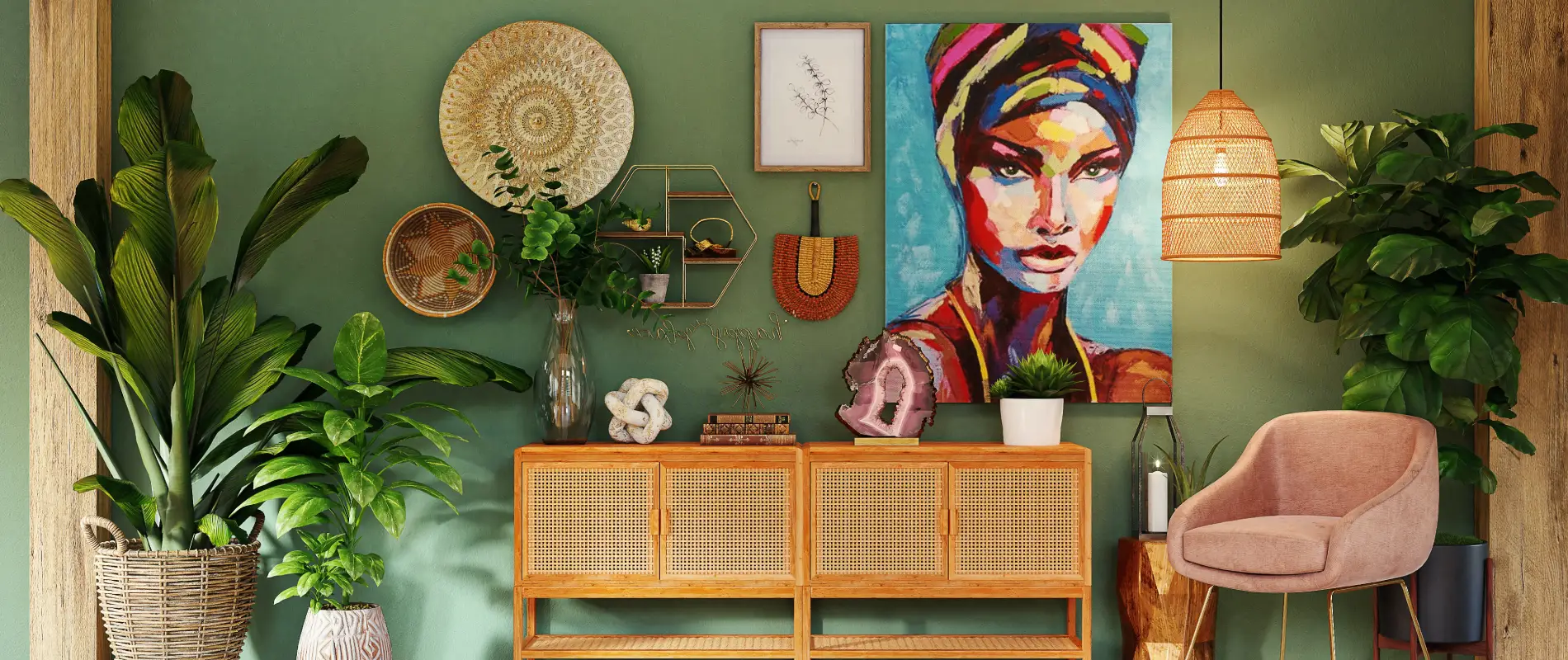
Imagine showcasing your content with a sleek grid layout that instantly captures attention. With eight boxes in a two-column, four-row structure, this design offers a modern and symmetrical aesthetic. The header eloquently states “In touch with tomorrow,” and is accompanied by the tagline, “Imagine the possibilities.” The rich, dark background enhances readability and makes your images pop.
Key features to enhance your WordPress site
Layout analysis
- Overall structure: The grid layout allows for easy navigation and a clean presentation.
- Arrangement: With 8 boxes neatly organized, your content will look organised and professional.
- Design consistency: The uniform structure enhances visual appeal and user experience.
Element and feature description
- Visible elements:
- Headers: Captivating titles atop each box intrigue your audience.
- Text blocks: Accommodate various themes or topics with dynamic phrases.
- Interactive opportunities: The text blocks are perfect spots for buttons or links, inviting user engagement.
- Typography: Modern sans-serif fonts create a polished look, with significant distinction between title and subtitle.
- Graphical elements: Landscape-oriented images paired with text provide a cohesive visual experience.
Unique design aspects
- Standout choices: The dark background offers a striking contrast against lighter text, ensuring clarity.
- Responsive design: With its adaptable grid layout, this design seamlessly transitions between desktop and mobile views.
- Accessibility considerations: High-contrast text enhances readability for a diverse audience.
Overall design style
- Minimalist and modern: This design focuses on striking imagery paired with straightforward typography, allowing your content to shine.
- Visual hierarchy: The prominent title directs focus while individual topics invite deeper exploration.
- Effective use of white space: Thoughtful spacing ensures your design remains uncluttered, enhancing user engagement.
Why choose this design?
This modern grid layout not only beautifully showcases your imagery but also guides user interaction through minimalist principles. Perfect for WordPress users who want to blend functionality with style, this design promotes clarity and engagement, making it an ideal choice for your next website project. Transform your content presentation today!
Use cases for website image-based patterns
Art portfolio
Bring your art portfolio to life with a grid design that accentuates your work. Display vibrant images against a dark backdrop, making every piece stand out. This layout beautifully blends titles and descriptions to guide art lovers through your collection, offering a dynamic viewing experience. Its responsive nature ensures your portfolio looks exquisite on any device, making it a top choice for artists.
Travel blog
Showcasing breathtaking destinations has never been easier. With a visually appealing grid layout, your travel blog will offer readers a sneak peek into your adventures. Picture your photos against a striking background, enticing visitors to explore more through engaging captions and interactive links. This modern design keeps your content organised, ensuring a seamless browsing experience.
Online store
An organised display of products can greatly enhance how your online store is perceived. This grid design provides an attractive way to feature your merchandise, with inviting calls-to-action in each box. Beautiful imagery, headers, and interactive elements guide shoppers through their buying journey, offering a user-friendly shopping experience that’s both stylish and efficient.
Photography showcase
For photographers seeking a sophisticated way to present their work, this grid design offers a stunning option. Each box frames your photography, allowing it to take centre stage. The use of sans-serif typography ensures captions and titles don’t detract from the images. With its sleek, modern aesthetic, your portfolio will captivate and inspire viewers at every glance.
Fashion lookbook
Capture the essence of your fashion collection with a grid layout that mirrors modern magazine aesthetics. Pair high-quality images with intriguing text overlays to engage customers. The dark background accentuates your designs while interactive elements encourage users to delve deeper into your offerings. Elevate your brand’s style and sophistication with this impactful presentation.
Real estate listings
A picture is worth a thousand words when it comes to selling homes. This grid design places stunning property photographs front and centre, enticing potential buyers. Headers and text blocks provide essential information, while interactive features allow easy navigation. Responsive design ensures listings look great on any screen, enhancing the user experience.
Recipe collection
Transform your recipes into a visually delightful feast for your audience. Use this grid layout to showcase mouth-watering images alongside concise recipe details. Interactive opportunities, such as links to full recipes or video tutorials, enrich the user experience. This layout will make your culinary creations irresistible and easy to explore.
Events portfolio
Make your events unforgettable with a sleek image-based design that beautifully displays the highlights. From weddings to corporate gatherings, this layout captures the essence and emotion of each occasion. Headers and interactive elements provide context and engagement, offering viewers an immersive experience that’ll leave a lasting impression.
Education courses
Educational content needs clarity and engagement for effective learning. Use this grid design to highlight courses with compelling imagery and concise descriptions. Include interactive links to register or learn more, ensuring students find the information they need quickly. The clean, structured layout supports knowledge transfer and enhances learning experiences.
Personal blog
Whether sharing your thoughts or experiences, this grid layout presents them in an organised, appealing manner. Vibrant imagery and thoughtful text placement draw readers in, encouraging exploration. The modern style aligns with today’s fast-paced digital landscape, without sacrificing personal touch or storytelling effectiveness.
Page types using image-based designs
Homepage
The first impression matters, and creating a striking homepage with image-based design sets the tone for your entire site. Display key messages and captivating visuals that engage visitors from the get-go. Make navigation intuitive with clearly designated blocks, guiding users seamlessly through the different sections.
Gallery page
For visual-focused content, a gallery page benefits immensely from a grid-based design. Showcase images in an organised, aesthetically pleasing manner, allowing viewers to appreciate each piece fully. With responsive properties, galleries look spectacular across all devices, making them perfect for artists and photographers.
Portfolio page
Highlight your best work using a portfolio page with a structured grid layout. Each project gets its dedicated space, complemented by concise descriptions and interactive links for further exploration. The design’s elegance boosts professionalism, making it a favourite for creatives wanting to impress potential clients.
Contact page
Design a contact page that’s informative and visually engaging. Use grid sections to distinctively highlight different contact methods, office locations, or links. Include striking images to illustrate your brand’s presence and inviting call-to-actions to encourage communication.
About page
Tell your story with style on an about page that utilises image-based design. Combine text blocks with imagery to narrate brand history, team introductions, or business milestones. This layout balances information dissemination with visual appeal, helping visitors connect with your brand on a personal level.
Service page
Present your offerings compellingly with a service page utilising a grid layout. Use images and headers to communicate offerings succinctly, enhancing user understanding. Interactive features can direct interested customers to more detailed information or booking forms, making it a practical and aesthetically pleasing solution.
Blog index page
Gather all your blog entries in a visually enticing index page using a grid design. It’s an excellent way to organise content thematically, offering users an intuitive browsing experience. Engage readers from the first glance and let them quickly find posts that capture their interest.
Client testimonial page
Showcase client testimonials in a structured, elegant format using an image-centric design. Pair each testimonial with the company’s logo or client’s picture for authenticity. These visual elements can significantly boost credibility and user trust in your brand’s offerings.
Resource page
Design an accessible resource page to provide guides, tools, or downloads. Use a grid system to categorise resources logically, making navigation straightforward. Add engaging visuals to capture attention, while interactive elements provide easy access to downloadable content or external references.
Case study page
Display your success stories with a case study page that makes heavy use of imagery. Each segment can include compelling visuals paired with insightful captions or data. Interactive elements allow users to dive deeper, fostering an immersive brand experience that highlights achievements effectively.
How to get an image for a website?
Finding the right images involves tapping into a variety of resources. While stock photo sites like Unsplash or Pexels offer an abundance of free images, keep in mind the benefits of using images that closely align with your brand. Consider hiring a photographer or designer to create bespoke visuals. Alternatively, some premium sites provide high-quality images that may offer more alignment with your specific needs than free ones. The best image websites for professional or tailored visuals often come at a cost, but they add immense value to your project’s overall quality and appeal.
What is the website image called?
Images used across websites serve a variety of roles, such as ‘featured images,’ ‘hero images,’ or ‘background images.’ Where can you download free images? Websites like Pixabay and Pexels provide a robust library of free images for commercial use. Additionally, Wikimedia Commons offers public domain images that are free to use. Always ensure that the images comply with legal requirements, even if they are free, to avoid potential copyright issues. Can you use Google Images without copyright? Only if they are filtered by usage rights stating they are meant for reuse.
Conclusion
Choosing the right design can dramatically elevate a WordPress website. The modern grid layout accentuates imagery while guiding user interaction through its minimalist principles. From engaging visitors with striking aesthetics to ensuring seamless usability across all devices, this design fulfills the core criteria of WordPress website design. To further enhance the aesthetics, consider using free WordPress themes to give your site a balance of functionality and style. Whether you aim to feature an Elementor Alternative or just want to explore different page layouts, this design is an ideal cornerstone for building engaging online experiences with the tools at hand, including multiple WordPress website builders.

