
WordPress pattern: Pure Image Dark PID-PRO-139
Build WordPress sites with MaxiBlocks. All features free forever. No locked functionality. Optional Cloud Library saves you 10+ hours per project. Start free

Elevate your website with our impactful image design
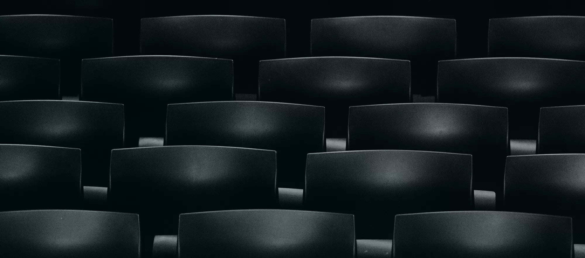
Discover how to transform your WordPress website design with an impressive image that exudes simplicity and purpose. This unique image features a minimalist design, consisting of an organised grid of black chairs arranged meticulously in neat rows. Enhancing the image’s appeal is a bold orange text block that takes centre stage at the bottom, boldly declaring: “Committed to people, committed to the future.” Its stark contrast against the dark background ensures it remains memorable, serving as a dramatic focal point perfect for any website revamp.
Understanding the design elements
Layout analysis
- Overall structure: The neat grid layout brings a clean and organised appeal, guiding visitors’ gaze smoothly.
- Rows and columns: Approximately five rows and several columns (ranging from five to six) create harmonious symmetry.
- Unique choices: The bright orange text against a neutral backdrop offers a unique focal point, standing apart from standard designs.
Element and feature description
- Visible elements: Rows of black chairs laying the image foundation and a vibrant orange text block that delivers a clear message.
- Interactive elements: Although a static image, its powerful message proves versatile for creative promotional use.
- Typography: Bold sans-serif font chosen for easy readability, contributing to the visual appeal.
- Graphical elements: Chairs and the dynamic orange text block remain focal, delivering a clean, aesthetic look.
Unique design aspects
- Standout features: Minimalism mixed with vibrant color ensures a captivating visual experience.
- Responsive design: Focus on central messaging allows seamless adaptation across devices.
- Accessibility considerations: High-contrast elements enhance visibility, spreading important messages effectively to all viewers.
Overall design style
- Design style: The minimalist theme leverages simplicity and contrast to powerfully convey your message.
- Visual hierarchy: Text block in the forefront, directing viewers amid orderly chair rows.
- White space and balance: Ample white space surrounds the text, presenting a balanced and uncluttered feel.
Creative uses for impactful images
Homepage focus
Utilise the image as a centrepiece on your homepage to captivate visitors instantly. The organised grid of chairs along with the vivid text block can provide immediate visual interest, encouraging users to explore your site further. This is a surefire way to establish a strong emotional connection with your audience right from their first interaction with your WordPress website.
Call-to-action highlights
Leverage the high-contrast design to ensure your call-to-action buttons stand out. Use the image’s bold features to direct attention precisely where you want it, driving conversions and user engagement effectively. Its visually appealing presentation makes it an ideal choice for impactful CTAs that need to capture immediate attention.
Banner ads
Include this attention-grabbing image in your banner ads to increase click-through rates. Its minimalistic yet vibrant design ensures your message is unmissable while fostering curiosity among viewers. With the powerful message it carries, it’s bound to resonate strongly regardless of the target platform.
Social media promotions
Integrate this image into your social media marketing campaigns for eye-catching posts that drive engagement. Its unique combination of orderly design and bold colour makes it a perfect fit to stand out on platforms typically saturated with content, encouraging more shares and reactions.
Blog post visuals
Enhance your blog posts with this striking image, ensuring readers’ attention remains hooked throughout. It’s particularly useful for narratives around structure, commitment, or future-focused topics, aligning perfectly with the strong message encapsulated within its design.
Newsletter headers
Use the image as a captivating featured header in your email newsletters. Its minimalism provides a clean start, drawing readers in effectively without overwhelming them. The strong message creates an underlying theme across your newsletter content, setting a tone of dedication and foresight.
Presentation slides
Incorporate this image as a slide background in your presentations. It sets a professional yet powerful tone while keeping the layout clean. Allow the bold text to speak volumes about your commitment, reinforcing any lecturer points or discussions centered around innovation and forward-thinking approaches.
Promotional campaigns
Enhance your promotional campaigns with this image, utilising its distinct components to swiftly communicate core values. Its structured layout, complemented by the bright callout text, builds a strong narrative around your brand promises to audiences.
Company landing pages
Utilise this image for your company’s landing pages. Its clear and impactful presentation helps build trust and connection as it mirrors the organisation’s emphasis on people and future-forward initiatives. The powerful central message imbues your landing page with authenticity.
Event announcements
Announce upcoming events using this dynamic image to grab attention. The organised chairs and bold messaging stand as a metaphor for well-planned gatherings, sparking interest. Share these visuals across your platforms to build excitement and attendee anticipation months before the event day.
Exploring page uses for image-based designs
Homepages
Homepages are your first impression, and using a strategic image like this enhances layout and directs focus. It draws visitors in, ensuring they dive deeper into your site content. A clean, impactful image communicates professionalism and commitment, key traits for retaining interest and nurturing exploration.
About us pages
Give insight into your brand’s commitment and values through a powerful image on your About Us page. Its structural configuration of chairs represents stability, while the striking message asserts your organisation’s dedication to people and the future. Visitors can thus connect emotionally with your values and missions.
Contact pages
Enhance your Contact page with this distinct visual that conveys vivid professionalism. The image not only adds visual appeal but also underscores a confident brand presence. Direct users towards reaching out, while the organised aesthetic reinforces clarity and ease of use in engaging with your business.
Product pages
Present your products under the spotlight by utilising this eye-catchy image. Its minimalistic, bold display complements any product descriptions, keeping them centred and uncluttered. The strong messaging aligns perfectly with highlighting commitment to quality and innovation expected by shoppers and clients.
Blog pages
Draw readers into your posts using this stylish and minimalistic image, enhancing readability and focus. The structured layout provides harmony across your writing, while the strong message supports topics around commitment and forward-thinking ideas, encouraging engagement and thoughtful reflection.
Service pages
Illustrate your service offerings with this appealing image as a backdrop. It sets a professional tone while allowing your service details to stand out. The visual contrast ensures any calls to action remain prominent, directing potential clients effectively towards exploring your services extensively.
Testimonials pages
Highlight client stories and feedback amidst this wonderfully organised image, ensuring positive testimonials take the lead. The arrangement symbolises order and trustworthiness, encouraging new clients to place faith in your business, enhancing credibility alongside the central message of commitment to quality.
Event details pages
Use this image to promote upcoming events effectively. Its professional design offers visual clarity while building anticipation for attendees. The vibrant text box invites attention, providing essential details at a glance and encouraging sign-ups or participation without overwhelming the user experience.
Portfolio pages
Present your past work beautifully with this minimalist image. Its organised aesthetic complements diverse portfolio items by guiding viewer focus seamlessly. The central message ties well with your professional achievements, painting a coherent picture of competence and focus across your field of expertise.
Landing pages
Captivate visitors right from entry with this impactful visual on your landing pages. Its high-contrast and strong messaging hold user attention, facilitating deeper exploration of your site’s offerings. Use it to communicate important propositions powerfully, engaging prospective clients or partners immediately.
Accessing images for your website
Finding the right image for your website can be straightforward with the right knowledge and resources. Begin with popular stock photo platforms, ensuring images fit website image contexts properly. Websites like Shutterstock and Getty Images provide high-quality options but are often part of a paid service. For public domain or free images online, explore resources such as Unsplash, Pexels, or Pixabay. These platforms offer image downloads under creative commons licenses, providing flexibility across commercial projects.
Conclusion
Simplify your web design for WordPress with impactful images that usher in professionalism, clarity, and vibrant storytelling. Integrate winning design elements into your WordPress site design using structured layouts like the one described, ensuring every visitor experiences your brand’s commitment firsthand. Elevating user engagement becomes effortless when aesthetic mastery melds with strategic messaging, providing a definitive edge amidst modern WordPress design costs.


