Discover Our Sleek Multi-Column Image Layout!
Transform your WordPress website with our modern and minimalist three-column design. Each section aligns perfectly in a horizontal row, crafting a visually appealing structure perfect for tech and cycling content. This balanced layout ensures each column is equally spaced, enhancing overall user engagement.
Key features of this design
Striking visual elements
- Headers: Each column is topped with a bold, eye-catching header (using a “Lorem ipsum” placeholder for easy customisation).
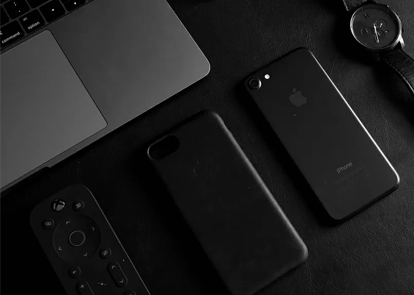
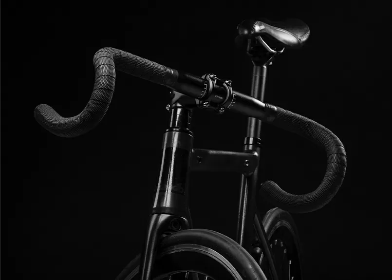
- Images: Showcase distinct tech and cycling images that resonate with your audience, adding personality to your site.
- Prominent buttons: Brightly coloured plus sign buttons invite interaction, suggesting opportunities for expansion and engagement.
Interactive design
The attention-grabbing buttons enhance the user experience by encouraging clicks and exploration.
Typography
A clear, bold sans-serif font for headers ensures visibility, with understated body text maintaining a clean aesthetic.
Visually appealing icons
The standout plus icons draw users’ attention to actionable features.
Image presentation
Each image is presented in a standard square or rectangular format, lending a polished look without distracting borders or shadows.
Unique design elements
Dynamic visual contrast
Dark images paired with bright buttons create a striking contrast, making each element stand out effectively.
Responsive adaptability
This symmetrical layout is designed to look great on any screen size, ensuring a seamless experience for all users.
Accessibility focus
The clear colour contrast between text and backgrounds enhances visibility, catering to a diverse range of user needs.
Overall style
Embrace a modern and minimalist design that prioritises essential elements, providing the visual hierarchy necessary to guide your users’ attention seamlessly from headers to accompanying images. Enjoy the effective use of white space, creating balance and clarity while separating sections for enhanced readability.
10 use cases for this website image-based patterns
1. Tech product showcase
Use this layout to display tech products in a sleek, engaging manner. Each column can highlight different aspects, such as features, specifications, and reviews, enticing potential buyers with a clean and coherent presentation.
2. Cycling gear catalogue
Perfect for showcasing a range of cycling gear, this design could lay out various categories like bicycles, helmets, or apparel, offering an exciting browsing experience for cycling enthusiasts.
3. Portfolio display
Ideal for creatives like photographers or designers, this layout allows you to showcase your work portfolio elegantly, enhancing the appeal of your projects through the visually harmonious arrangement.
4. Blog post gallery
This layout suits blog posts with rich visual content. Arrange featured images in a compelling line-up to draw readers into your articles with a cohesive overview of your blog’s visual narrative.
5. Recipe collections
Each column could represent a different meal course, displaying delicious dish images and corresponding recipes with this appetising layout, making it easy for foodies to navigate and select what to cook next.
6. Event highlights
Capture the essence of an event by using this layout to present key moments, featuring photographs and details like dates, venues, or speaker highlights, providing attendees with a memorable recap.
7. Fashion lookbook
Fashion brands can leverage this style to create an eye-catching lookbook, each column representing a different fashion item or style, offering a coherent and stylish preview of collections.
8. Educational content
This layout can be used to organise educational material, such as step-by-step guides or tutorials, by visually delineating different sections or stages of learning, enhancing clarity and engagement.
9. Travel destinations
Tempt travel enthusiasts by arranging stunning destination images in an inviting lineup, encouraging users to explore new locations and journeys through a compelling visual narrative.
10. Real estate listings
Real estate professionals can display property features and highlights, providing a crisp, organised view of available listings and making it easy for potential buyers to browse options.
10 different types of pages you can use image-based designs
1. Homepages
Create an engaging first impression by using this layout on your homepage to visually communicate your brand’s core message and lead visitors seamlessly through your offerings.
2. About pages
Tell your brand’s story using this structured layout to showcase founding moments, milestones, and profiles of team members, creating a connection with your audience.
3. Service pages
Detail your brand’s suite of services with visual clarity, arranging graphics or images that align with each service, providing a comprehensive understanding for clients.
4. Product description pages
Enhance product pages with modern image arrangements to showcase product ranges in an intuitive, visually appealing manner that encourages exploration.
5. Gallery pages
Photographers, artists, and other creatives can use this layout for gallery pages, highlighting collections in a clean, balanced presentation that enhances artwork.
6. Landing pages
Landing pages come to life with a clear column-based structure that assists in directing leads through calls to action, enhancing conversion rates.
7. Online catalogues
Organise digital catalogues using this layout for a streamlined browsing experience, helping customers explore and select products with ease.
8. Testimonial pages
Feature client testimonials and success stories in an organised, digestible format, building trust and credibility with potential clients through a professional presentation.
9. Event announcement pages
Promote events by featuring striking visuals and essential information in a well-organised fashion, encouraging attendees to register and participate.
10. Blog or news pages
This layout enhances storytelling by arranging blog post summaries or news snippets in an appealing lineup, inviting readers to dive deeper into articles of interest.
Conclusion
Upgrade your WordPress website design with this elegant three-column layout featuring dark images and bold call-to-action buttons. Perfect for tech-oriented content, it ensures your site is not only visually appealing but also engaging for your audience. Dive into a streamlined user experience that encourages exploration and interaction today! For those seeking free WordPress themes to complement this design, there are plenty of options that offer seamless integration. Explore various WordPress website builders and Elementor alternatives if you’re looking to diversify your site’s capabilities.
Remember, using high-quality imagery is key to making your site stand out. Wonder where to get these images for your website? Platforms like Unsplash, Pexels, and Pixabay offer free images online. Be sure to check the licensing to ensure you’re using public domain images or know how to use tools like Google Images without copyright breaches. To download images online, ensure they suit your site’s aesthetic and resolution needs.
This streamlined layout, easily adaptable using drag and drop website builder open source solutions, alongside options like WordPress block themes and WordPress block templates, makes it an excellent choice for beginners and seasoned designers alike.


