WordPress pattern: Pure Image Dark PID-PRO-15
Build WordPress sites with MaxiBlocks. All features free forever. No locked functionality. Optional Cloud Library saves you 10+ hours per project. Start free
Eye-catching image layout for your website
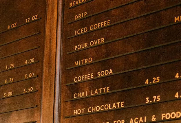
Transform your WordPress website with a dynamic grid layout that captivates your visitors. This modern design, arranged in a stylish 2×2 grid, perfectly balances striking images and engaging text, offering an inviting and interactive user experience. It’s an ideal solution for showcasing the key aspects of your content effectively.
Detailed design analysis
Layout overview
- Structure: This layout uses a multi-column format for clear organization.
- Rows and Columns: Featuring 2 rows and 2 columns, each section is balanced and visually appealing.
- Design Choices: Symmetry and distinct section elements create a sophisticated, polished look.
Element breakdown
- Section Elements: Each quadrants feature vibrant images, compelling headers, and concise descriptions, alongside a “Read more” link for further engagement.
- Interactive Features: Playful “+” icons invite interaction.
- Typography: Clean, sans-serif fonts maintain readability and modern style.
- Graphic Elements: Circular red “+” icons enhance the visual appeal.
- Image Style: Clean square formats keep visuals focused and uncluttered.
Unique design highlights
- Playful Aspects: Circular icons add a fun, unconventional twist to the structured grid.
- Animation & Effects: Though simple, the design is captivating without flashy animations.
- Responsive Potential: Designed for adaptability to varied screen sizes, ensuring a responsive WordPress design.
- Accessibility Focus: High-contrast text on darker backgrounds supports readability.
Overall aesthetic
- Design Vibe: A blend of modernity and playfulness with structured elements and inviting visuals.
- Visual Flow: Seamless hierarchy directs viewers from headers to descriptions.
- Use of Space: Generous white space enhances balance and readability.
Use cases for this website image-based pattern
1. Photography portfolios
Photographers can showcase their artworks using this layout, providing an alluring gallery-like experience. The combination of images with interactive elements allows users to view additional details or purchase prints seamlessly.
2. Blogging
Bloggers can highlight popular or evergreen articles using compelling visuals and descriptive text, increasing engagement and click-through rates to deeper blog posts.
3. Product launches
Perfect for promoting new products, this layout supports highlighting features along with inviting CTA buttons that guide users to purchase or learn more.
4. Event announcements
Event organizers can attract attention with date, venue, and a strong visual theme, encouraging bookings with clickable icons.
5. Portfolio presentations
Use this layout to present work samples or case studies, adding interactive elements for detailed exploration.
6. Educational content
Display courses or programs with concise descriptions, enticing students to enroll via linked features.
7. Testimonials and reviews
Highlight customer feedback effectively, promoting confidence and encouraging potential customers to explore more.
8. Team introductions
Humanise your organisation with team member profiles, each with a bio and contact link.
9. Promotional campaigns
Run seasonal sales or offer promotions with vivid images and dynamic text that commands action.
10. News and updates
Providers of news services can use this layout to headline breaking stories with engaging entry points for full articles.
Types of website image-based themes
1. Minimalist design
Focusing on simplicity, minimalist themes use clean lines and basic color palettes to ensure content clarity and emphasis.
2. Photographic
Ideal for photographers, these themes prioritize image display with minimal distractions, often using full-screen layouts.
3. Magazine layout
This design emulates traditional magazines, featuring multiple sections for various content types, perfect for news and media sites.
4. Parallax scrolling
Offer dynamic on-page interaction with layered graphics that move at different speeds, providing a captivating viewing experience.
5. Grid layout
Organizes content into modular grids, offering a structured and professional look, popular in portfolio and commerce designs.
6. Dark theme
Modern and sleek, dark themes reduce glare and make colors pop, often seen in tech-focused websites.
7. Flat design
Flat design emphasizes simplicity with an intuitive interface, using bright colors and crisp edges for a contemporary aesthetic.
8. Retro/vintage theme
Invoke nostalgia with classic fonts and color schemes that reflect past decades, appealing in creative and lifestyle circles.
9. One-page layout
Condense all site content into a single, scrollable page for streamlined navigation and mobile responsiveness.
10. Interactive
For sites seeking high engagement, interactive themes incorporate animations and clickable elements to captivate visitors.
Conclusion
The right image layout enhances your WordPress website design, providing a cohesive, engaging visual experience. By integrating this versatile grid, you’re not just improving aesthetics but also boosting user interaction. Whether you’re highlighting projects, sharing news, or launching campaigns, this layout caters to diverse needs while maintaining accessibility and modern appeal. Explore varied free WordPress themes or consider Elementor Alternatives for even more customization options in your WordPress website builder journey.


