Discover the versatile image analysis block pattern
Transform your WordPress website with our striking Image Analysis block pattern! This modern design features a symmetrical multi-column layout that showcases content in a sleek and engaging way. Each of the four equally spaced sections is thoughtfully arranged to captivate your audience’s attention and enhance your site’s usability.
Layout highlights
Overall structure
- Enjoy a clean multi-column format, featuring four distinct sections lined up horizontally.
Arrangement of rows and columns
- The design includes a single row with four meticulously balanced columns, providing a cohesive look.
Symmetry
- Each column mirrors the others in size and content type, establishing visual harmony throughout your layout.
Engaging elements
- Headers: Each section boasts eye-catching headers that introduce the content effectively.
- Content blocks: Below each header, you’ll find ample descriptive text (utilising “Lorem ipsum” as placeholders) to enrich your narrative.
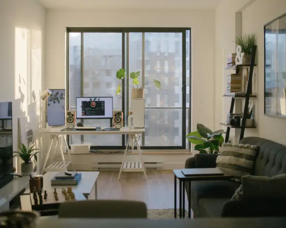
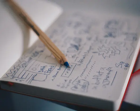
- Images: Corresponding images in each column visually narrate each section-think vibrant workspace scenes and dynamic activities that resonate with your audience.
- Interactive features: The right-arrow icon in the first column hints at interactive possibilities for navigation, enhancing user engagement.
- Typography: Bold, large headers create a clear visual hierarchy against refined subtext that supports readability.
- Graphical touch: A circular icon next to the first header adds an appealing graphic element to your layout.
- Image quality: The images maintain various orientations (landscape and possibly portrait) with clean borders, contributing to a curated aesthetic without overwhelming overlays or filters.
Unique design attributes
- Eye-catching design choices: A striking contrast between dark backgrounds and lighter content images effectively highlights your visuals.
- Interactive hover effects: While hover effects are not explicitly visible, the icon’s shape suggests interactive potential.
- Responsive design: The adaptable grid layout preserves its form across different devices, ensuring a seamless user experience.
- Enhanced accessibility: Symmetrical columns paired with contrasting text and backgrounds promote readability, making your content accessible to all users.
Modern aesthetic
- Design style: This block pattern embraces a minimalist aesthetic, focusing on clarity and the key message at hand.
- Visual hierarchy: Larger headers alongside detailed text create a clear direction for your audience’s attention.
- Whitespace utilisation: Thoughtful spacing between columns provides a balanced presentation, ensuring each section stands out without clutter.
Use cases for this image-based pattern
1. Corporate websites
Enhance the visual appeal of corporate websites by presenting key information in a visually organized manner. This image-based pattern allows companies to display essential company information, employee highlights, and service offerings attractively. By using WordPress website blocks, a business can effectively communicate professionalism while encouraging user interaction. Bold headers and strategic images will help keep potential clients interested and informed.
2. Portfolios
Artists and designers can showcase their work using this pattern to highlight various projects. With balanced column layouts, they can add images, text descriptions, and links to full project details, creating engaging portfolios. The design promotes a sophisticated presentation that captures the viewer’s interest and allows for seamless navigation of their creative journey. For those exploring WordPress website builders, this pattern simplifies the showcasing of distinct portfolios.
3. Non-profit organisations
Non-profit organisations can effectively share their mission with visually compelling images and stories. This pattern enables them to highlight upcoming events, volunteer opportunities, and recent accomplishments. By employing distinct columns, various cause elements can be displayed with clarity and accessibility, encouraging site visitors to engage, contribute, or learn more about the organisation’s impact.
4. Educational platforms
Schools and learning hubs can present course offerings, faculty introductions, and interactive elements within this symmetrical block structure. Highlighting course descriptions alongside tutor profiles adds a personal touch, while images capture the essence of each educational experience. An educational platform using this pattern will ensure easy navigation to resources, fostering a user-friendly environment for prospective students.
5. Travel blogs
Travel blogs can captivate readers with striking photos and personal anecdotes. This pattern lets bloggers seamlessly integrate inspiring images with sitting adventures or travel tips. The use of distinct sections ensures vibrant travel experiences and unique stories get the attention they deserve. Bloggers interested in [Elementor Alternatives](https://maxiblocks.com/wordpress-websites/wordpress-plugins/wordpress-page-builder/elementor-alternatives/) could find this pattern suitable for creating an engaging, fluidly designed blog.
6. E-commerce websites
Online stores can present their products using a combination of imagery and descriptions in an inviting layout. With enticing product photos and price tags, these segments guide buyers through offers, assisting decision-making. This pattern can help showcase bestsellers or seasonal deals, ensuring an inviting shopping experience. The visually harmonious display cultivates a positive brand impression, increasing sales opportunities.
7. Event announcements
Event planners can utilise this pattern to efficiently introduce upcoming events. Each segment can feature event details such as date, location, participants, and images of past events. This organised approach ensures that visitors have all the information needed to decide whether to attend, along with clear call-to-action prompts to register or inquire further.
8. Product landing pages
A product-focused WordPress block template allows clear communication of a product’s features and benefits. With separate sections detailing specifications, customer reviews, and high-quality product images, potential customers can access crucial details at first glance. This user journey helps convert interest into a purchase confidently.
9. Digital agencies
Digital marketing agencies can stylishly present their services and highlight success stories using an elegant block pattern. Introducing creative team members, marketing strategies, and client testimonials in a well-arranged pattern delivers credibility and impact. The detailed presentation enhances the agency’s ability to attract and retain potential customers seeking innovative solutions.
10. Restaurant menus
Restaurants can present menu items attractively with images of signature dishes and descriptions. Each section can illustrate diverse menu categories, such as appetisers, mains, desserts, and drinks, making it easy for customers to visualise meal options and pricing. A seamless pattern ensures diners quickly locate and choose their favourite meals.
10 Types of pages you can use image-based designs
1. Home pages
Home pages using image-based designs provide an immediate visual impact. High-quality imagery combined with precise messaging quickly captivates visitors, giving them a clear sense of your website’s purpose. This format sets the tone, drawing users deeper into your site while reflecting your brand’s identity and professionalism.
2. About us pages
On ‘About Us’ pages, distinct sections can showcase a company or individual’s background, mission, and team. This pattern enables the telling of an engaging brand story, enriched with images of key milestones or authentic team moments. The organised layout boosts credibility, ensuring audience engagement through concise yet compelling storytelling.
3. Blog post pages
An image-based design for blog posts improves readability and engagement. Breaking content into structured sections with accompanying images helps convey themes effectively. Readers find it easier to follow narratives and digest key points, maintaining interest and encouraging them to explore further articles and related blog topics.
4. Service pages
Service pages can effectively highlight offerings by using stylised images and succinct descriptions. This structure enables service providers to demonstrate capability and specialisation across distinct areas clearly. Visitors get insight into the depth of expertise available, fostering trust and encouraging enquiry actions or service purchases.
5. Product pages
Image-based designs on product pages create a visually appealing showcase of features and benefits. Organising information lays out the product experience, helping potential buyers navigate details effortlessly. High-resolution images complement key specifications, while user reviews provide social proof, boosting product appeal and fostering purchase decisions.
6. Portfolio pages
Professional portfolios come alive when image-based designs are utilised, showcasing work in appealing segments. Artists and creatives can feature project details with corresponding visuals, providing viewers a comprehensive understanding of their talents. This approach ensures an enduring impression and encourages potential clients or employers to reach out.
7. Contact pages
Contact pages with mapped locations, visuals of physical premises, and connection details provide visitors with confidence and clarity. Structured designs featuring icons, office photos, contact forms, and direct links streamline user interaction, ensuring easy navigation toward building connections or resolving queries.
8. Testimonial pages
Testimonial sections could harness image-based layouts, presenting customer success stories effectively. Structured columns highlight satisfied clients’ experiences through snippets and accompanying images, building authenticity and trust. This setup reinforces brand reputation for potential prospects considering established business relationships.
9. Event pages
Event pages structured through image-based patterns capture the essence of activities on offer. Organised segments provide information about ticketing, venue, speakers, or entertainers, accompanied by enticing imagery. Presenting event highlights instantly hooks future attendees while delivering crucial details to guide participation choices.
10. FAQ pages
An image-based design for FAQ sections enhances navigation and understanding by using visual cues alongside clear responses. This format segments common queries, ensuring users access valuable information seamlessly. It encourages exploration while reducing potential confusion, leading visitors toward more informed interactions.
Conclusion
With its modern, minimalist design, our Image Analysis block pattern is perfect for content-rich websites looking to provide clarity and ease of navigation. This layout enhances user engagement, underscores your message with stylish headers, compelling images, and a responsive framework. Elevate your WordPress website design today with this versatile design! Discover how incorporating a user-friendly block pattern into your site can improve performance and user satisfaction.


