WordPress pattern: Pure Image Dark PID-PRO-33
Build WordPress sites with MaxiBlocks. All features free forever. No locked functionality. Optional Cloud Library saves you 10+ hours per project. Start free
Elevate your website with our engaging image block pattern!
Imagine giving your WordPress website a fresh look with a multi-column layout that brings your content to life. Our design features three captivating sections-“Our Story,” “Our Mission,” and “Our Results”-lined up for a neat, balanced presentation. This chic, minimalist style not only boosts visual charm but also highlights crucial ideas with clear headers and concise text.
Layout analysis
- Overall structure: The setup features a tidy multi-column format with three columns in one row, each spotlighting different key content to grab your audience.
- Arrangement: Asymmetrical image heights create an engaging, harmonious visual appeal, balancing professionalism with an inviting feel.
Element and feature description
Visible elements
- Headers: Eye-catching titles (e.g., “Our Story”) snag attention instantly.
- Text blocks: Each header comes with concise text, ensuring everything is straightforward.
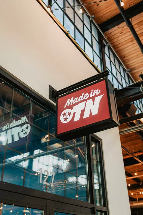
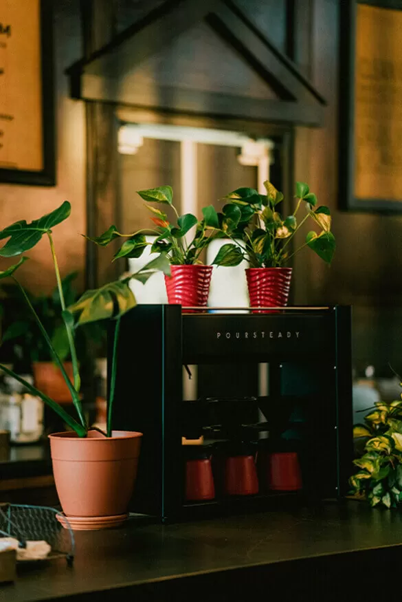
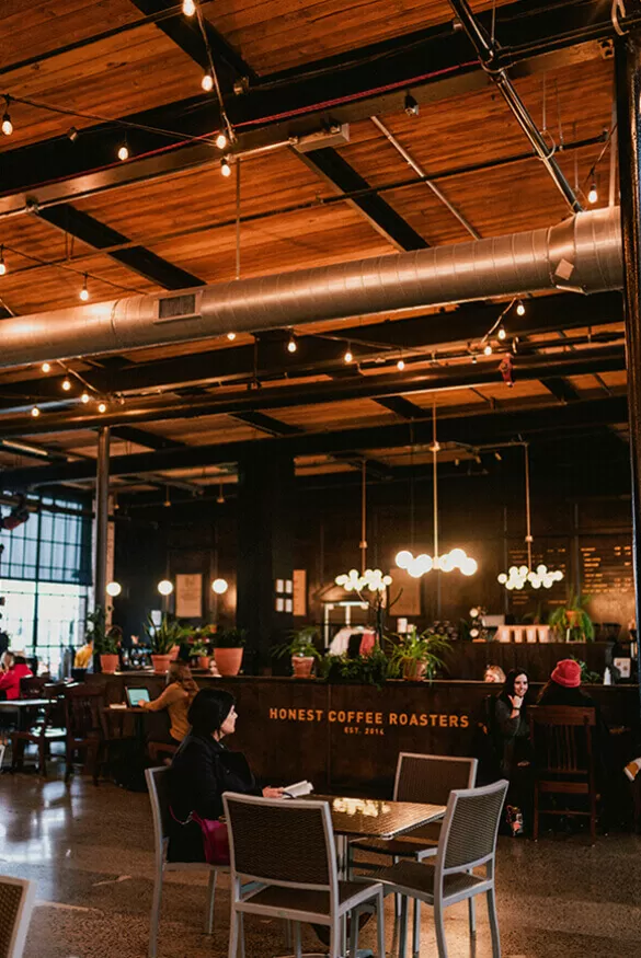
- Images: Distinct, relevant visuals enhance each section’s storytelling.
Interactive elements
The layout is currently static, but there’s room for clickable links or buttons to engage users more effectively in the future.
Typography
Modern typography using bold, easy-to-read fonts ensures clarity and a neat appearance.
Icons and graphical elements
Simple yet striking coloured squares near the headers add a creative flair.
Image details
Mostly landscape images blend smoothly with the background, featuring soft shadows for depth.
Unique design aspects
- Standout features: Colourful squares draw attention and distinguish this design from others.
- Hover effects or animations: Currently straightforward, but animations can be added later for more engagement.
- Responsive design elements: Mobile-friendly columns adapt and stack vertically for ease of access on small screens.
- Accessibility considerations: Good contrast between text and background ensures readability, offering potential for improvements in text size or alt text.
Overall design style
- Design style categorisation: A clean, modern, and minimalist approach focuses on simplicity and functionality.
- Visual hierarchy: Effective use of headers and structured layouts guides users naturally through content.
- Use of white space: Spacing surrounds each section, promoting balance and focus.
Website image pattern use cases
Here are 10 scenarios where this WordPress web design image pattern shines:
-
Portfolio showcase: Artists and designers can showcase their work beautifully, letting each piece stand out.
Take your portfolio up a notch with this pattern. Position your projects side by side, letting potential clients view your work easily. With clear headers for project names, your portfolio becomes not just readable but also visually attractive. Use the dynamic layout and integrate interactive elements to make your work even more engaging. Whether showcasing graphic design, webdesign WordPress content, or any creative form, this pattern makes your portfolio professional and appealing.
-
Product features: Ideal for businesses wanting to highlight key product features.
Display your product’s outstanding features side by side. This approach not only draws attention but also makes it easy for potential customers to understand what makes your product special. With bold headers and concise descriptions, this layout communicates your product’s value effectively. Accompanied by relevant images, this pattern makes your feature listing not only comprehensive but also visually engaging.
-
Company ethos presentation: Present your story, mission, and achievements cohesively.
Infuse your company’s personality into your WordPress block templates. This layout enables you to communicate your brand’s journey, values, and milestones seamlessly. By pairing headers with relevant illustrations and succinct text, your audience gets a clear understanding of your company’s background and mission. Enhance engagement by adding interactive elements or links for further reading.
-
Educational content delivery: Teachers and educators can structure lessons in a more engaging manner.
Unleash the power of education with this design. Lay out lessons, educational resources, and course content side by side, making the material easy to consume. Use header elements to point out significant topics while accompanying images make learning active and exciting. Include interactive elements like quizzes or feedback forms to complete the experience, turning your WordPress website into an educational powerhouse.
-
Online gallery: Showcase art collections or photography with elegance.
Display your art or photography collection dynamically. This layout not only puts each piece in focus but also maintains a coherent visual flow. With high-quality WordPress images and detailed captions under each header, your audience is drawn into your artistry. For an enhanced experience, incorporate animations or hover effects, allowing viewers to interact with your gallery in a more immersive way.
-
Service breakdown: Service providers can clearly illustrate what they offer.
For service providers, this layout is essential. Display your services side by side with attention-grabbing headers and brief descriptions to ensure your clients know your offerings. Using compelling WordPress images with your services, you highlight what sets your company apart. Make your layout interactive by integrating elements like scheduling buttons or contact forms, simplifying the booking process directly on your WordPress website.
-
Event reveal: Perfect for revealing events, agendas, or schedules.
Unveil your event details with sophistication. Align speakers, sessions, or agenda items side by side, delivering clarity at a glance. Use engaging headers with succinct descriptions and relevant visuals to create interest and excitement. This design, coupled with your events and offers calendar, captures attention easily. Incorporate links for registration or additional event details to provide an interactive experience.
-
Team introduction: Introduce your team with flair and structure.
Put the face to the names. This pattern allows a structured introduction of your team, placing members side by side with captivating headers, brief bios, and portraits. Your website visitors can get to know them easily and feel connected to your organisation. Insert hover effects and interactive elements to allow more information to unfold on demand, perfect for enhancing personal connection.
-
Storytelling: Provide a visual narrative alongside written content.
Transform your storytelling into an impactful experience. Use images next to your narrative sections to create a visual story on your best website builder software. This setup draws readers into your tale, allowing them to connect visuals with each section of text. Add in animations to bring elements to life when users hover over them, further enriching their journey through your content.
-
Promotional campaign: Market products or services with punch and appeal.
Bring your promotional campaign to the forefront with this style. Line up product highlights, offers, and call-to-action statements in a compelling arrangement. Streamlined headers, succinct descriptions, and vivid WordPress images carry your message loud and clear. Use interactive buttons to direct your audience to purchase or learn more, converting interest into action efficiently.
Website image pattern themes
Here are some WordPress block themes that make fabulous use of image patterns:
-
Minimalist elegance: Focuses on simplicity, ensuring content shines.
This theme embraces a minimalist style, enabling your content to take center stage without distractions. With clean lines and ample white space, your WordPress favicon and images pop against the serene background. Perfect for users seeking functionality and refined aesthetics, this theme offers readability and an intuitive user experience, keeping visitors locked into your site content seamlessly.
-
Dynamic showcase: Provides flexibility to create animated visual stories.
Dynamic showcase themes add movement to WordPress development. Animations and hover effects catch the eye, making user interaction with your site more lively. This theme is the choice for storytellers or businesses looking to captivate their audience with sleek transitions as they scroll, presenting content as an unfolding experience rather than static blocks.
-
Portfolio spotlight: Perfect for artists wanting to display their work compellingly.
Designed for creatives, the Portfolio spotlight theme boasts features that let every piece of work shine. Using grid layouts and high-resolution imagery, this theme showcases portfolios with sophistication. Its focus on visuals over text ensures that your work is the focal point, ideal for photographers, designers, and anyone keen to showcase their craft vividly and effectively.
-
Engaging narratives: Suits writers looking to pair text with powerful visuals.
This theme is a haven for content creators. Combining expressive text blocks with captivating visuals, it offers a seamless storytelling experience. Headers and typographies complement visuals, ensuring every aspect of your block templates is harmonious and compelling. Use it to create blogs or magazine-style websites where stories come alive and captivate.
-
Modern chic: Aligns with current design trends, boasting sleek lines and modern icons.
Modern chic leverages latest design trends to provide stylish website presentations. With sleek lines, modern WordPress icons, and vibrant colour schemes, this theme ensures your web platform is current and trend-friendly. It’s a fantastic choice for businesses and brands eager to represent themselves innovatively while keeping their digital face fresh and enticing.
-
Interactive insights: Utilises animation and hover capabilities to enhance interaction.
Interactive insights transform user experience through engaging interaction options. Bringing a touch of modern web interactions with animations and hover effects, it takes users beyond basic scrolling. Highlight essential content with motion, ensuring visitors interact and connect more deeply with what they see on screen. A theme ideal for informative websites, making data lively and accessible.
-
Gallery grandeur: Tailored for art galleries and photography websites.
Gallery grandeur theme focuses on the exhibition of visuals. Suitable for art galleries or photography sites, it provides a virtual gallery experience with its expansive image display features. This theme embraces soft shadows and layout designs reminiscent of gallery walls, offering an elegant and immersive atmosphere, transporting audiences through visual storytelling with ease.
-
Corporate clarity: Designed for businesses highlighting professionalism and transparency.
Corporate clarity is engineered for businesses that value clear communication and professionalism. With structured layouts and polished visual elements, this theme portrays trust and reliability. Tailored for corporate communication, it ensures your company’s story is told with transparency and authority. Headers and bullet points make complex information easily digestible, keeping stakeholders well-informed.
-
Educational framework: Supports educational content with structured design layouts.
Educational framework theme is perfect for learning environments. Offering structured layouts that accommodate lesson adaptations, it turns WordPress into an academic assistant. Headers outline important topics, while visual aids enhance learning comprehension. Educational entities benefit from reliable design patterns which transform instructional content into engaging, effective learning modules.
-
Event enthusiasts: Perfect for managing and showcasing events with finesse.
Event enthusiasts theme provides a methodical way to present events. With professional layouts, attention-grabbing banners, and a structured itinerary presentation, it ensures your events stand out. Comprehensive integration of interactive elements like RSVP buttons fortify its robustness for event management. Event-focused businesses find this theme ideal for representing occasions with style and precision.
FAQs on website images
How to get an image for a website? You can source images through stock photo websites, custom photography, or design platforms offering web-compatible visuals. Always ensure to check usage rights or licensing.
What is the website image called? This is often referred to simply as a “website image.” It can range from banner images to product photos and more, used to visually enhance web content.
What is the best image website? Popular platforms include Shutterstock, Unsplash, and Adobe Stock, known for high-quality images with a variety of licensing options. Each offers unique benefits suitable for different budgets and needs.
Where can I download free images? Websites like Pexels, Unsplash, and Pixabay offer an extensive collection of free images under a Creative Commons license. These are ideal for non-commercial use.
Where can I find public domain images? The Wikimedia Commons is an excellent resource for public domain images, as well as the Library of Congress and the New York Public Library collections.
Can you get free images online? Yes, many platforms provide free images. Always verify the licensing to ensure legal use, especially for commercial projects.
How to use Google images without copyright? Use Google Advanced Image Search to filter images by usage rights. Make sure to choose “Creative Commons licenses” for legally obtainabl images.
How do I download images online? On most sites, right-clicking on an image and selecting “Save As” will download it. Ensure you have the right permissions before use.
Conclusion
Updating your WordPress website with a remarkable multi-column image block pattern enhances engagement and draws attention to your site’s key messages. Its contemporary design, unique accents, and spacious layout not only appeal visually but also allow room for potential interactive features. Start transforming your WordPress website builder today to capture and captivate your audience with the aesthetic upgrade it deserves.


