Born to play
Lorem ipsum dolor sit amet,
consectetuer adipi

Empowering people
Lorem ipsum dolor sit amet,
consectetuer adipi

Be direct
Lorem ipsum dolor sit amet,
consectetuer adipi

Build WordPress sites with MaxiBlocks. All features free forever. No locked functionality. Optional Cloud Library saves you 10+ hours per project. Start free

Born to play
Lorem ipsum dolor sit amet,
consectetuer adipi

Empowering people
Lorem ipsum dolor sit amet,
consectetuer adipi

Be direct
Lorem ipsum dolor sit amet,
consectetuer adipi
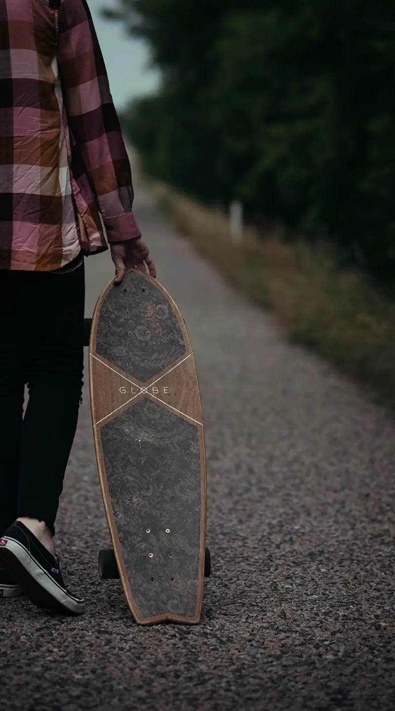
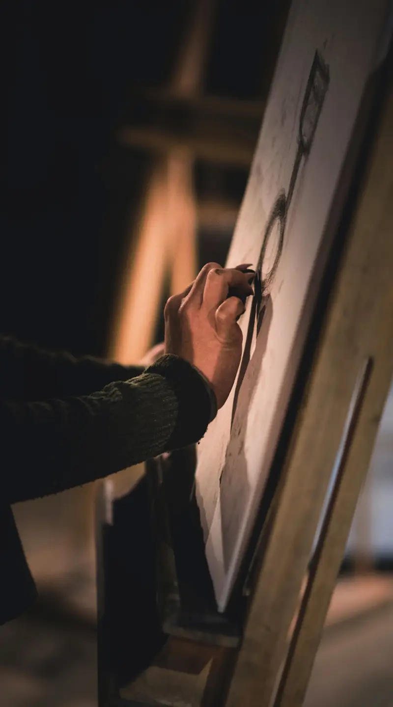
Transform your WordPress website with this eye-catching multi-column image design that invites engagement and interaction. Featuring a dynamic layout with three distinct vertical sections, this design seamlessly combines striking imagery and compelling text to tell your story.
The layout consists of one row with three visually unique columns, each showcasing vibrant images paired with captivating titles and descriptive text. The asymmetrical arrangement creates visual intrigue, making it perfect for highlighting different activities or themes.
Engagement is key! Each button is designed for clickability, inviting users to explore further.
A multi-column layout can vividly display travel destinations, giving each location its spotlight. Pair stunning images with engaging narratives to invite readers on a virtual journey.
Highlight different features of a single product by dedicating each column to a unique element. Use compelling images and descriptions to explain how each feature enhances the overall product experience.
For creatives, this layout is perfect for showcasing diverse works. Each column can represent a project or theme, accompanied by a brief description or title to capture potential clients’ interest.
Promote an event by dividing details like venue, schedule, and headliners into distinct columns. Use attractive images and action-oriented text to encourage engagement.
Organise educational material by themes or subjects within the columns, enhancing readability and helping users navigate the content more efficiently.
Outline a recipe’s key steps through images and short text snippets. Each column can represent a stage in the cooking process, making it easy for readers to follow along.
Promote lifestyle content by using columns to reflect different aspects, such as fashion, wellness, and hobby ideas, drawing readers into a multifaceted experience.
Businesses can use this layout to showcase various services, illustrating each with its image and description, helping clients easily identify areas of interest.
Illustrate different aspects of a nonprofit’s mission, using each column for key projects, impact statistics, or volunteer opportunities to engage supporters.
Use the columns to highlight seasonal trends, with each section focusing on a distinct theme, accompanied by engaging images and descriptions to captivate fashion enthusiasts.
Emphasise simplicity and elegance with a minimalist theme. This approach prioritises essential elements and clean design, ensuring your content stands out without distraction.
Perfect for creatives, a portfolio theme offers an ideal platform to showcase diverse works. A grid-style layout with vivid images enhances the visual appeal, attracting potential clients.
Designed for avid writers and storytellers, a blog theme provides a clean, user-friendly layout that enhances readability and keeps audiences engaged.
Ideal for photographers, this theme places images front and centre, letting stunning visuals speak for themselves. High-resolution displays ensure each shot captivates viewers’ attention.
Optimised for online shops, an e-commerce theme showcases products beautifully, uses prominent images, and includes user-friendly navigation for seamless shopping experiences.
This theme simulates a digital magazine, with a multi-column layout perfect for displaying a variety of content types, from articles and galleries to video previews.
A business theme emphasises professionalism, blending sleek design with functionality, and creating a polished platform to share company offerings and information.
Ideal for event management, this theme features dynamic layouts to display schedules, speakers, and logistics, ensuring attendees have all the information they need.
Capture the essence of modern living with a lifestyle theme that highlights diverse interests, from food and fashion to travel and wellness, using engaging imagery and text.
Designed for charities, this theme effectively communicates your mission through vivid imagery and storytelling, encouraging user engagement and support.
Obtaining an image for your website can be done efficiently through various resources. Stock photo websites like Unsplash and Pixabay offer high-quality images free for personal and commercial use. Additionally, many WordPress icons and block templates provide built-in visual elements that can harmonise with your design.
In WordPress website design, an image displayed on a website is often referred to as a “web image”. This term covers any picture or visual element used to enhance content or layout.
For high-quality images, Unsplash and Pexels rank among the best platforms. Offering a vast collection of free images, they are excellent for enhancing a free WordPress theme with engaging visuals.
Websites like Pixabay, Unsplash, and Pexels offer free-to-download images suitable for a variety of projects, including both personal and commercial use.
Public domain images are available on platforms such as Wikimedia Commons and the PublicDomainPictures.net. These resources provide images that you can use without copyright restrictions.
Yes, free images are available online on platforms like Unsplash, Pexels, and Pixabay, offering a wealth of resources for your WordPress block themes and templates.
To use Google images without copyright issues, filter search results by rights under “Tools” and select images labelled for reuse or modification.
Downloading images online is straightforward. On most sites, right-click the image and select “Save image as” to store it on your device. Remember to respect any copyright restrictions associated with the image.
Elevate your WordPress website builder experience with this imaginative multi-column image design. By combining vibrant imagery, interactive elements, and a playful style, your content will not only draw attention but also invite users to engage and explore. Perfect for promoting lifestyle or experiential themes, this layout ensures your message is both impactful and accessible, harnessing user-friendly drag and drop website builder open source technologies to create an engaging online presence.
