WordPress pattern: Pure Image Light PIL-PRO-01
Build WordPress sites with MaxiBlocks. All features free forever. No locked functionality. Optional Cloud Library saves you 10+ hours per project. Start free
Enhance your WordPress site with this engaging image block pattern design
Imagine a stunning website layout that captures attention and drives engagement! Our design is a symmetrical, multi-column layout that helps you showcase your content effectively. This article guides you through the details and offers insight into making the most out of your WordPress website design.
Layout overview
- Overall structure: A sleek three-column layout that is both user-friendly and visually appealing.
- Arrangement: Featuring three rows for each column, giving you ample space for text and images. The even spacing enhances readability.
- Layout choice: With a focus on symmetry, each column is perfectly aligned and maintains equal width for a polished look.
Key elements and features
Headers
Engaging headers like “Born to play,” “Empowering people,” and “Engineered for life” draw users in and set the tone for your content.
Text blocks
Under each header, a concise paragraph provides informative context while keeping readers engaged.
Images
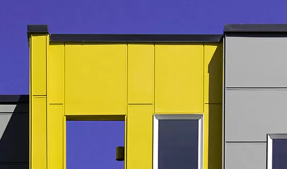
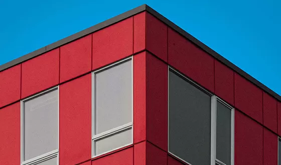
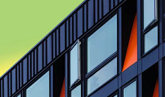
Each section pairs with relevant, vibrant images that visually communicate your themes and keep visitors intrigued. We recommend using free resources like Pexels or Unsplash to download images online easily.
Buttons
Clear “Learn more” buttons invite users to delve deeper into your content, encouraging interactions.
A touch of interactivity
Each column’s “Learn more” button suggests an interactive experience, inviting users to click for additional content, a feature that stands out in Elementor Alternatives.
Design considerations
Typography
The modern sans-serif font gives a clean, contemporary look. The larger, bold headers capture attention, while smaller text ensures clarity.
Visuals
Images have straight edges, enhancing the minimalist aesthetic and focusing the viewer’s attention on the content. If you are searching for ways to use WordPress icons, they can complement the design well.
Unique design highlights
- Vibrant themes: The choice of eye-catching images adds a strong visual impact that resonates with your audience’s interests.
- Responsive design: This layout is adaptable across different screen sizes, perfect for mobile and desktop users alike.
- Accessibility: The ample text contrast aids readability; however, consider further optimising for button accessibility.
Overall design style
With its modern and minimalist approach, this design emphasises clarity and effective communication through visual hierarchy. The headers lead the viewer’s focus, followed by supporting text and images in a well-balanced layout enhanced by ample white space.
10 use cases for this website image based pattern
Portfolio showcase
Displaying your work has never been easier with a sleek three-column layout. Use engaging images and concise text to captivate potential clients, illustrating your skills and creativity effectively. The visual impact of this design ensures your portfolio stands out, making enthusiasts eager to learn more through interactive buttons and supplemental links.
Product highlights
Feature your top-selling products with bold, engaging visuals and essential details. This structured layout can help clarify complex information, enhancing customer understanding and product appeal. It’s an ideal choice to inform, attract, and convert potential customers through aesthetic presentation and strategic information placement.
Blog excerpts
Capture readers’ interest by showcasing thoughtful snippets from your recent blog posts. The interactive buttons encourage users to explore full articles while the design maintains interest and engagement. A blog-styled presentation offers viewers quick access to varied content, expanding their interaction with your site.
Service descriptions
Present your services compellingly with a design dedicated to detailed explanations and captivating imagery. Use headers, text blocks, and interactive buttons to guide users through service features, pricing, and benefits. This method succinctly conveys the essence of your offerings and fosters user curiosity.
Announcement board
Whether you’re launching a new product or hosting an event, this layout is an excellent platform for announcements. It ensures that vital messages aren’t lost in translation but are instead amplified for the audience. Use the space for clear, bold messages and direct users effortlessly to more detailed information.
Team presentations
Introduce your team creatively with individual columns for each member, highlighting their unique skills and roles. This personal touch adds a layer of relatability and professionalism, engaging users and portraying your team’s diversity and talent comprehensively.
Client testimonials
Feature compelling customer stories using this dynamic layout. Pair their glowing testimonials with striking images to give potential customers confidence in your brand. The structured portrayal of satisfied clients’ experiences can significantly boost your site’s credibility and trustworthiness.
Art gallery
Emphasize your creative pieces with carefully chosen visuals and thematic descriptions. Use vibrant images to complement your artwork, ensuring that each piece receives the attention it deserves. An art gallery-styled approach can be both inspiring and informative for art enthusiasts.
Educational resources
Help users through learning materials, presenting information in a clear, engaging format. Use images and text to highlight key takeaways or benefits, making educational content digestible and visually appealing. This layout effectively encapsulates the essence of educational outreach.
Travel blogs
Inspire wanderlust by featuring travel experiences, stunning imagery, and personal anecdotes. Invite readers to explore new destinations via engaging visuals and anecdotes that resonate emotionally. This format effectively blends storytelling and imagery, offering a mesmerising virtual escape.
10 different types of pages for image-based designs
Homepages
Welcome visitors to a well-structured, aesthetically pleasing homepage. Leverage image blocks to introduce key sections and services, immediately giving users an overview of your site’s purpose and offerings. The clear, organised format aids navigation and enhances the site’s professional look.
About us
Present your story with compelling visuals and concise summary statements. An image-rich About Us page can creatively illustrate your company’s journey, values, and mission, fostering a deeper connection with visitors. This format humanises your brand, making it relatable and memorable.
Gallery pages
Showcase visual content effectively with a clean, minimalist gallery page. Image blocks allow for beautifully arranged displays, ideal for organising photography, art collections, or other visual projects. The organised design ensures easy viewing and unimpeded focus on the artwork.
Product pages
Display products attractively with images that highlight key features and benefits. The structured layout emphasises product details, making it easier for customers to evaluate and decide. This cohesive design aligns product presentation with user browsing for an enhanced shopping experience.
Blog landing pages
Present your blog offerings attractively, guiding users towards posts that catch their interest. This layout effectively organises varied blog types and genres, encouraging exploration across topical boundaries. Users appreciate the cohesive content delivery and straightforward navigation experience.
Events pages
Promote upcoming events with eye-catching imagery and concise event information. This three-column format ensures essential details are front and centre, from dates and venues to event highlights. An interactive design also encourages users to learn more or register directly.
Portfolio pages
Feature creative works or projects within a clean, impactful portfolio layout. Visitors can quickly survey your talents through thematic photographs and brief descriptions while remaining engaged thanks to the interactive elements. This template strengthens credentials and skill presentations.
Testimonial pages
Highlight your brand’s success stories through relevant visuals and customer quotes. Testimonials presented in a structured image-based format enhance perceived credibility, building potential clients’ trust level in your offerings and services. It provides seamless storytelling through visual evidence.
Services pages
Present each service creatively, with matching visuals and well-organised text to guide user understanding. A tailored service page allows for detailed description expansions, complete with ‘Learn more’ sections. This setup clearly communicates the solution’s value with strong preliminary engagement.
Contact pages
Enhance the standard contact page format by adding thematic images in the layout. Clearly displayed contact methods and inquiries foster easy interactions, which can be visually enhanced through structured blocks. It’s about creating a functional first impression that eases visitor connection efforts.
Conclusion
Elevate your WordPress website with this captivating three-column image block pattern. It harmoniously blends vivid imagery with concise messaging while encouraging user engagement through effective design choices. For those looking to further customise their sites, consider exploring AI website builders or browsing the WordPress block themes library. This layout isn’t only visually stunning; it’s also designed to guide users effortlessly through your content, making it a perfect addition for any site. Embrace this versatile design pattern to make a statement and create an unforgettable WordPress website builder experience.


