WordPress pattern: Pure Image Light PIL-PRO-06
Build WordPress sites with MaxiBlocks. All features free forever. No locked functionality. Optional Cloud Library saves you 10+ hours per project. Start free
Modern minimalist image layout
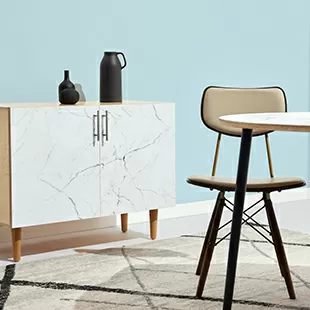
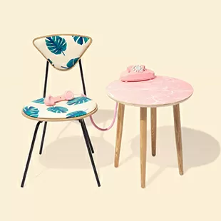
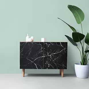
Transform your WordPress website with an eye-catching multi-column image layout that is sure to captivate your audience. This design features three distinct sections arranged horizontally, each showcasing a circular image above a concise text block. Offering a refreshing alternative to conventional rectangular layouts, it’s appealing and distinctive for modern WordPress website design.
Detailed image analysis
Layout analysis
- Overall structure: A clean, multi-column design comprising three sections that flow harmoniously.
- Arrangement: The symmetrical three-column setup ensures an even distribution of space, providing balance and visual interest.
- Asymmetrical choices: The circular images break away from tradition, offering a modern twist that enhances the visual aesthetic.
Element and feature description
- Visible elements:
- Headers: Each section features descriptive header text beneath the corresponding circular image, grabbing immediate attention.
- Text blocks: Following the headers, concise descriptive text provides valuable context without overwhelming the viewer.
- Images: Each section prominently displays a circular image that relates to the header content.
- Interactive elements: While the design maintains a clean look without explicit buttons or forms, it encourages viewer engagement through appealing visuals.
- Typography:
- Font styles: The bold headers contrast with lighter, smaller descriptive text, effectively guiding the viewer’s focus.
- Sizes: Clear hierarchical contrast in text sizes helps direct attention where it’s needed most.
- Icons/Graphical elements: The primary visual elements are the striking circular images, framed to enhance their impact.
- Image borders and orientation:
- Borders: Images are elegantly presented within circular frames, offering a polished appearance.
- Orientations: Although the subjects might be landscape-oriented, their circular presentation adds a creative flair.
- Image effects: With no distracting overlays or shadows, this layout emphasizes a fresh, modern vibe.
Unique design aspects
- Standout design choices: The combination of circular images and a grid layout sets this design apart, making it visually engaging.
- Hover effects/animations: The design remains sleek and straightforward, with no additional hover effects, ensuring a seamless user experience.
- Responsive design elements: This adaptable layout is optimized for different devices, ensuring consistent performance and appeal across screens.
- Accessibility considerations: Clear textual descriptions aid in comprehension, making the design inclusive and user-friendly for everyone.
Overall design style
- Design style: A minimalist aesthetic prevails, emphasizing simplicity, elegance, and clarity.
- Visual hierarchy: The strategic arrangement of headers, images, and text guides viewers through the layout effortlessly.
- White space and balance: Generous margins foster a sense of tranquility, allowing each section to stand out and enhancing the overall composition.
Use cases for this website image-based pattern
- Portfolio showcase: Highlight individual projects or artwork in a clean and modern style that draws attention directly to the works without overwhelming viewers with unnecessary details.
- Product display: Perfect for eCommerce, this layout showcases products elegantly while integrating descriptions that can effectively convert visitors to buyers.
- Team introduction: Introduce team members with style by using circular images to convey professionalism and a welcoming atmosphere.
- Event promotion: Showcase upcoming events with captivating visuals that encourage engagement and interest through concise descriptors.
- Travel blog: Create visually appealing travel stories that combine stunning photography with engaging narratives.
- Restaurant menu: Display dishes in a stylish format that complements modern restaurant branding, enticing diners to explore your offerings.
- Photography portfolio: Make each image pop in a layout design that highlights photographer skills and artistry.
- Personal blog: Use unique visuals to enhance personal stories, making posts more relatable and engaging.
- Fashion lookbook: Showcase fashion items or styles within an appealing visual context that invites exploration of each piece.
- Educational resource: Present informative resources or content attractively, with images enhancing understanding of complex topics.
Types of pages using image-based designs
- Homepage: A dynamic first impression with stunning visuals captivates visitors and communicates brand identity instantly.
- About us page: Present company history and mission through engaging images that narrate the brand’s journey and philosophy.
- Gallery page: Provide a stunning display of curated images that highlight artistic skills or product features.
- Contact page: Use minimalistic design to share contact information clearly, accompanied by engaging visuals for a personal touch.
- Services page: Showcase what you offer with images that communicate the benefits and value of your services.
- Testimonials page: Add authenticity and trust through customer photos and stories, enhancing reliability with visual testimonials.
- Blog post: Capture attention with eye-catching visuals that enhance the storytelling and insight of blog entries.
- Product page: Encourage conversions with elegant imagery and concise text that communicates product benefits and features.
- Landing page: Drive action with compelling images that align with campaign goals, optimized for quick impact and clarity.
- Portfolio page: Highlight individual achievements or creative projects with focused visuals that demonstrate capability and style.
Conclusion
Embrace this modern, minimalist design that features a unique multi-column layout with circular images and well-crafted text. Its clarity, thoughtful structure, and generous whitespace create an engaging user experience that invites exploration. For WordPress users looking to elevate their website’s visual appeal and navigational ease, this design offers an ideal solution to stand out.
Explore free WordPress themes and enhance your wordpress website builder capabilities. For help downloading images online, consider using public domain sites like Unsplash or Pexels. Remember to ensure proper use by exploring guides on Google Images for copyright-free options. With these tools, add appealing visuals and enhance the allure of your site seamlessly.


